> ## Documentation Index
> Fetch the complete documentation index at: https://docs.flowx.ai/llms.txt
> Use this file to discover all available pages before exploring further.
# Root Components in UI Design
> Root components serve as the foundation for structuring user interfaces, providing the framework for arranging and configuring different types of components.
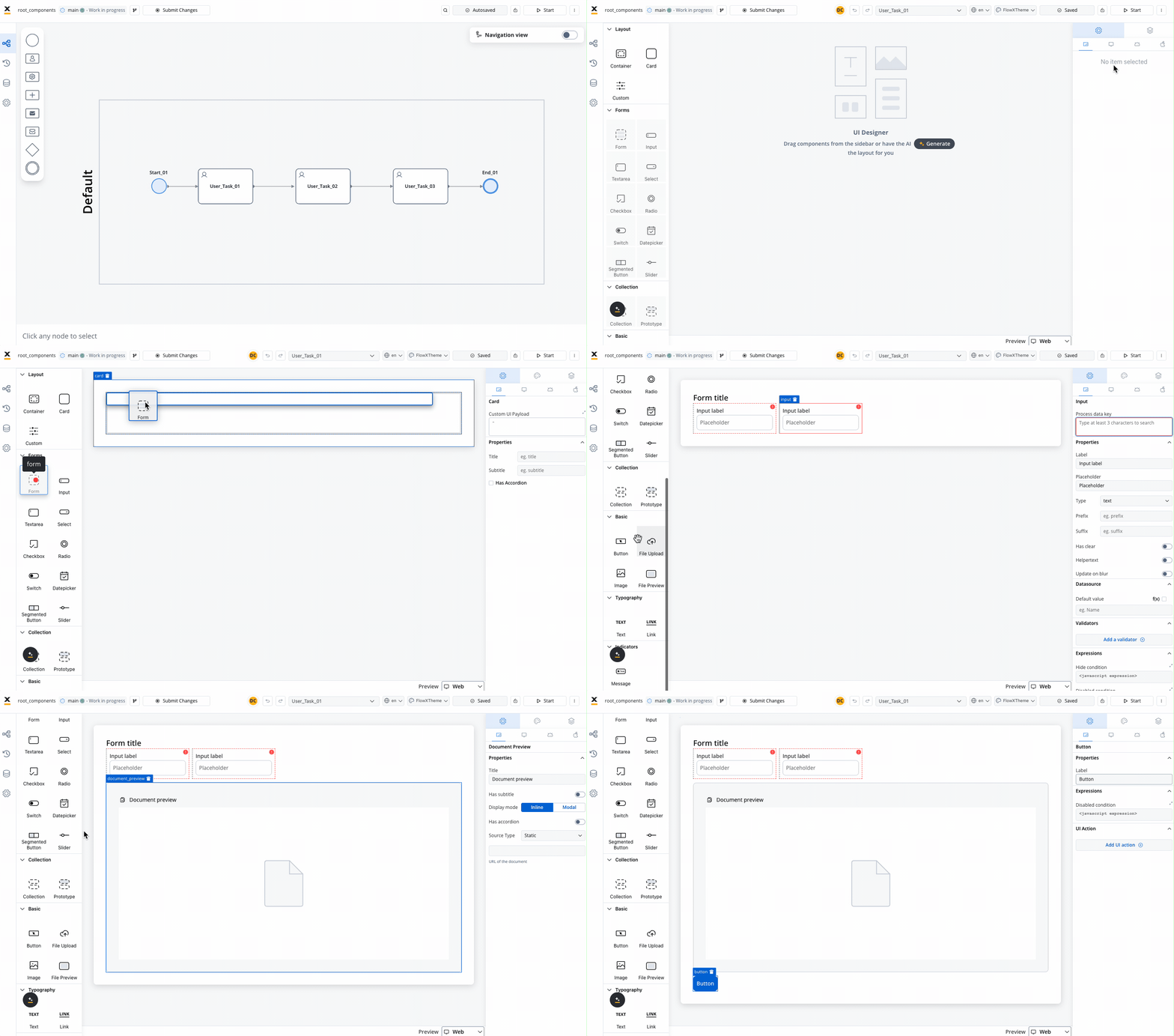
Root components play a crucial role in defining the layout and hierarchy of elements within an application. Here's an overview of key root components and their functionalities:
### Container
The Container component is a versatile element used to group and configure the layout for multiple components of any type. It provides a flexible structure for organizing content within a UI.
Learn more about [Container components](./container).
### Card
The Card component functions similarly to a Container component but also offers the capability to function as an accordion, providing additional flexibility in UI design.
Discover more about [Card components](./card).
### Custom
Custom components are Web components developed within the container application and dynamically passed to the SDK at runtime. These components are identified by their unique names and enable developers to extend the functionality of the UI.
Explore [Custom components](./custom) for advanced customization options.
### Global Header and Footer
In UI Flows, a **Global Header** and **Global Footer** display consistently across every page of the flow. See [Global Header and Footer](./global-header-footer) (SaaS · 5.10).
A card or a container can hold a hierarchical component structure as this example:
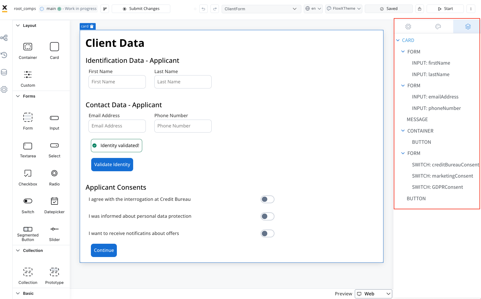
Available children for **Card** and **Container** are:
1. [**Form**](../form-elements/) - Used to group and align form field elements (inputs, radios, checkboxes, etc.).
For more information about the form elements, please refer to the [**Form elements**](../form-elements/) section.
2. [**Image**](../image) - Allows you to configure an image in the document.
3. **Text** - A simple text can be configured via this component; basic configuration is available.
4. **Link** - Used to configure a hyperlink that opens in a new tab.
5. [**Button**](../buttons) - Multiple options are available for configuration, with the most important part being the possibility to add actions.
6. [**File Upload**](../buttons) - A specific type of button that allows you to select a file.
7. [**Custom**](./custom) - Custom components.
8. [**Indicators**](../indicators) - Message UI elements to display different types of messages.
### Analytics Screen Name
Root components (Cards and Containers) can emit an analytics event when they are displayed, so you can track screen views in an analytics tool such as Google Analytics.
To configure it, select the root component and open the **Advanced** section of the config panel:
* **Analytics Screen Name** - turn on the toggle and set the screen name. When the component appears, the renderer emits an event carrying this name, which your analytics tool can pick up.
* **Analytics custom payload** - optional. When the toggle is on, add an expression to include extra data in the emitted event.
UI Flows expose the same capability as an **Add analytics** step (Analytics name + Custom payload) when you build a flow. See [UI Flows](../../../ui-flows).
Learn more:
## Related topics
- [Custom component](/5.9/docs/building-blocks/ui-designer/ui-component-types/root-components/custom.md)
- [UI Designer](/5.9/docs/building-blocks/ui-designer/ui-designer.md)
- [Container](/5.9/docs/building-blocks/ui-designer/ui-component-types/root-components/container.md)
- [Global Header and Footer](/5.9/docs/building-blocks/ui-designer/ui-component-types/root-components/global-header-footer.md)
- [Card](/5.9/docs/building-blocks/ui-designer/ui-component-types/root-components/card.md)