> ## Documentation Index
> Fetch the complete documentation index at: https://docs.flowx.ai/llms.txt
> Use this file to discover all available pages before exploring further.
# Typography
> Typography is an important aspect of design that greatly influences how users perceive and interact with your content. In this section, we'll explore how to effectively utilize two essential UI elements, "Text" and "Link."

## Text
The "Text" UI element serves as a tool dedicated solely to presenting text within your user interface. Whether it's paragraphs or descriptions, the "Text" UI element. Through manipulation of embedded CSS properties, you're afforded to edit the visual appearance and formatting of text, aligning it with your design preferences.
### Markdown compatibility
The Text UI element gives you with the flexibility of Markdown formatting. You can enhance your text using various markdown tags, including:
* **Bold**
```markdown theme={"dark"}
**Bold**
```
* *italic*
```markdown theme={"dark"}
*italic*
```
* ***bold italic***
```markdown theme={"dark"}
***bold italic***
```
* strikethrough
```markdown theme={"dark"}
~~strikethrough~~
```
* URL
```markdown theme={"dark"}
[URL](https://url.net)
```
* Inline code
```markdown theme={"dark"}
Press `Enter` to continue
```
* Line break: on web, use a raw `
` tag, or end the line with two spaces or a backslash and press **Enter**. Blank lines don't produce breaks. Behavior differs on mobile; see the note below.
```html theme={"dark"}
First line.
Second line.
```
Let's take the following markdown text example:
```markdown theme={"dark"}
Be among the *first* to receive updates about our **exciting new products** and releases. Subscribe [here](https://flowx.ai/newsletter) to stay in the loop! Do not ~~miss~~ it!
```
When running the process it will be displayed like this:

> [!WARNING]
>
> On web, the Text element renders inline-only Markdown. The following Markdown features are **not supported** and will appear as plain text:
>
> * Bullet lists (`- item`) and ordered lists (`1. item`)
> * Headings (`#`, `##`, `###`)
> * Paragraph breaks (a blank line between paragraphs)
> * Blockquotes (`>`)
> * Tables
>
> Code blocks (triple backticks) render as a single inline code span, not a block.
> [!TIP]
>
> **Need bullet points?** Stack multiple Text elements vertically inside a Container, or use a list-capable component instead of Text.
> [!NOTE]
>
> Line breaks in the Text component are **not officially supported yet**, and the behavior is still being aligned across the Designer and the SDKs. As a current, unofficial workaround:
>
> * **Web:** insert a raw `
` tag between lines (shown above).
> * **Mobile:** enter an actual line break in the text editor by pressing **Enter** — do not use a `
` tag or a literal `\n`. A literal `\n` is escaped and displayed as text.
### Text styling
The **Styles** tab provides you with granular control over how your text is displayed, ensuring it aligns with your design vision.
#### Spacing:
Set the margin (outside) and padding (inside) on each side of the text.
#### Sizing:
Choose "Fit W" to ensure the text fits the width of its container.
#### Typography
The **Typography** section holds only **Align**. Font and color come from the theme, or from the **Text Style** and **Text Color** style overrides for this instance.
#### Align
Determine the text alignment.
## Link
Links are essential for navigation and interaction. The "Link" UI element creates clickable text that directs users to other pages or external resources.
### Configuring the Link element
The Link component provides a simple way to create hyperlinks in your application interface.
#### Properties
* **Text**: The visible text for the link that users will click on.
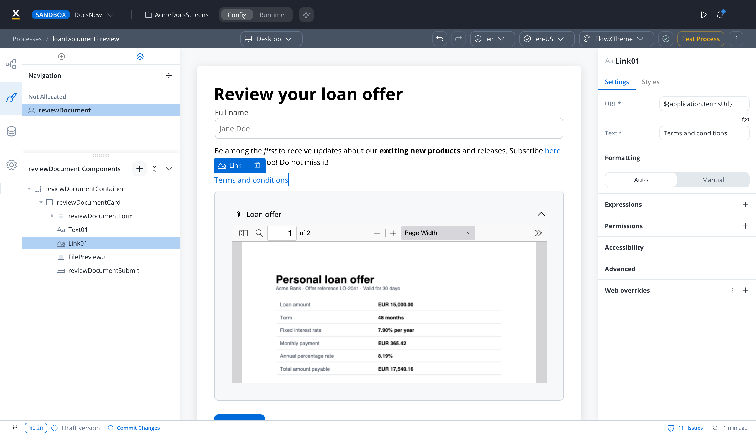
* **URL**: The destination URL for the link. This property supports:
* Static URLs (e.g., `https://example.com`)
* Dynamic keys for dynamic URL construction (e.g., `${application.externalUrl}`)
* Combination of static text and dynamic values (e.g., `https://example.com/${application.userId}/profile`)
> [!NOTE]
>
> The Link component supports dynamic keys in the URL property across all platforms (Web, iOS, and Android). This allows you to dynamically construct URLs using process data stored in the datastore.
>
> 
#### Using dynamic keys in URL
You can reference process data in your link URLs by using the `${key}` syntax:
**Example:**
If you have process data like:
```json theme={"dark"}
{
"application": {
"documentId": "12345",
"userId": "user-abc"
}
}
```
You can create a link with:
* URL: `https://docs.example.com/view/${application.documentId}`
* Text: View Document
When rendered, this will create a link to `https://docs.example.com/view/12345`.
#### Link behavior
* On web, links always open in a new browser tab.
* Link font and color come from the theme. To change them for one link, use the **Text** and **Color** style overrides.
* Links maintain accessibility standards with proper hover and focus states
### Link styling
The Link element supports styling customization similar to the Text element:
#### Typography
The **Typography** section holds only **Align**. Font and color come from the theme's Link settings, which define a font and a color with no separate hover state. To change them for one link, use the style overrides: **Text**, **Color**, **Background Color**, **Border Color**, **Border Width**, and **Border Radius**.
#### Spacing
Adjust the spacing around your link element using margin properties.
## Related topics
- [Radio](https://docs.flowx.ai/6.x/docs/building-blocks/ui-designer/ui-component-types/form-elements/radio-form-field.md)
- [Checkbox](https://docs.flowx.ai/6.x/docs/building-blocks/ui-designer/ui-component-types/form-elements/checkbox-form-field.md)
- [Markdown](https://docs.flowx.ai/6.x/docs/building-blocks/ui-designer/ui-component-types/markdown.md)
- [Single Select](https://docs.flowx.ai/6.x/docs/building-blocks/ui-designer/ui-component-types/form-elements/select-form-field.md)
- [Input field](https://docs.flowx.ai/6.x/docs/building-blocks/ui-designer/ui-component-types/form-elements/input-form-field.md)
This documentation is built and hosted on [Mintlify](https://mintlify.com), a developer documentation platform.