

Configuring a File preview element
A File Preview element can be configured for both mobile and web applications.File preview properties (web)
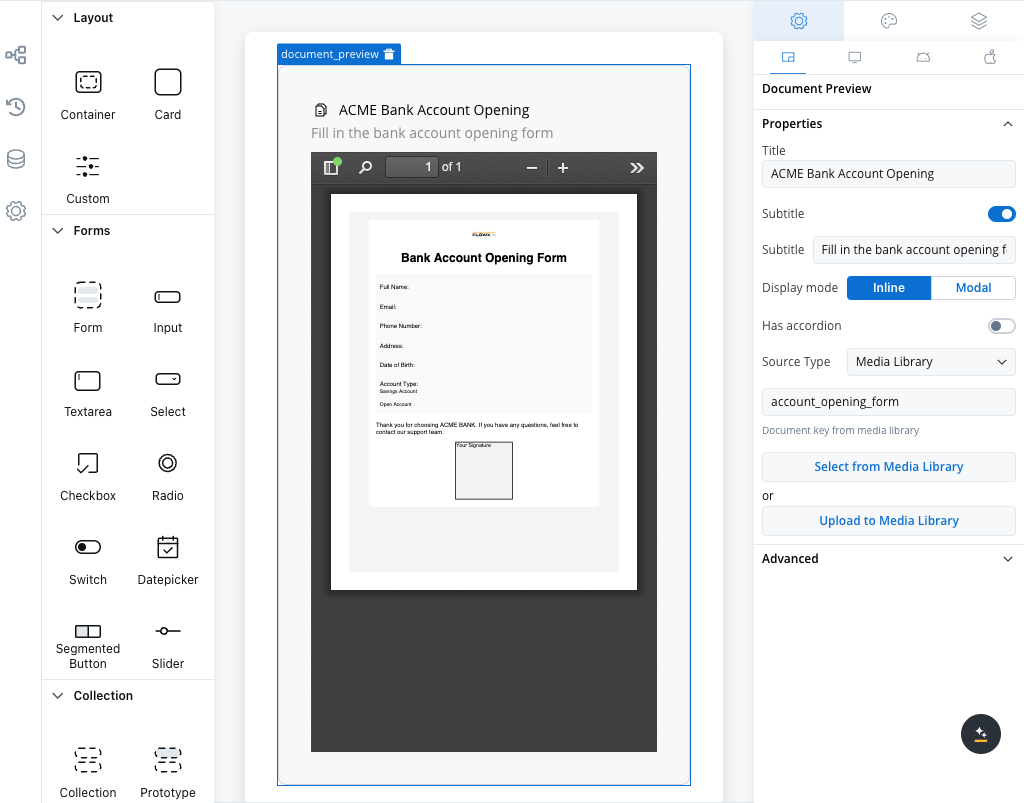
- Title: Specifies the title of the element. If the file is downloaded or shared, the file name should serve as the title used in the preview component.
- Subtitle: Allows for the inclusion of a subtitle for the element.
- Display mode: Depending on the selected display method, the following properties are available:
-
Inline → Has accordion:
false: Displays the preview inline without an expand/collapse option.true(Default View: Collapsed): Displays the preview inline with an expand/collapse option, initially collapsed.true(Default View: Expanded): Displays the preview inline with an expand/collapse option, initially expanded.
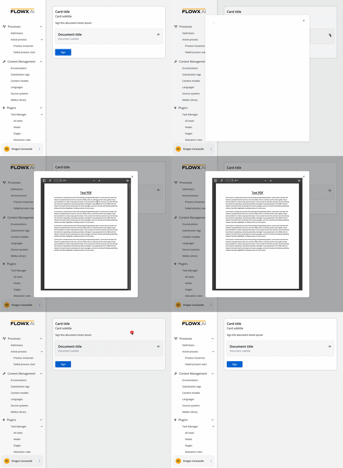
- Modal → view icon is enabled
-
Inline → Has accordion:
- Has accordion: Introduces a Bootstrap accordion, facilitating the organization of content within collapsible items. It ensures that only one collapsed item is displayed at a time.
- Source Type:
- Media Library: Refers to PDF documents uploaded in the Media Library.
PDF documents uploaded to the Media Library must adhere to a maximum file size limit of 10 MB.
- Process Data: Identifies the key location within the process where the document is sourced, establishing the linkage between the document and process data. The value at that key is used as-is, so it must be a complete, absolute URL. The renderer attaches the user’s access token only when the URL ends in
download. To preview a file uploaded through the Documents plugin, see Preview an uploaded file. - Static: Denotes the document’s URL, serving as a fixed reference point.
File preview properties (mobile)
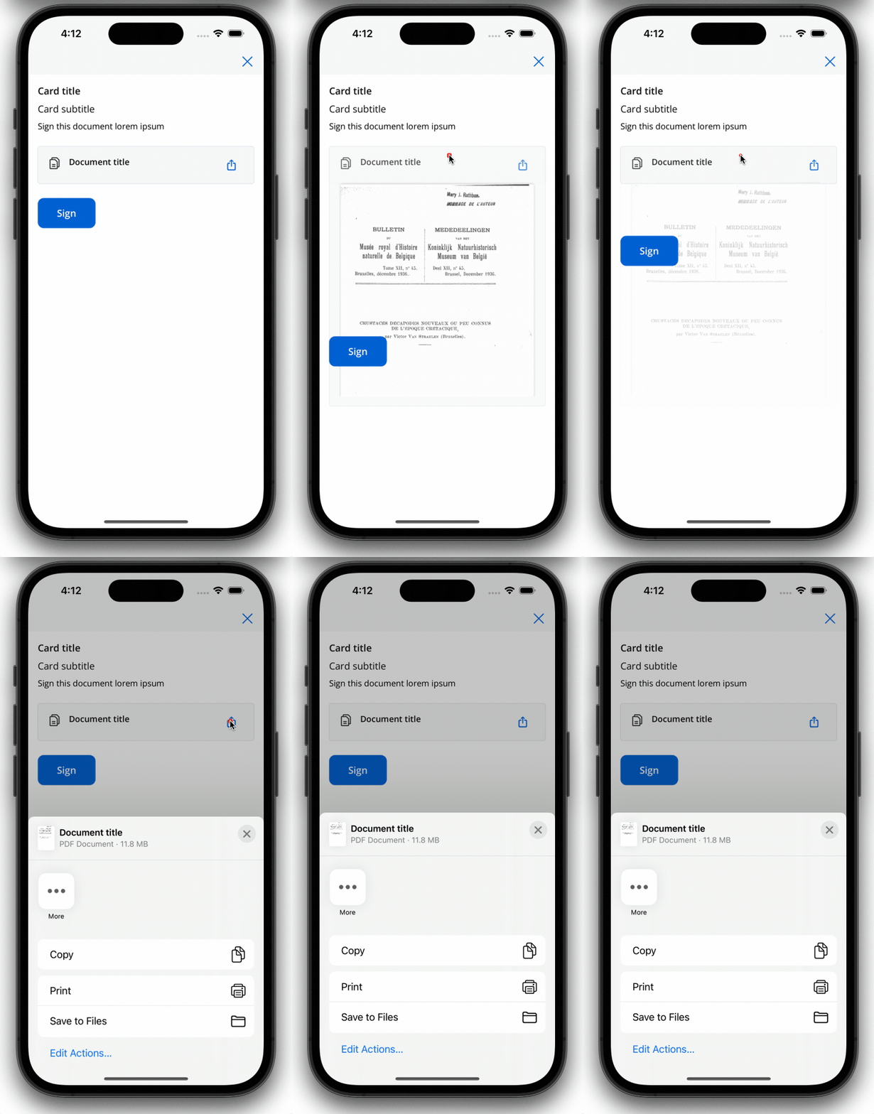
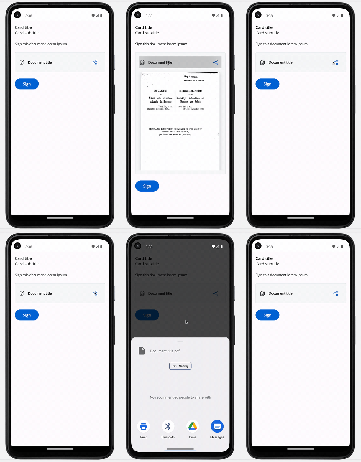
Both iOS and Android devices support the share button.
iOS
Android
File preview styling
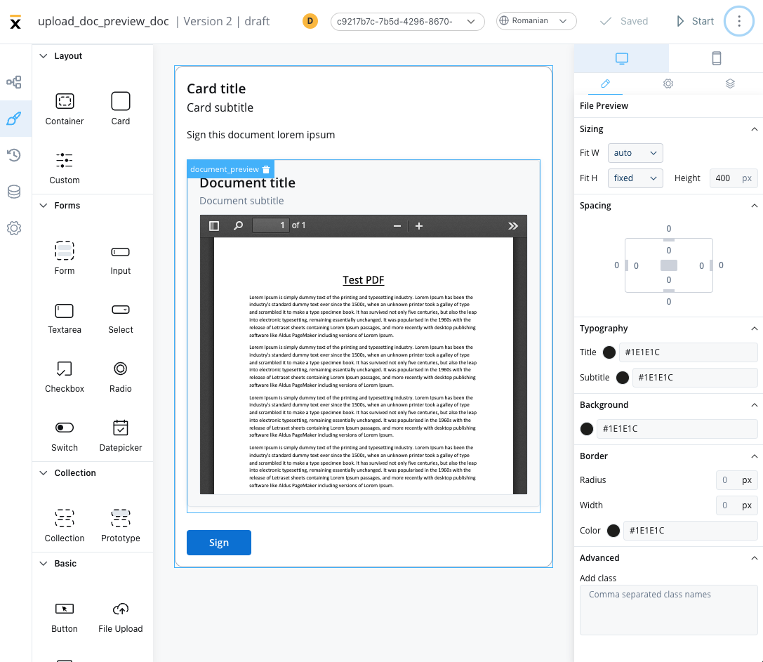
The File Preview styling property enables you to customize the appearance of the element by adding valid CSS properties. For more information, see the styling documentation. When drag and drop a File Preview element in UI Designer, it comes with the following default styling properties:Sizing
- Fit W - auto
- Fit H - fixed / Height - 400 px
File Preview example
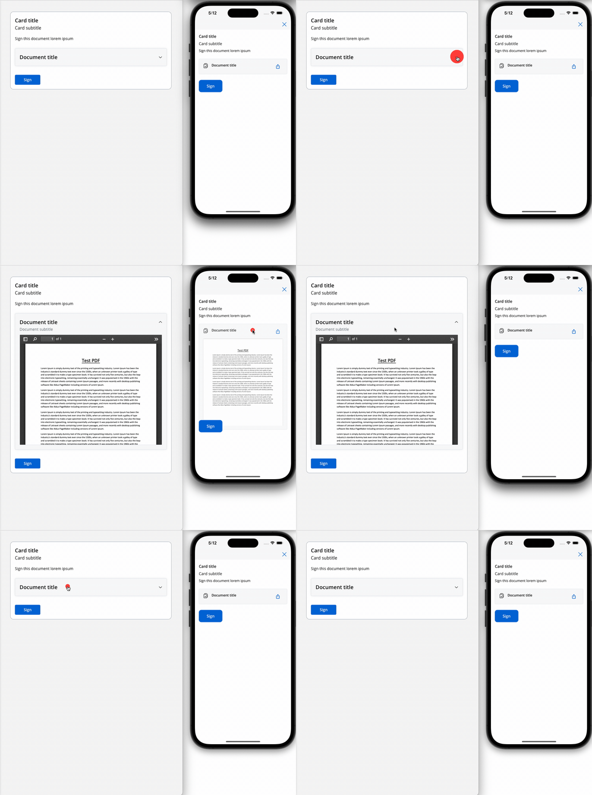
Below is an example of a File Preview UI element with the following properties:- Display mode - Inline
- Has accordion - True
- Default view - Expanded
- Source Type - Static
Preview an uploaded file
When a user uploads a file with a File Upload component, the Documents plugin stores it and replies on its persist reply topic. The reply doesn’t contain a URL that File Preview can load directly:downloadPathis relative, for exampleinternal/files/{fileId}/download.filePathis the object path in file storage (MinIO or S3), not a URL.
1
Receive the upload reply
Configure the upload as described in Creating and uploading a new document. On the node that receives the reply, add the persist reply topic under Data stream topics, with a key, for example
uploadedDocument.2
Build the absolute URL
Add a business rule that prefixes The example uses MVEL.
downloadPath with the Documents plugin base URL and stores the result under a new key:{your-flowx-api-host} is the host that serves the FlowX APIs to your renderer. The Documents plugin is exposed on it under /document, as configured in the Designer ingress routing for plugins.3
Bind File Preview to the URL
On the user task that shows the file, set the File Preview Source Type to Process Data and the key to
preview.filePath.