Documentation Index
Fetch the complete documentation index at: https://docs.flowx.ai/llms.txt
Use this file to discover all available pages before exploring further.
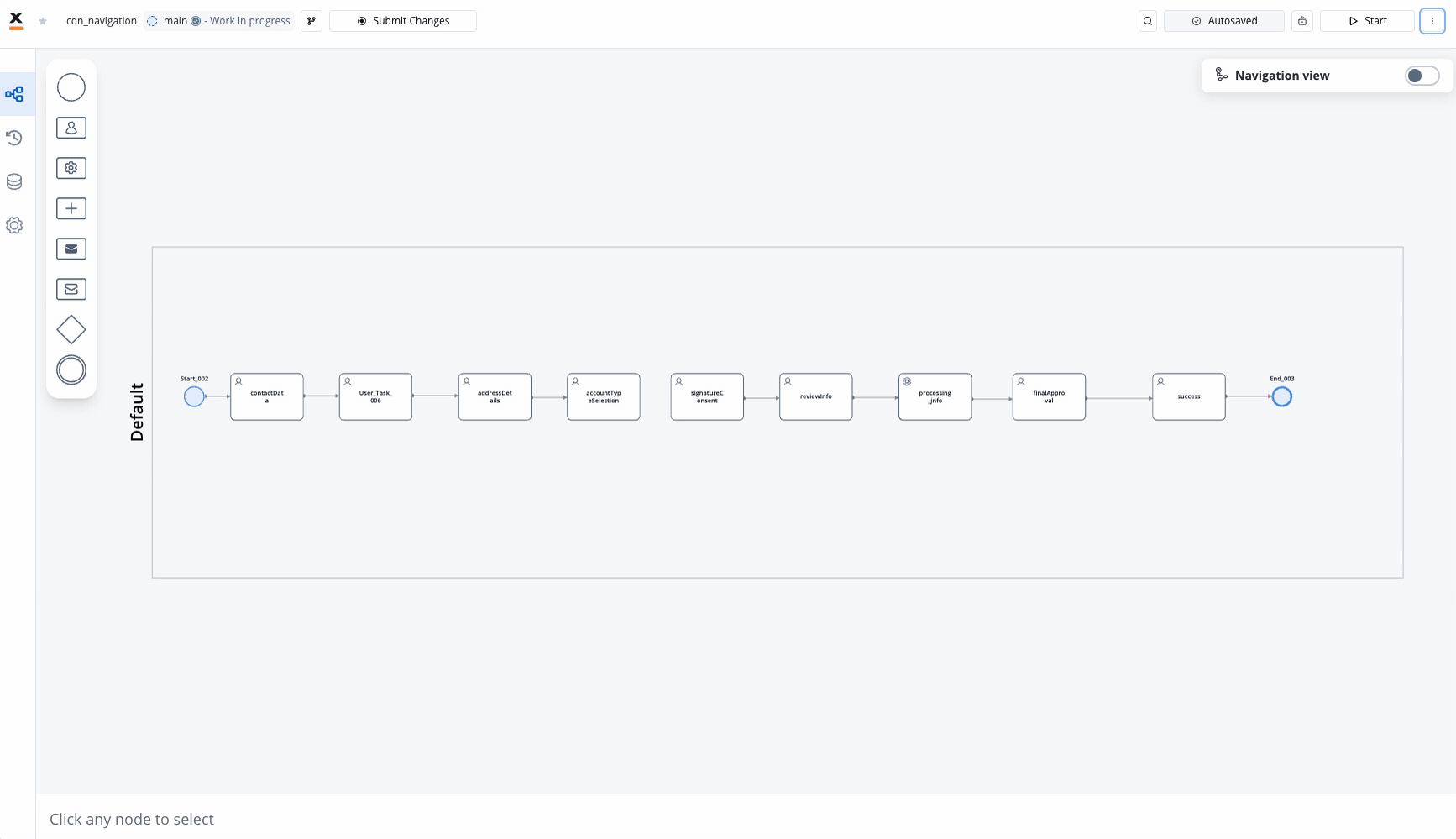
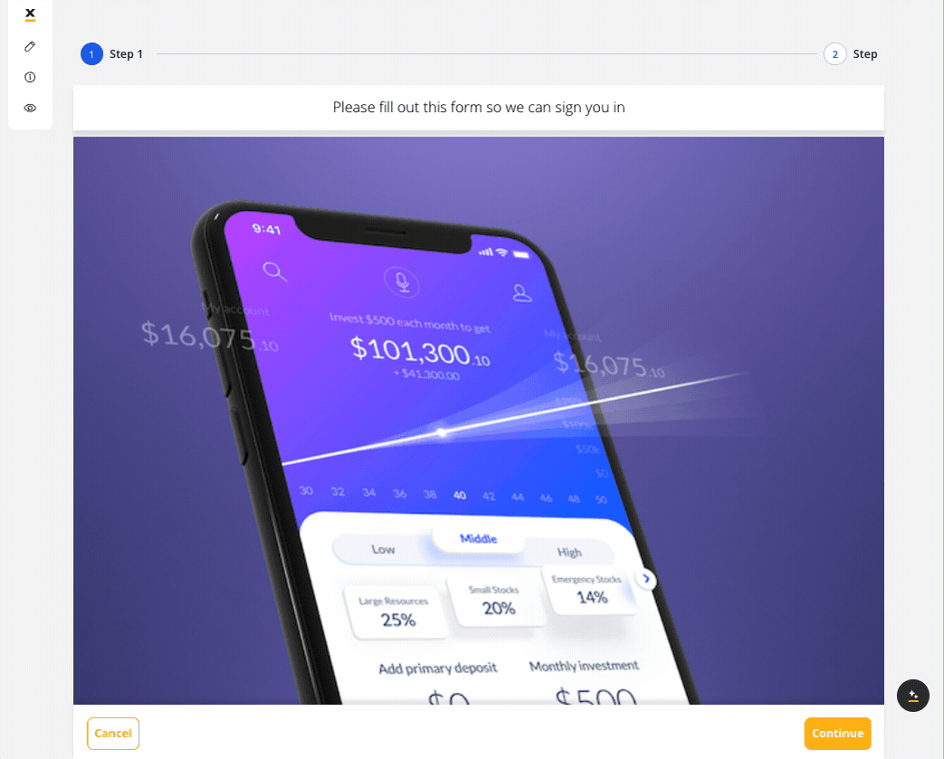
Stepper
Sequential workflow navigation with progress tracking. Maximum 2 levels supported.
Tab Bar
Multi-section navigation. Must be root component on mobile platforms.
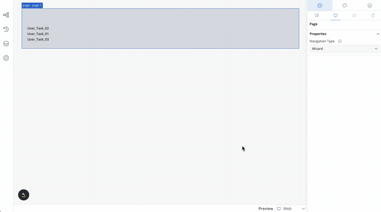
Page
Full-screen content display with wizard or single-page form options.
Modal
Temporary overlay for focused tasks. Use sparingly on mobile.
Zone
Layout container with headers/footers. Web-only feature.
Parent Process Area
Subprocess hierarchy management and design organization.
In the navigation panel, the navigation hierarchy should be displayed beneath platform tabs, which include options for both web and mobile platforms. The default tab selected upon opening should be the web platform.
User task requirements
Platform-specific capabilities
Web platform capabilities
- Zone: Used for organizing parts of screen with headers and footers
- Zone/Page: Supports wizard navigation and single-page form layouts
- Tab Bar: Optional placement and full navigation hierarchy support
- Stepper: Maximum 2 levels supported
- Modal: Full functionality with flexible usage patterns
- Parent Process Area: Complete subprocess design support
Mobile platform capabilities
- Tab Bar: Must be positioned as first root navigation to define the entire application navigation structure
- Stepper: Maximum 2 levels supported
- Modal: Limited usage recommended (see recommendations below)
- Parent Process Area: Basic subprocess design support
- Zone: Not supported
- Page: Basic functionality only
- 1 User Task = 1 screen: Mobile renders each User Task as its own screen. A multi-UT flow means multiple screens, one per task
Platform support matrix
| Navigation Area | Web | Mobile | Platform-specific notes |
|---|---|---|---|
| Zone | ✅ | ❌ | Web only - used for organizing parts of screen |
| Tab Bar | ✅ | ✅ | Mobile: must be first root navigation for entire app structure |
| Page | ✅ | ✅ | Web: wizard navigation/single-page form support |
| Stepper | ✅ | ✅ | Maximum 2 levels across all platforms |
| Modal | ✅ | ✅ | Mobile: specific usage recommendations apply |
| Parent Process Area | ✅ | ✅ | Subprocess design and hierarchy management |
Getting started
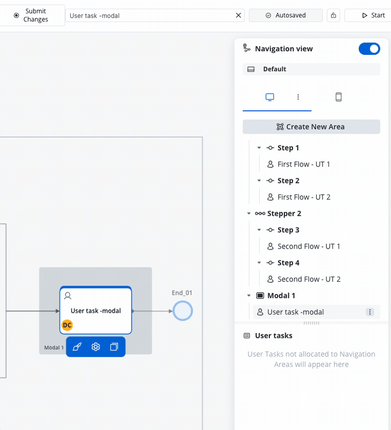
This section covers the essential tasks for working with navigation areas: creating, configuring, and managing them in FlowX.AI Designer.Creating navigation areas
To create a new navigation area, follow these steps:Access FlowX.AI Designer
Open FlowX.AI Designer and either open an existing process definition or create a new one.
Managing navigation areas
Once you’ve created a navigation area, you can manage it through the breadcrumbs menu, which provides these options:Area settings
Area settings

- Name - a name for the navigation area element that is visible in the Navigation menu
This does not represent the label for your navigation area (for example, for a step element) that would be visible in the process at runtime. To set the label for your element, use the UI Designer to edit it.
To do that, trigger the Navigation View menu, then navigate to your element and click on the breadcrumbs. Afterward, click “UI Designer.”
- Alternative Flows - There might be cases when you want to include or exclude process nodes based on some information that is available as a start condition.
UI Designer
UI Designer
- Settings:
- Generic: Properties available cross-platform (Web, Android and iOS), available for all platforms
- Platform-specific configuration and styling: For components across Web, iOS, and Android.
Copy/Paste
Copy/Paste
Delete an area
Delete an area
- Access the Navigation view menu within the FlowX.AI Designer.
- Choose the intended navigation area, then click on the breadcrumbs menu located on the right.
- Select Delete Area.
Navigation area types
Choose the right navigation area type based on your user interface needs and platform requirements.Quick reference
| Type | Use Case | Web Support | Mobile Support | Key Features |
|---|---|---|---|---|
| Stepper | Sequential workflows | ✅ | ✅ | Progress tracking, 2-level max |
| Tab Bar | Section switching | ✅ | ✅ (root only) | Parallel content access |
| Page | Full-screen content | ✅ | ✅ | Wizard/single-page modes |
| Modal | Focused tasks | ✅ | ✅ | Temporary overlays |
| Zone | Layout structure | ✅ | ❌ | Headers/footers (web only) |
| Parent Process | Subprocess design | ✅ | ✅ | Hierarchy management |
Available navigation types
You can create the following types of navigation areas:
Stepper
Sequential workflow navigation that breaks down complex processes into logical, numbered steps.
- Progress tracking with visual indicators
- Return to previously visited steps
- Maximum 2 levels of nesting supported
Stepper Recommendation: FlowX supports a maximum of 2 levels of stepper navigation across all platforms. Design your processes with this limit in mind to avoid navigation complexity. If you need more levels, consider breaking complex flows into separate processes.
If you need more levels, consider breaking complex flows into separate processes.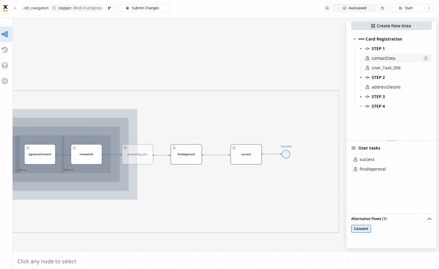
Stepper in step example
Steps
Steps are individual elements within a stepper, simplifying complex processes.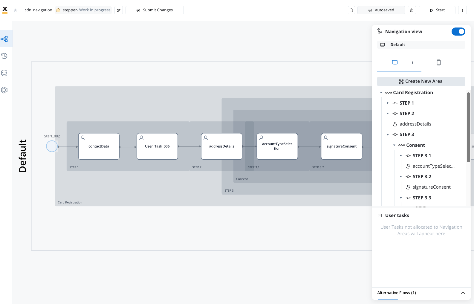
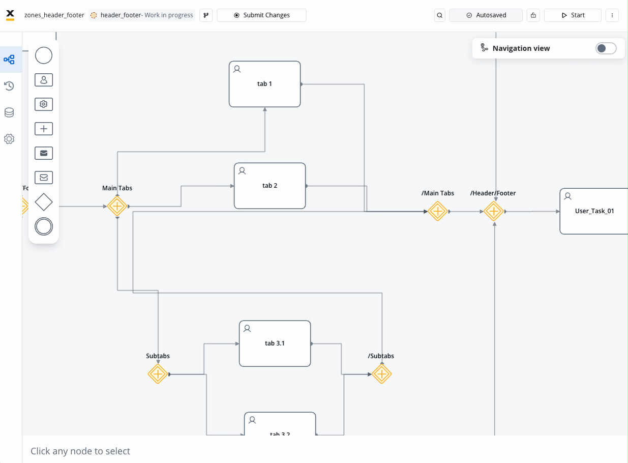
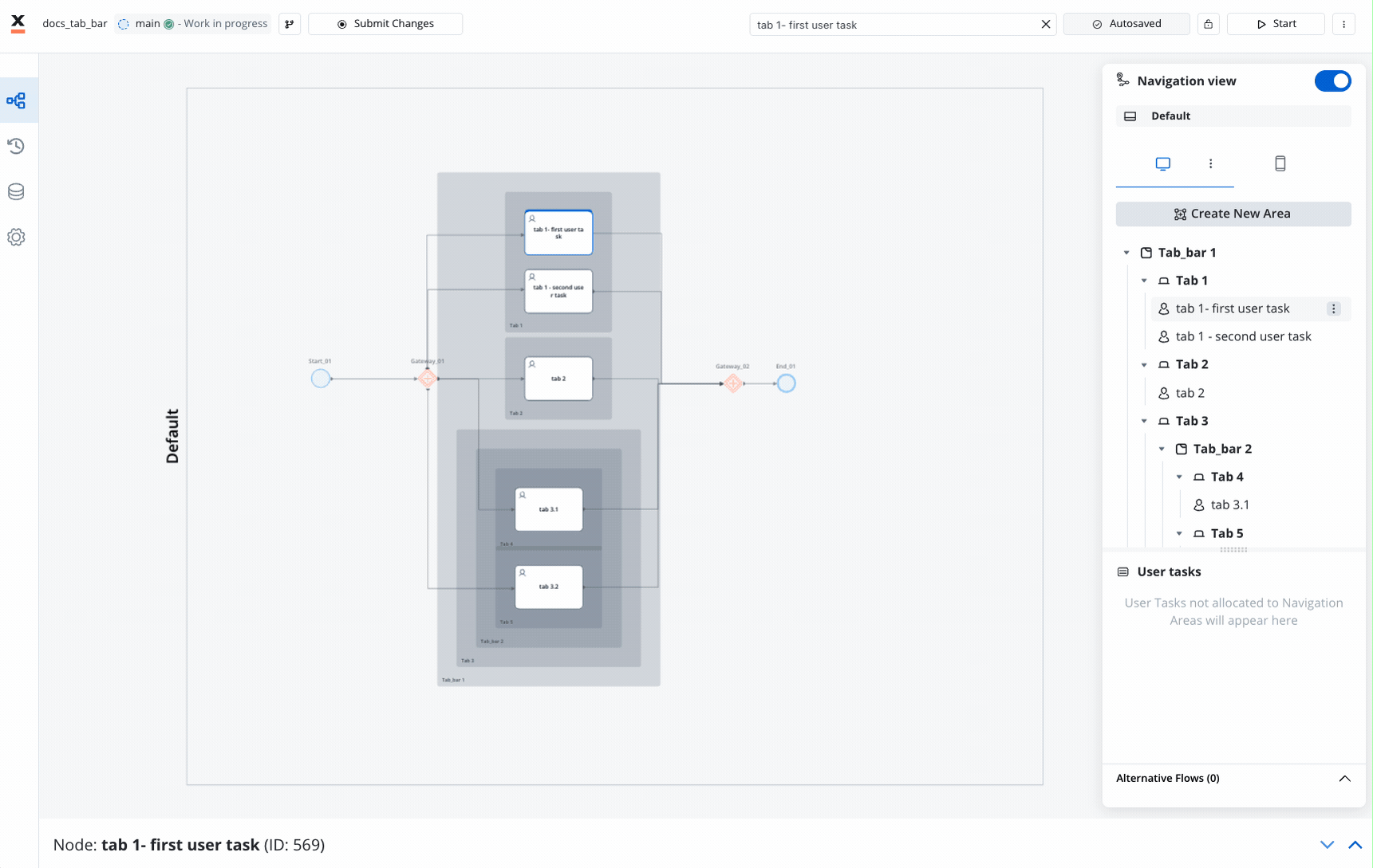
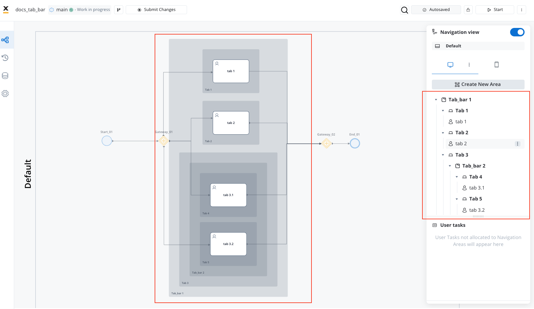
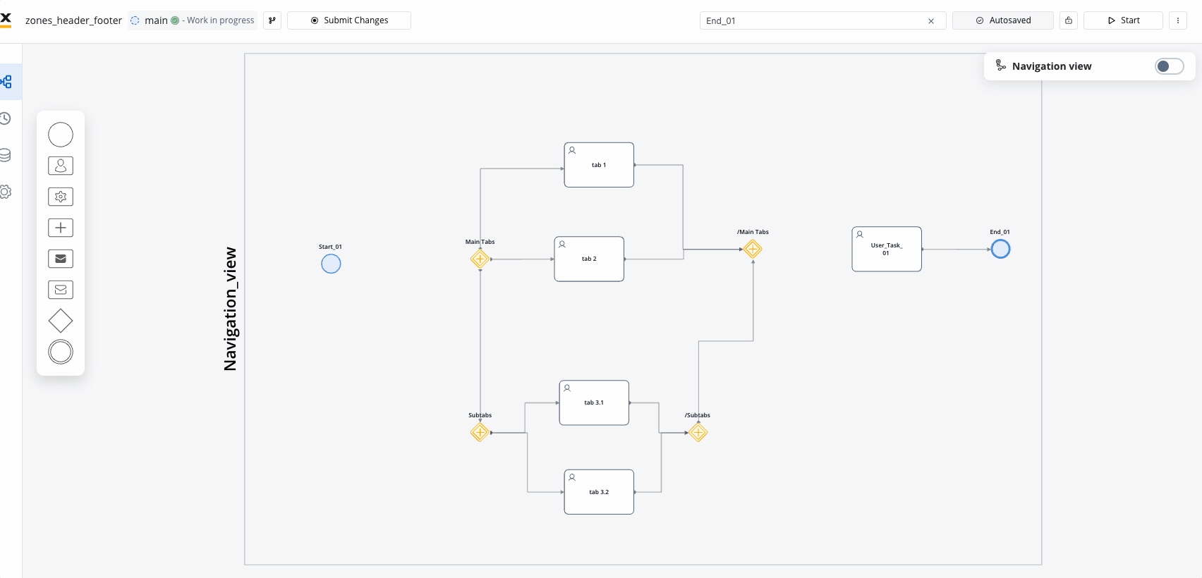
Tab Bar
Multi-section navigation component that allows users to switch between different areas of content.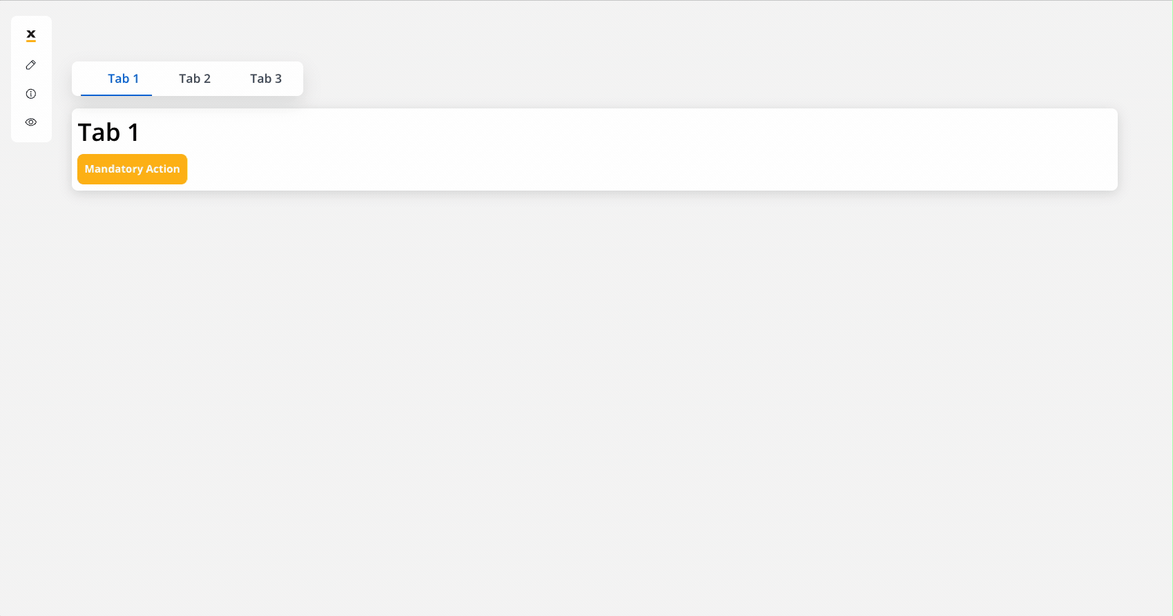
- Parallel zone support within user tasks
- Quick switching between sections
- Support for nested tab structures
Parallel Zones
The navigation Tab Bar offers specialized support for parallel zones within the same user task. This feature allows users to navigate effortlessly between different sections or functionalities.
Multiple Tabs
Access multiple tabs within the tab bar for quick switching between various views or tasks.
Mobile Requirements: On mobile devices, tab bars must be positioned as the root component in navigation and remain consistently visible, prioritizing ease of navigation.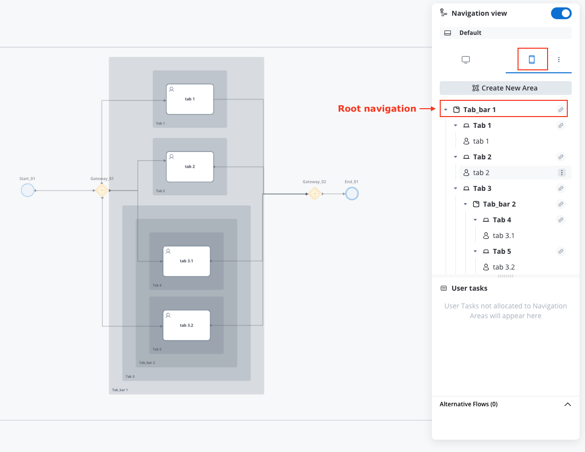
Parallel scenarios must be independent. Each parallel branch under a Tab Bar (and each Tab’s content) should be a self-contained scenario, behaving as if it were its own process with no parallel siblings. Data can propagate between branches via normal FlowX mechanisms. Navigation cross-jumps between branches are not supported by design: the SDKs instantiate each branch with its own navigation scope, but there is no runtime firewall preventing cross-branch state leakage. Treat parallel branches as independent scenarios. See Process design principles for the full set of rules.
What a Tab can contain on mobile. Tabs can hold User Tasks and Modals. They cannot hold Pages, nested Tab Bars, or Zones. Keeping the hierarchy flat is intentional: the mobile renderer relies on the Tab Bar being the consistent root.
Tabs
Tabs are clickable navigation elements within the Tab Bar that allow users to switch between different sections or functionalities within an application.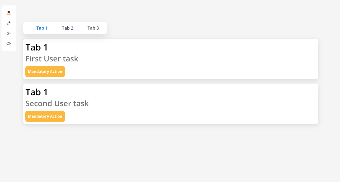
You can also use Start embedded subprocess nodes to render defined subprocesses as a tab. Check the Start embedded subprocess for more details.
Tab bars inside tabs
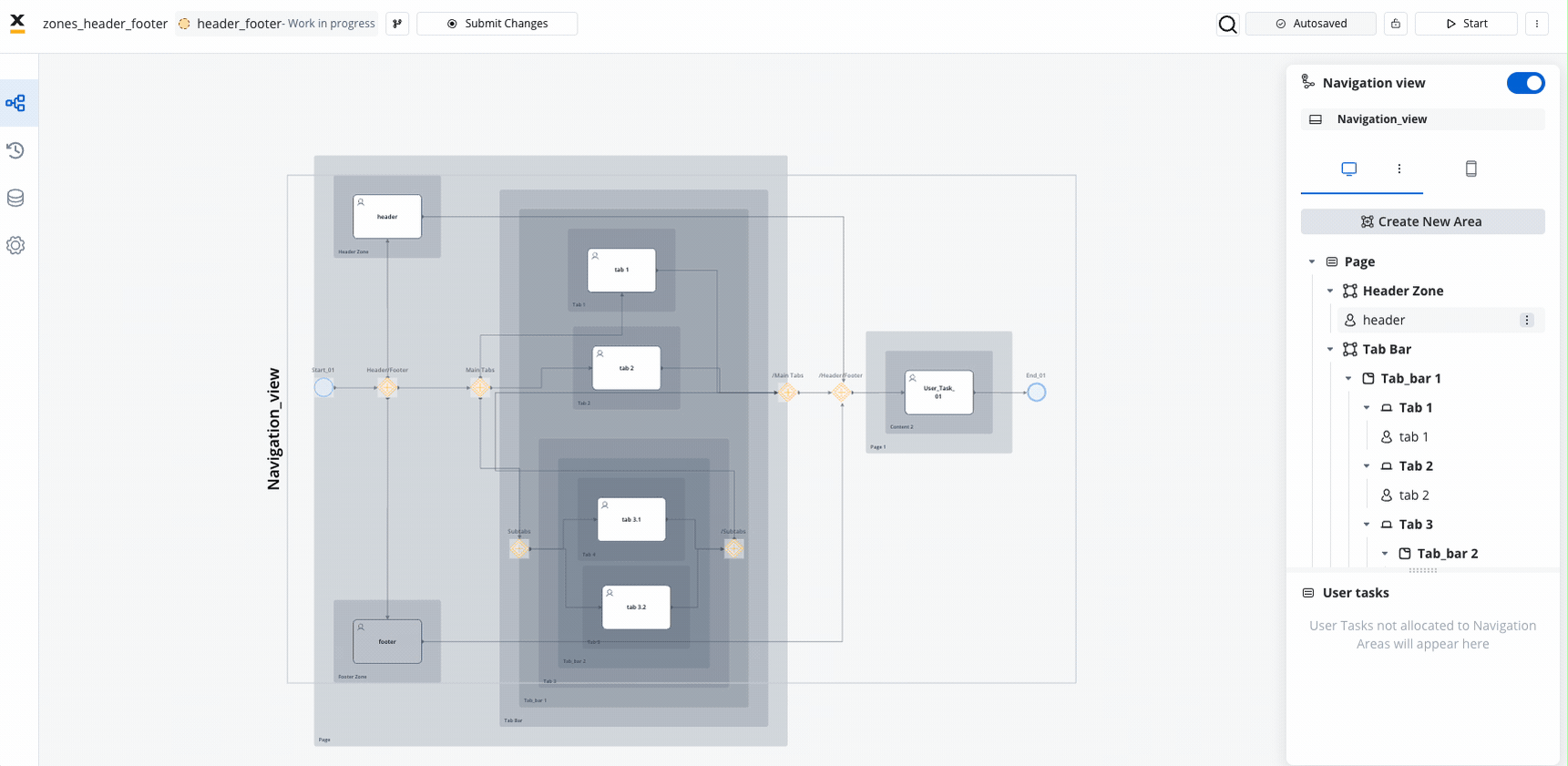
In addition to regular tab bars, you have the option to implement nested tab bars, allowing for the display of another set of tabs when accessing a specific tab.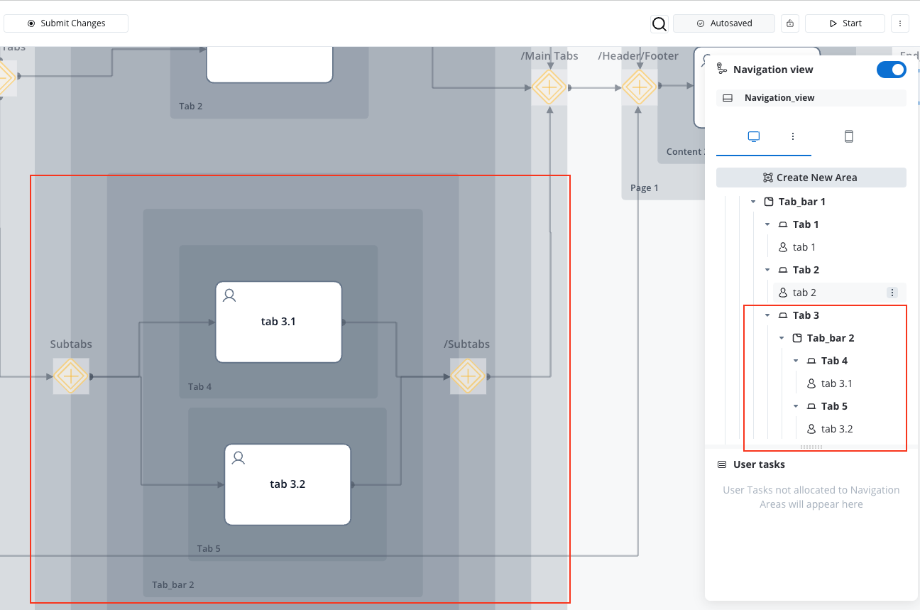
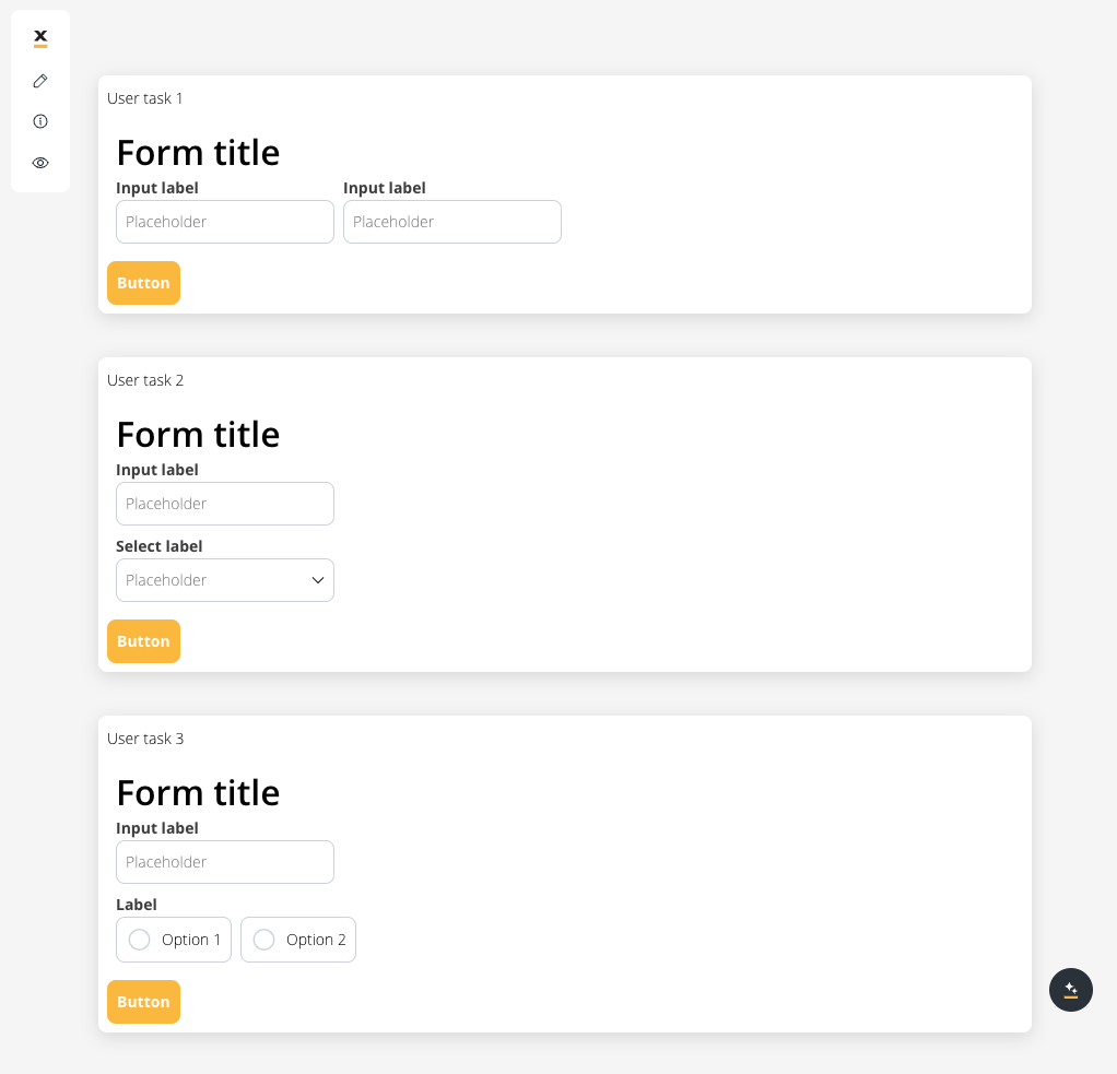
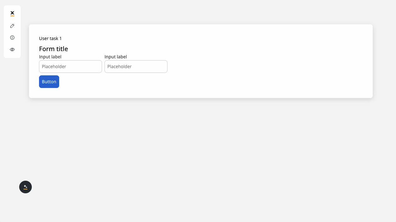
Page
Full-screen content display that can contain multiple user tasks in parallel or sequential presentation.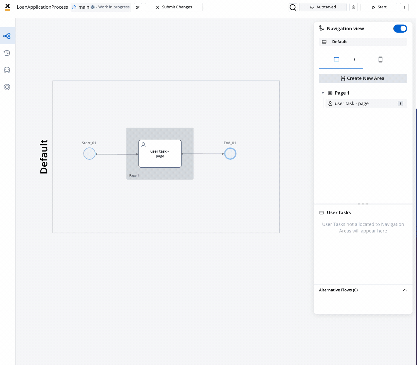
Navigation type (only for Web)
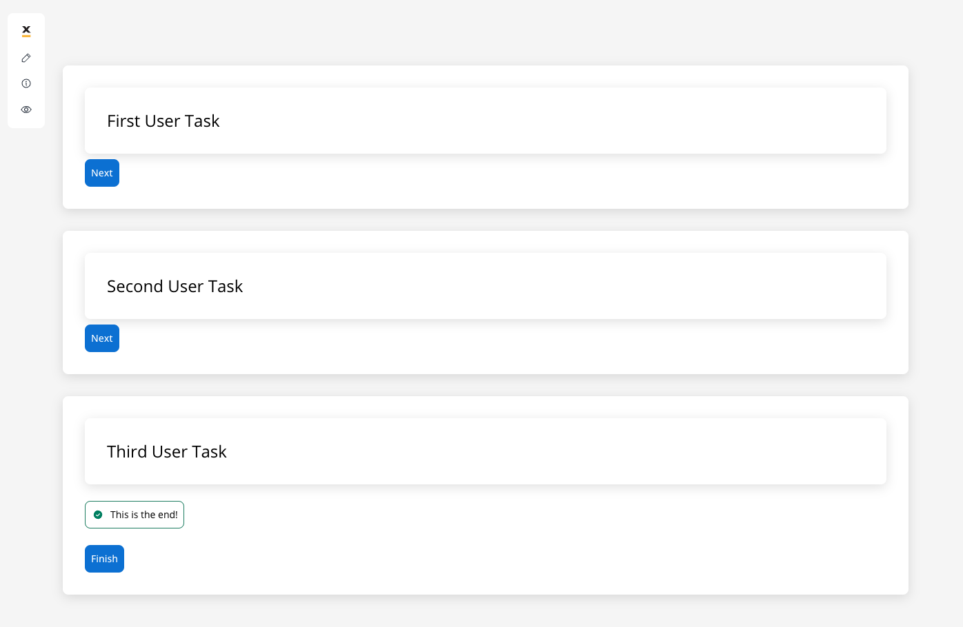
You have the possibility to add step-by-step or wizard-style navigation within a page (applicable when a page contains more than one User Task). This means you can navigate through the app in a guided manner, accessing each step within the designated area and page.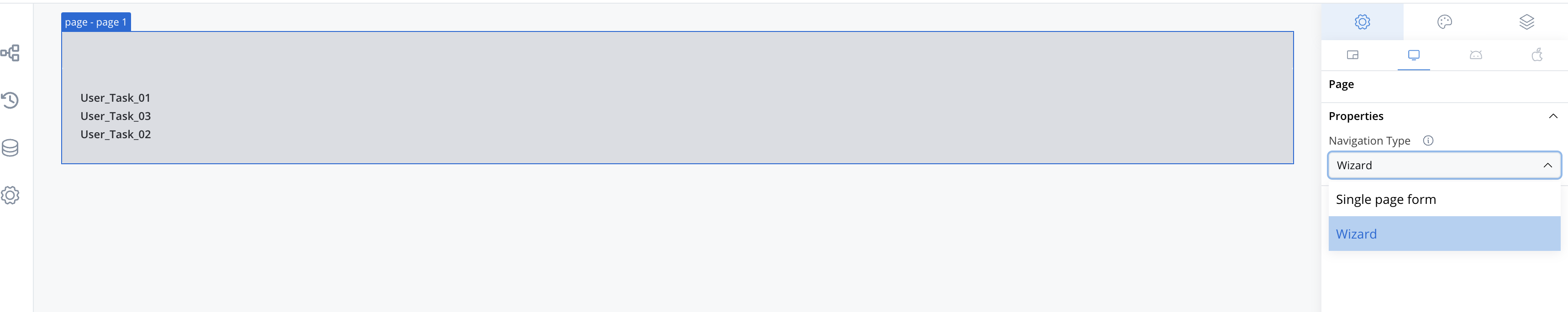
- Single page form (default): The Web Renderer displays all User Tasks within the same page (in parallel).
For optimal navigation, we suggest utilizing cards to guide users through the content.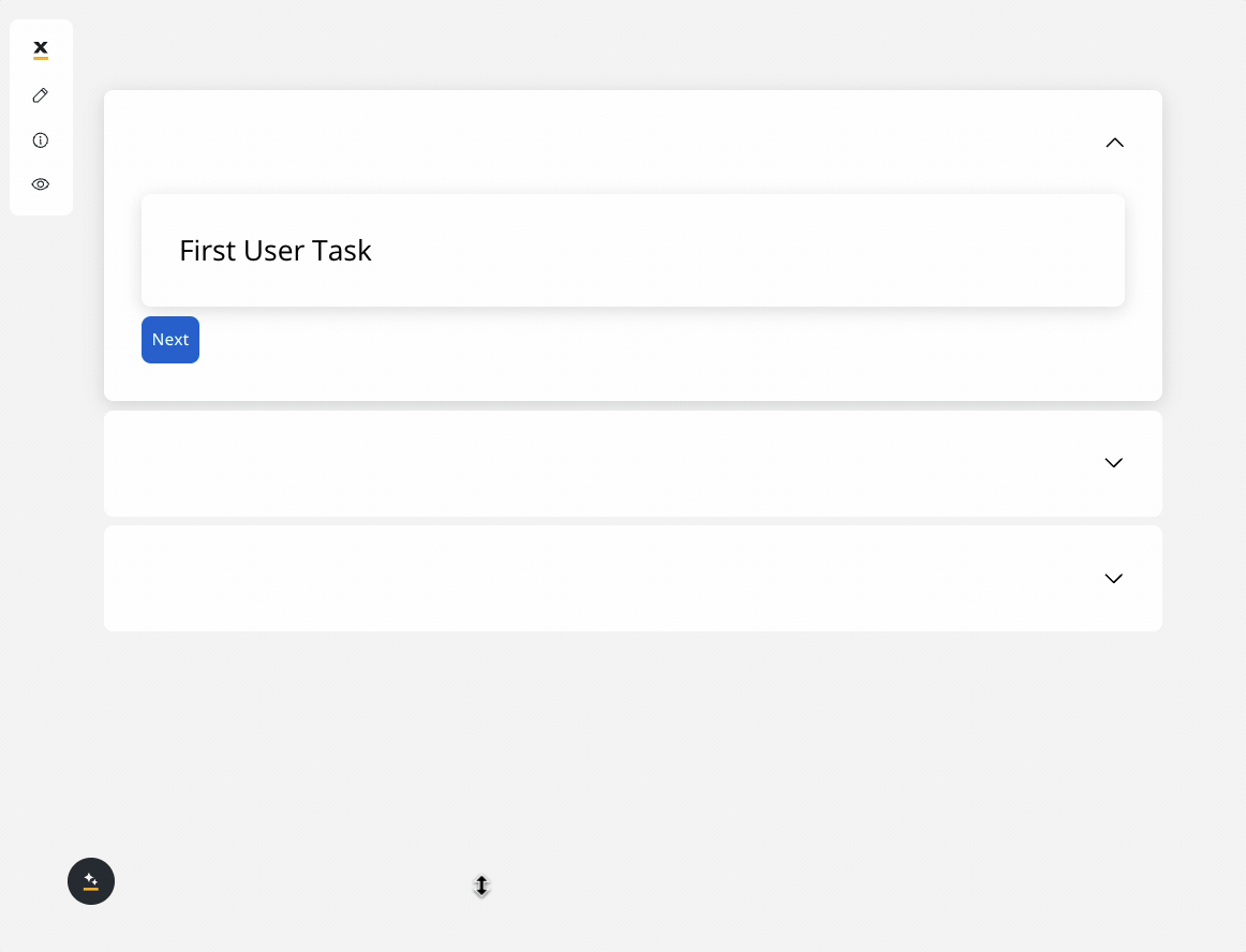
To maintain a clean UI while displaying user tasks on a single page, use cards as the root UI elements and apply accordions to them. This allows you to collapse each card after it is validated by an action.
Child areas will be rendered on the same page.
- Wizard: For the Wizard option, the Web Renderer will display one user task at a time, allowing navigation using custom Next and Back buttons.
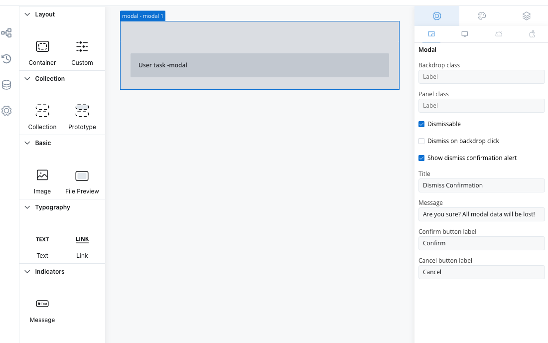
Modal
Temporary overlay that interrupts the main flow to present focused tasks or information.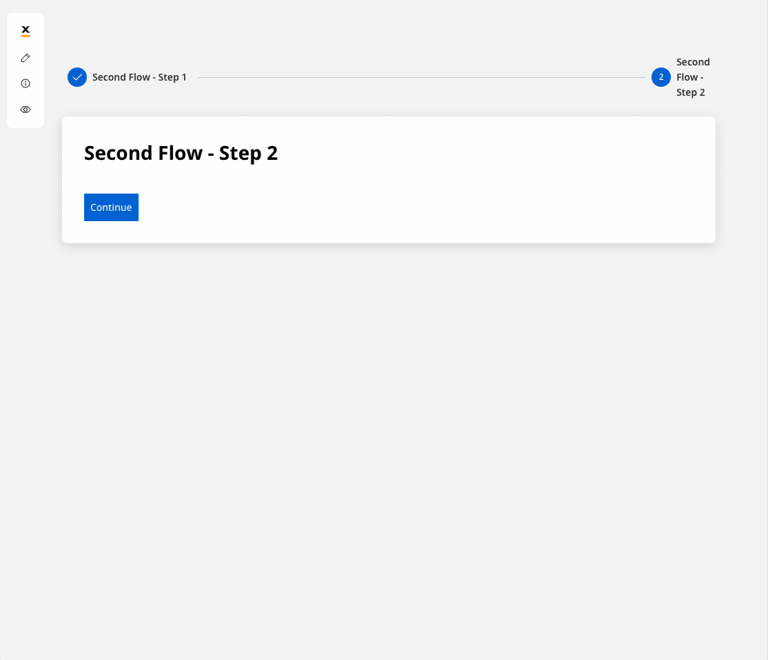
- Dismiss on backdrop click
- Display dismiss confirmation alert
- Navigate to your configured modal and access the UI Designer.
- In the UI Designer navigation panel, select the Settings tab, then choose Generic.
-
Check the box labeled “dismissable.” If you also want to display a dismiss confirmation alert, configure the:
- Title
- Message
- Confirm button label
- Cancel button label
Modal title or header. The Modal navigation area itself has no built-in
title property. The only title field available on a Modal is the dismiss confirmation alert title (shown when a user tries to close a dismissable modal). To display a title or header inside the modal content on any platform, including mobile, place a Text or Heading UI component as the first element of the modal’s user task content.Zone
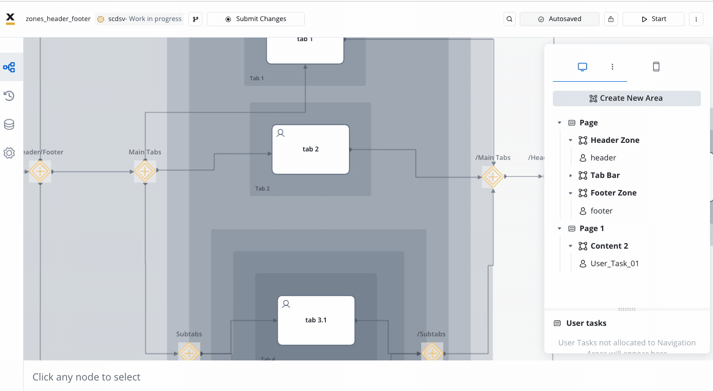
Web-only container for organizing layout with headers, footers, and structured content areas. A Zone serves as a container designed to govern UI navigation by grouping specific elements together. Its optimal application is in scenarios involving processes featuring both a header and footer.Navigation type (only for Web)
You have the possibility to add step-by-step or wizard-style navigation within a specific zone (applicable when a zone contains more than one User Task). This means you can navigate through the app in a guided manner, accessing each step within the designated area and page.- Single page form (default): The Web Renderer will display all User Tasks within the same zone.
Child areas will be rendered on the same page.
- Wizard: For the Wizard option, the Web Renderer will display one user task at a time, allowing navigation using custom Next and Back buttons.
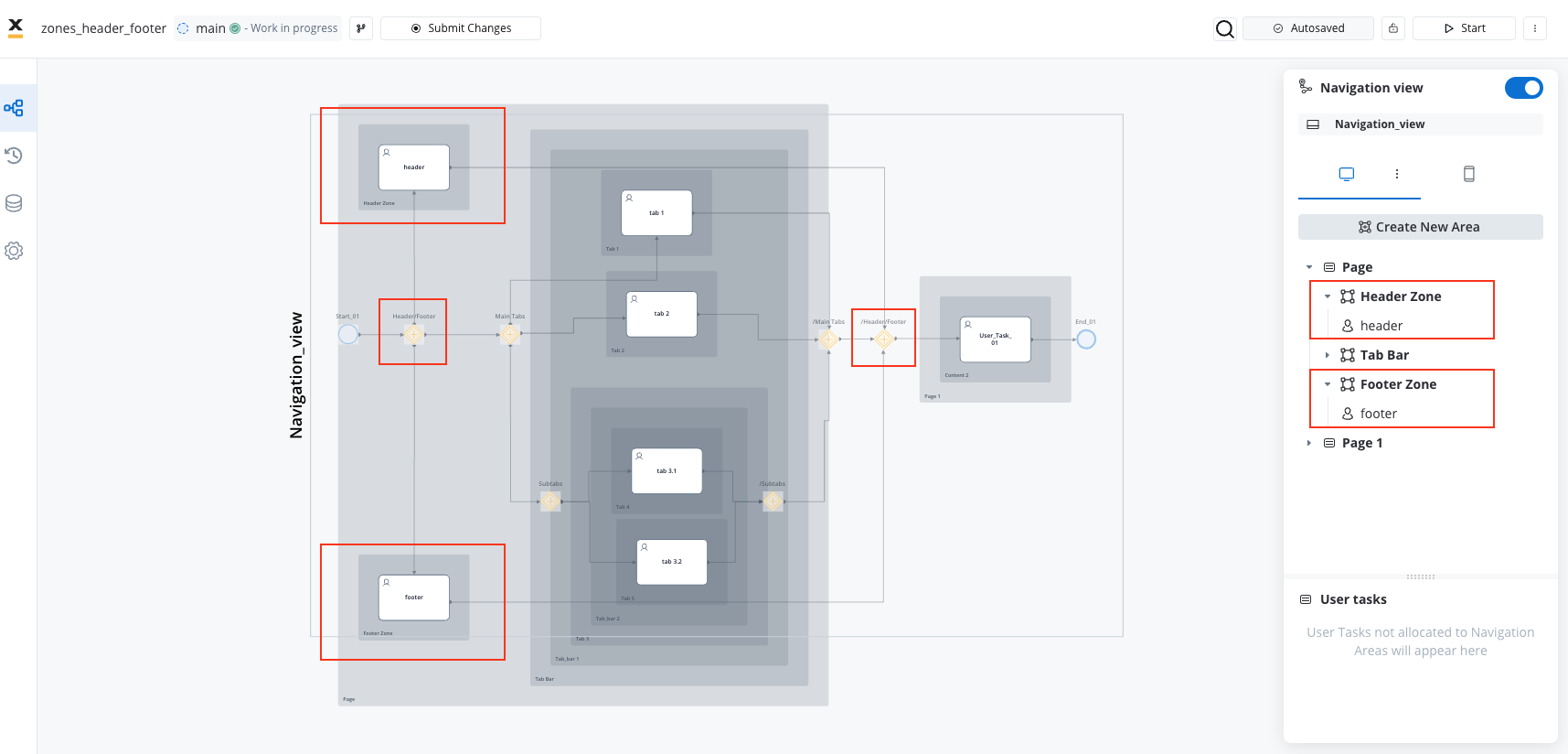
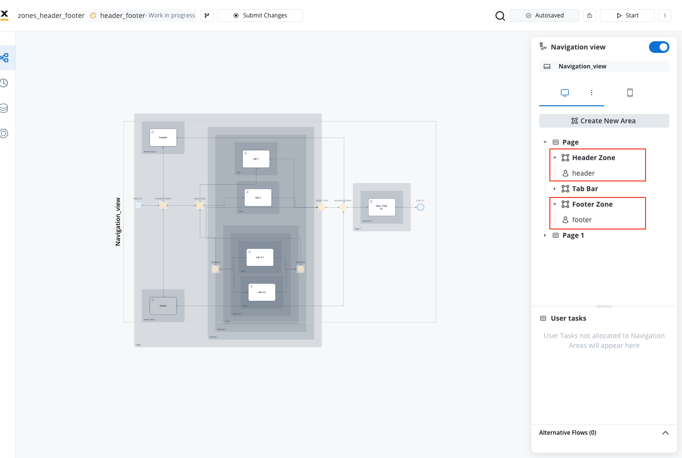
How to Create a Header/Footer Zone
To establish a header/footer zone, follow these steps:- Begin by opening a new parallel zone and ensure to close it where you want the header/footer zone to end.
- Introduce two new user tasks nodes within your process, designated to function as the header, respectively as footer.
- Connect the first parallel gateway node to both of them.
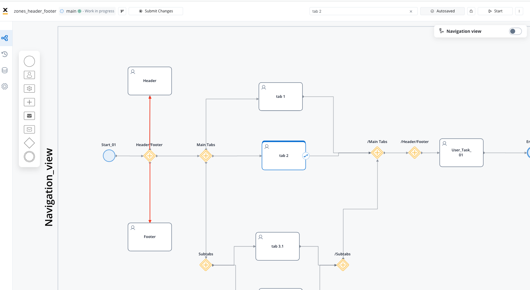
- Now connect the header and footer user tasks to the closing Parallel Gateway.
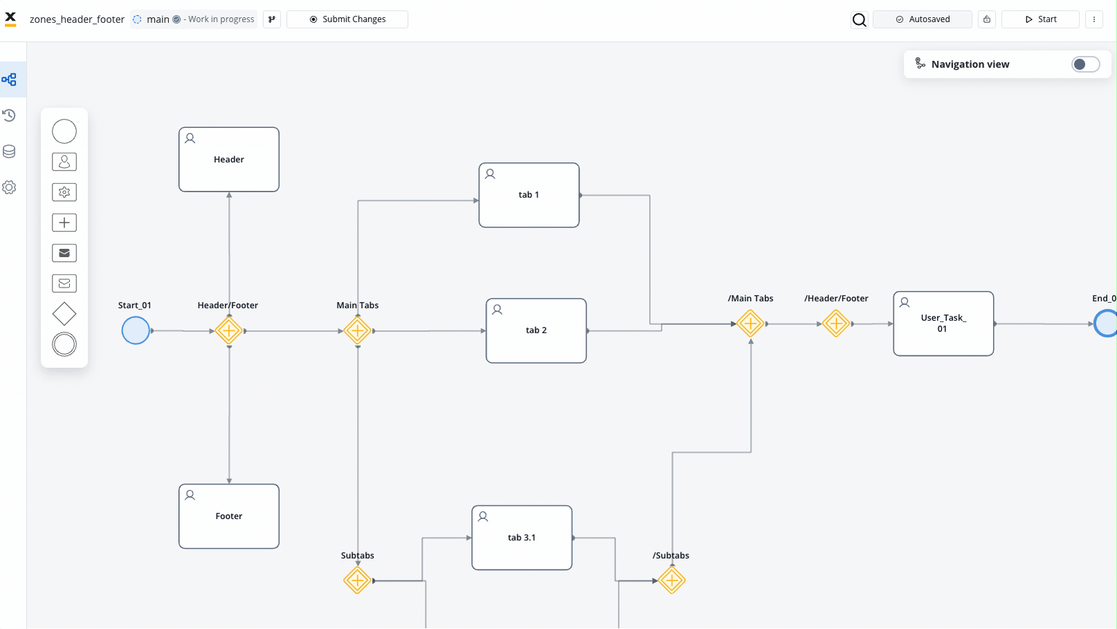
- In the navigation areas menu, incorporate a new zone labeled “Header Zone” and a new zone “Footer Zone”.
- Position the header at the top of your navigation structure or at the top within your primary navigation element and the footer at the bottom.
- Assign the user tasks to the “Header Zone” and to the “Footer Zone”.
When working with containers directly within navigation zones, you have the flexibility to set the sticky/static property directly on your specific navigation zone using the UI Designer, without having to add specific user tasks. However, determining the best practice depends on the specific use case you’re aiming to implement.
For instance, if you’re looking to incorporate footers containing actions or buttons such as “Cancel application” or “Continue,” it’s advisable to include user tasks, allowing you to configure node actions effectively.
- Proceed to customize the user tasks UI according to your preferences.
Styling options
To customize the appearance of headers and footers, you need to utilize containers as the root UI elements for user tasks or navigation areas.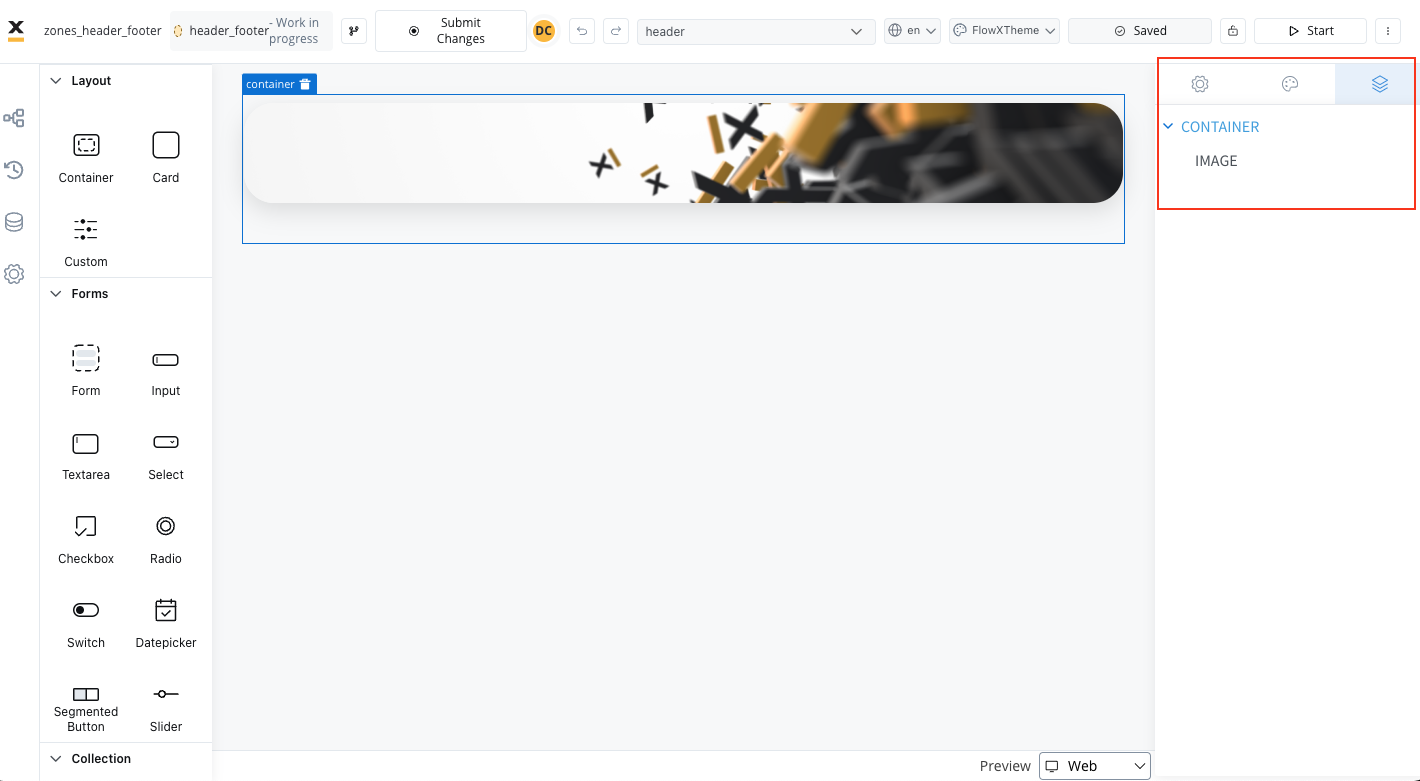
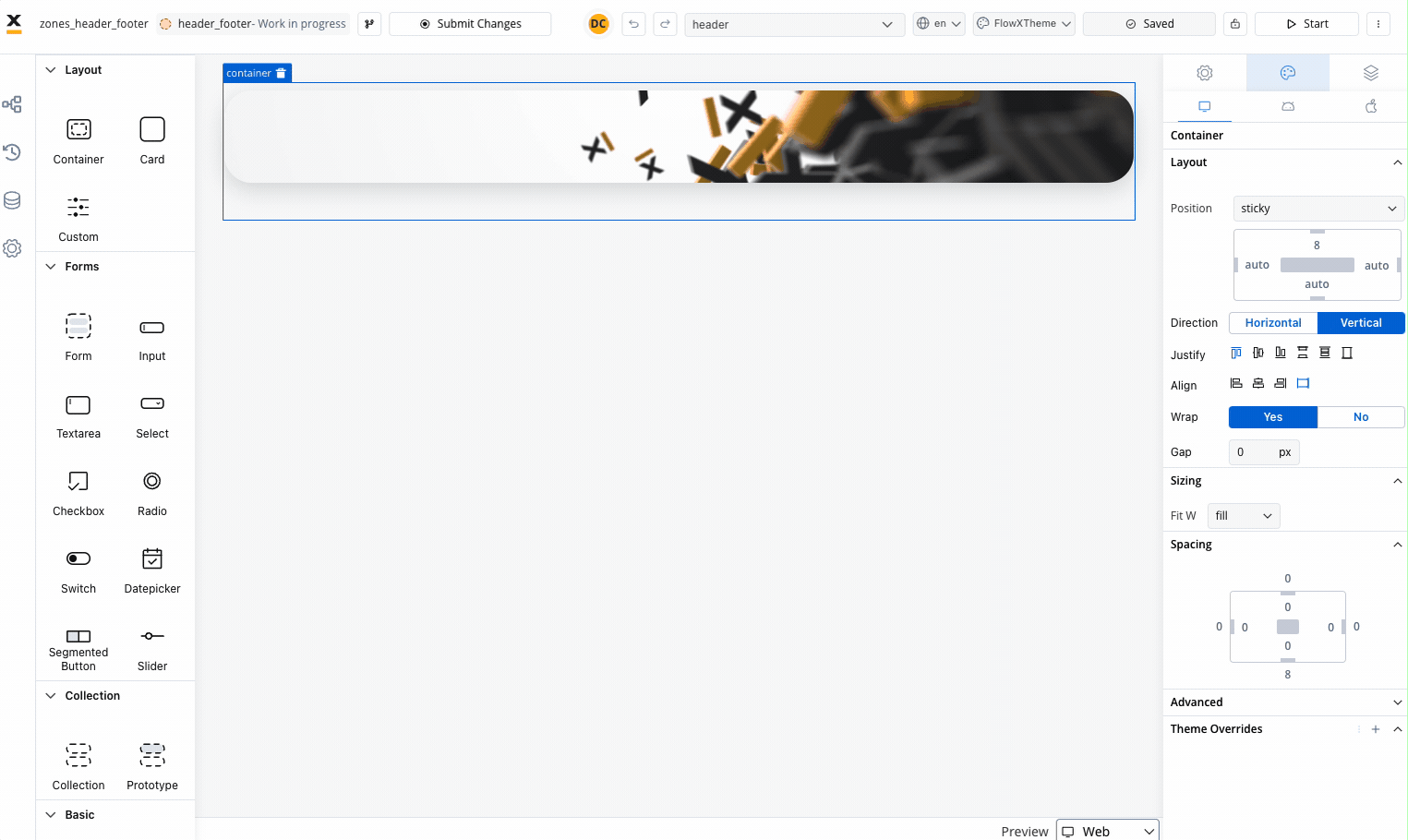
- Static: This style remains fixed and does not scroll along with the page content.
- Sticky: When the sticky property is enabled, the container maintains its position even during scrolling.
- Layout: You have the option to specify minimum distances between the container and its parent element while scrolling. At runtime, sticky containers will keep their position on scroll relative to top/ bottom/ right/ left margin of the parent element
In mobile configurations, the right and left properties for sticky layout are ignored by the mobile renderer.
Parent Process Area
Specialized container for managing subprocess design within parent process hierarchies. Use Cases:- Subprocess organization
- Hierarchy validation
- Design restriction enforcement
Warnings
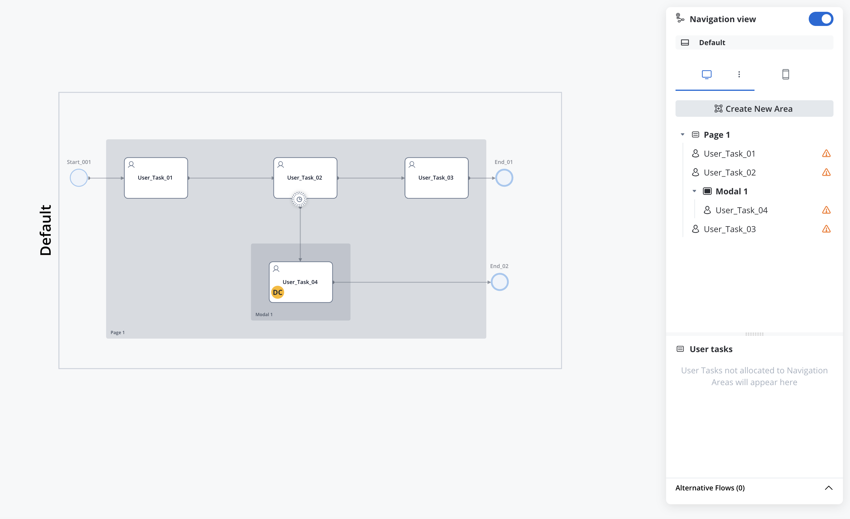
If you do not assign a user task to a navigation area, the platform will display a warning indicating that there are user tasks not included in the navigation structure (applies to all platforms).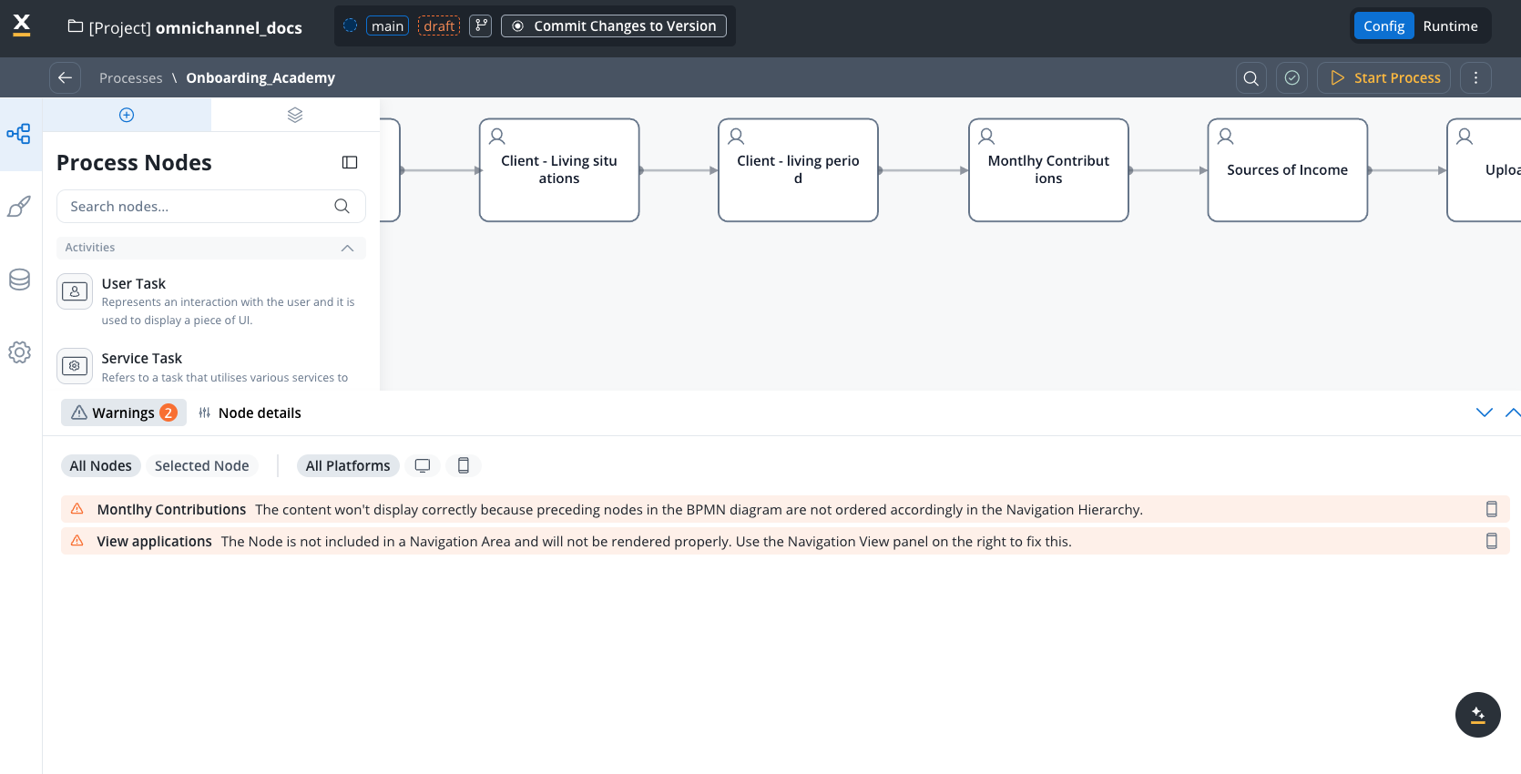
Best practices and recommendations
Navigation best practices guide
Detailed guidance on choosing between pages and modals, valid nesting combinations, common scenarios (phone verification, confirmations, multi-step forms), and anti-patterns to avoid.
User task configuration requirements
Mobile platform recommendations
- Modal usage: FlowX strongly recommends the use of modals only when you need to temporarily interrupt the normal (root) flow of the app, to present a focused task or message to the user, requiring the user to interact with it before returning to the main flow.
- Important: If finishing a task in a modal leads to navigating to another screen, and not just dismissing the modal, then the modal should be a root navigation area.
- Tab bar implementation: On mobile, tab bars must be positioned as first root navigation to define the entire application navigation structure and remain consistently visible.
Cross-platform guidelines
- Stepper complexity: Maximum 2 levels supported across all platforms. Break complex flows into separate processes if more levels are needed.
- Design approach: Start with mobile constraints first, then enhance for web. Keep navigation structures simple and flat with clear visual indicators.
- Web-specific features: Use zones with headers and footers for comprehensive layouts. Use wizard navigation for complex processes and take advantage of larger screen real estate.
Advanced features
Demo and learning resources
For more information, you can also check the following demo on our Academy website:FlowX.AI Navigation view
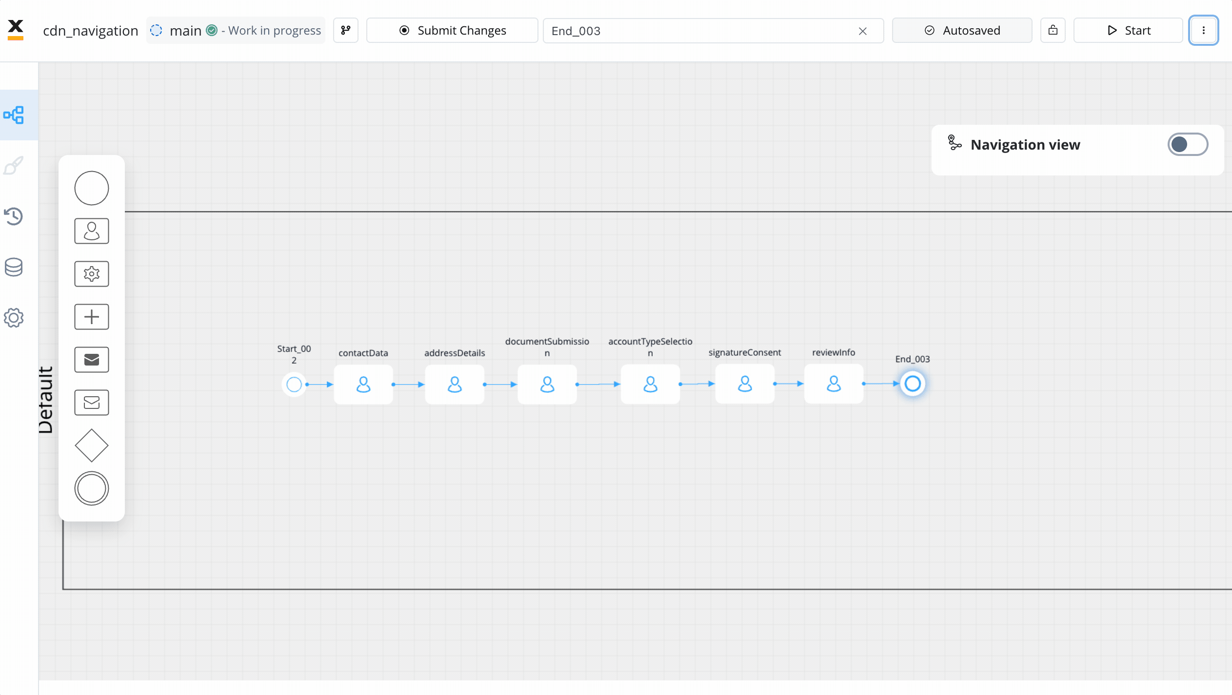
Alternative flows
There might be cases when you want to include or exclude process nodes based on some information that is available at start.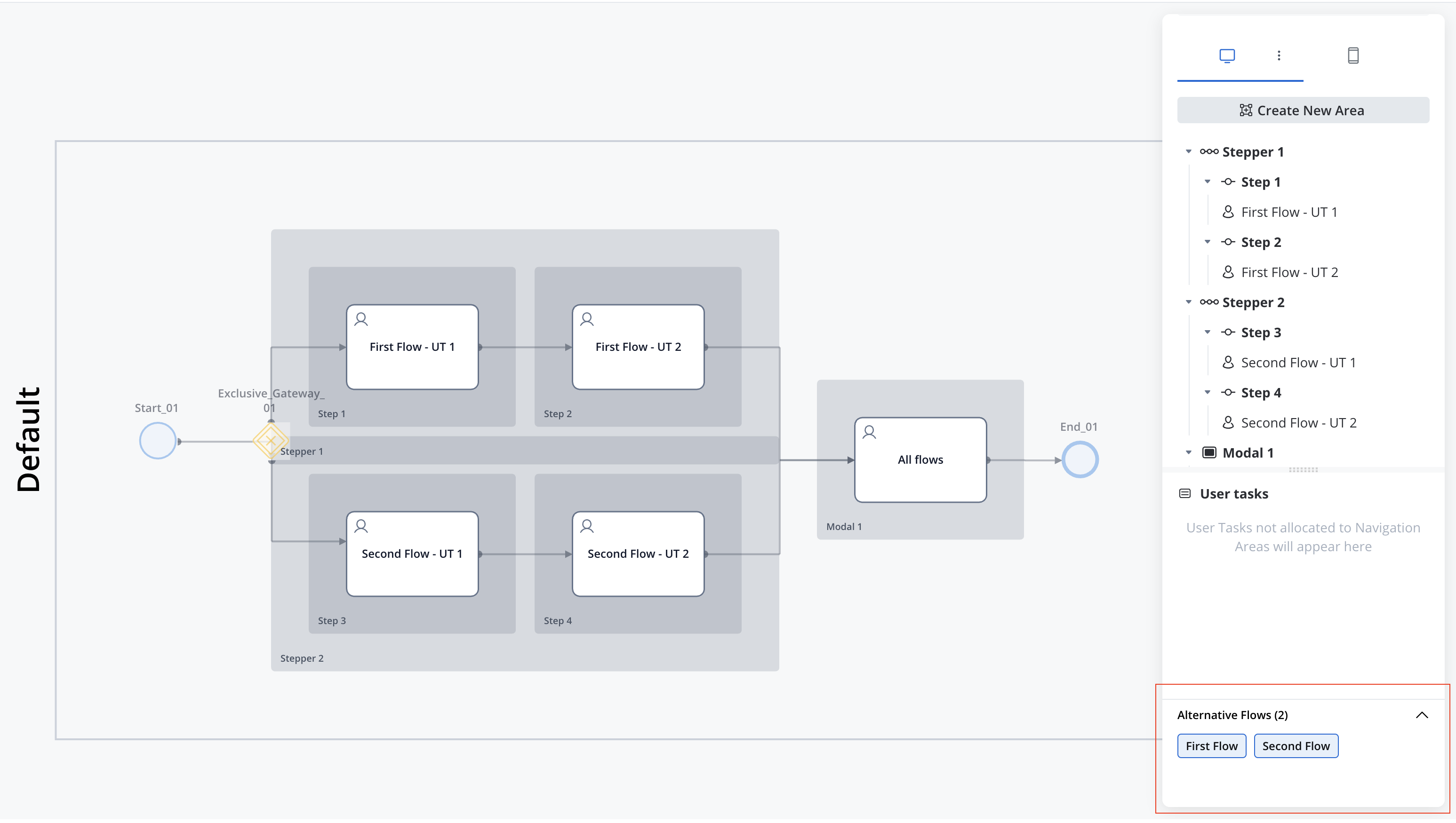
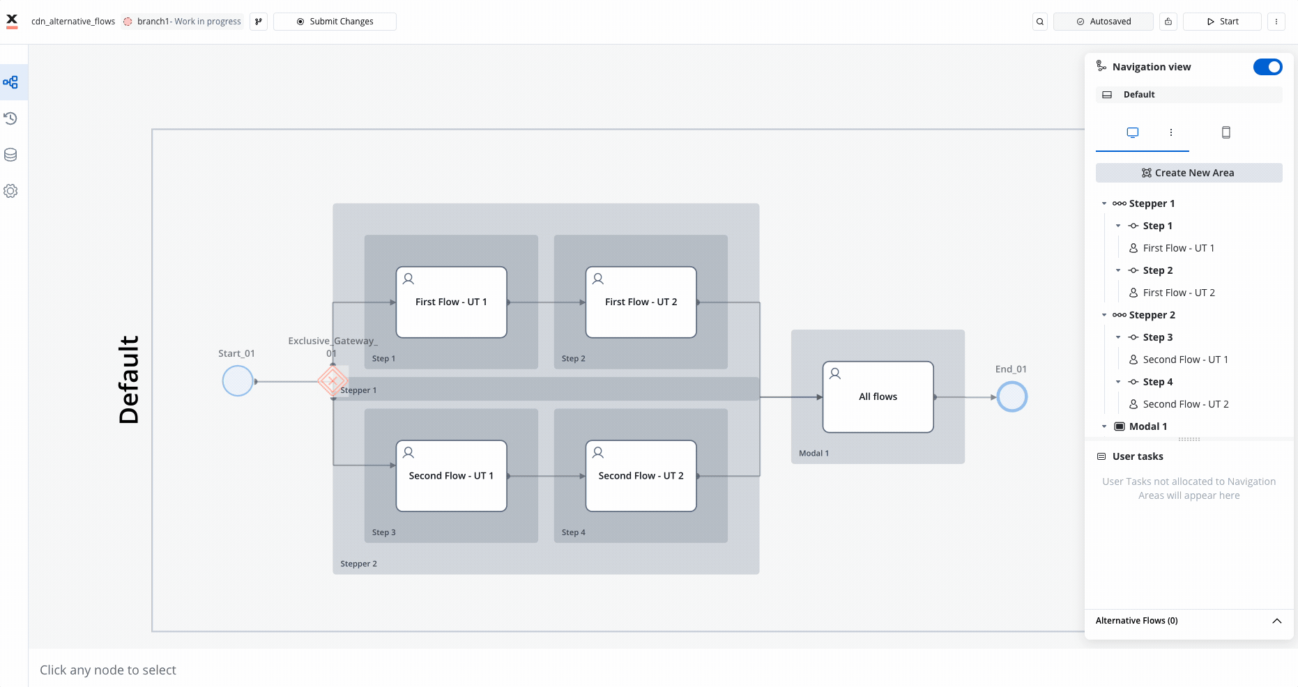
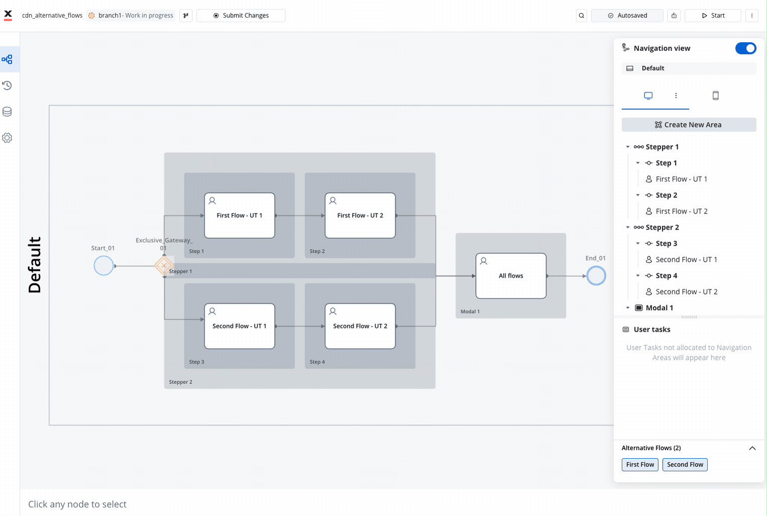
If a node is not assigned to an alternative flow, this means the node will be included in all possible flows.