

What are Custom Components?
Custom Components are developer-defined React components that you create in FlowX Designer and reference in UI Flows. Unlike Reusable UI Templates which use the visual component builder, Custom Components let you write actual React code to build complex, interactive UI elements.Code-based
Write React TypeScript/JavaScript directly in the Designer code editor
Data-connected
Receive process data through input keys and trigger process actions
Reusable
Define once in Reusable Resources, use across multiple User Tasks
Import/Export
Export as ZIP and import into other projects
When to use Custom Components
Creating a Custom Component
Custom Components are managed under Reusable Resources in your project.1
Navigate to Custom Components
In the Designer, open your project and go to Reusable Resources → Custom Components.
2
Create a new component
Click the + button to create a new Custom Component. Fill in the creation modal: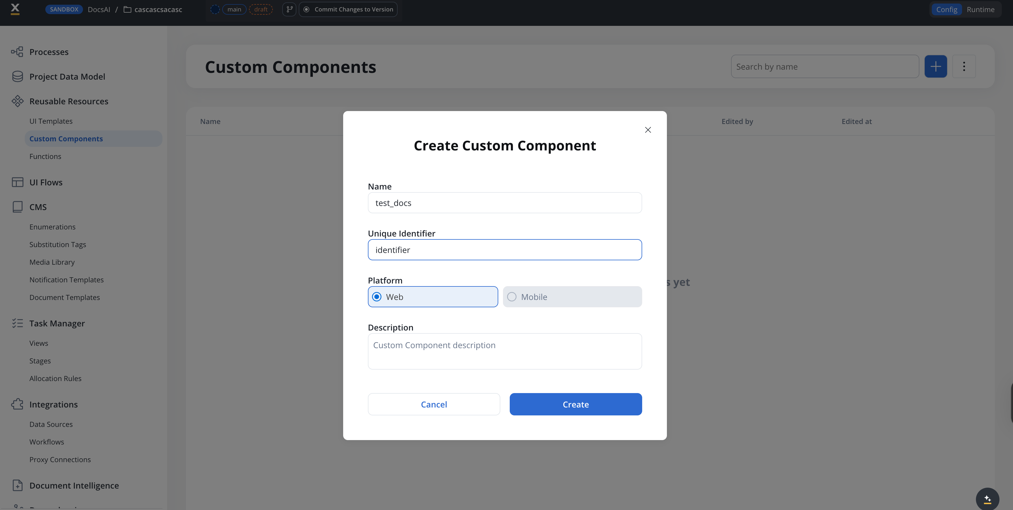
3
Write your component code
The component editor has three panels:
- Source Files (left) — a file tree with your component’s JSX, CSS, and
package.json - Code editor (right) — edit the selected file
- Dependencies (bottom-left) — lists available packages
identifier.jsx— your React component codeidentifier.css— component stylespackage.json— dependency declarations
4
Read process data in your code
Your component receives an
input prop. The process data it gets is on input.data, and the process actions are on input.actionsFn. You choose which data the component gets when you place it: an input key (see Map input keys) or, for Bundled components in a Process User Task, INPUT mappings (see Configure INPUT mappings).For example, if the input key is application.metrics.revenue, input.data is the value at that path itself, not an object keyed by the path.5
Test and save
Use the Test button to preview your component with sample data. Click Save to persist your changes.You can also test end-to-end by starting a UI Flow that includes the component.
Using Custom Components in UI Flows
Once defined, Custom Components can be added to User Tasks in your UI Flows.1
Add to a User Task
In the UI Designer, drag a Custom Component element from the component palette into your User Task layout.
2
Select the component
In the properties panel, select your Custom Component by its Identifier (e.g.,
MyCustomChart).3
Map input keys
Configure the process data path passed to the component. Enter a plain data model path such as 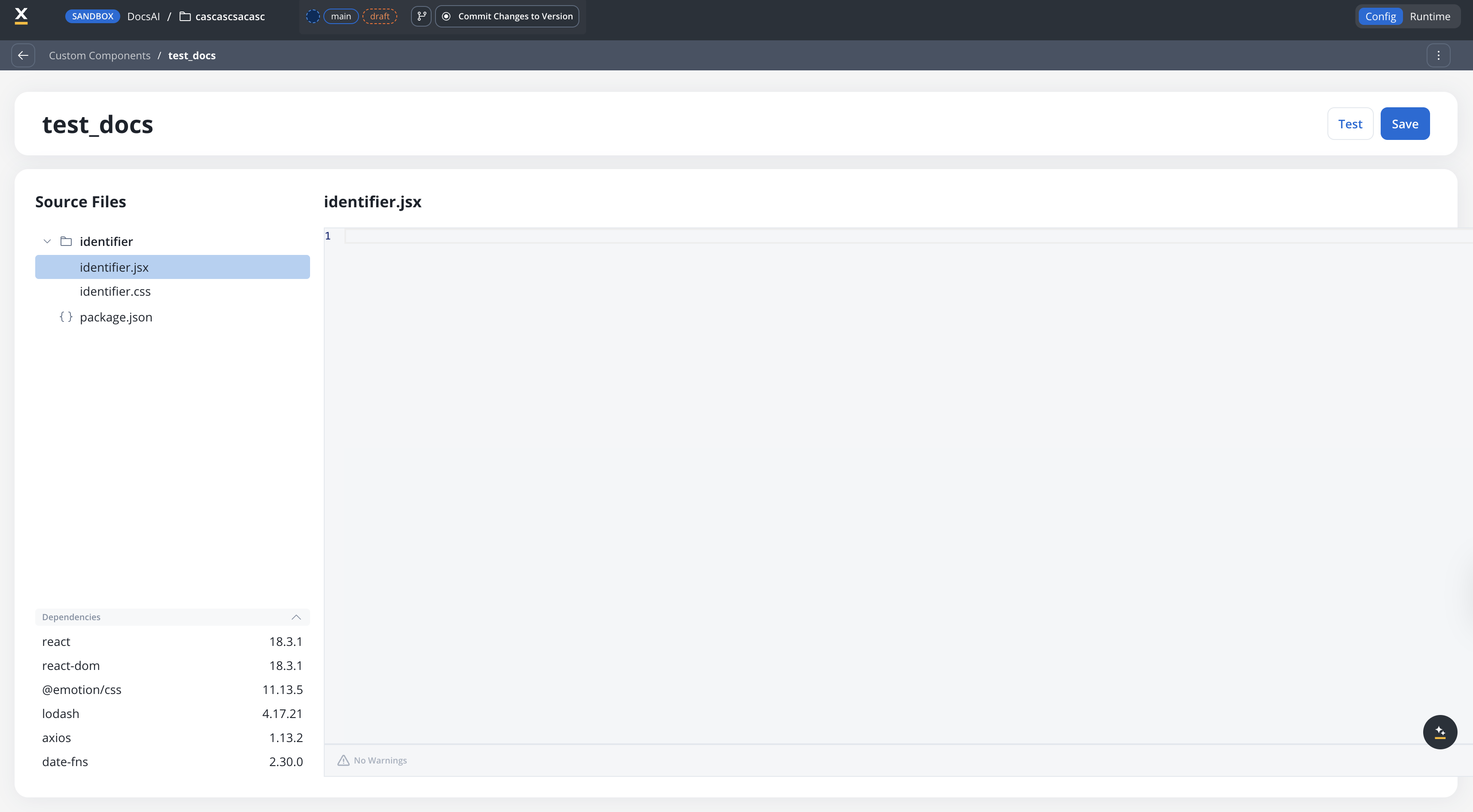
application.user.profile, without ${}. A component takes one input key.4
Connect event handlers
If your component triggers actions (e.g., button clicks), connect them to process actions defined on the User Task node.
Using Custom Components in Process User Tasks
The Process User Task host follows the same drag-and-drop authoring flow as UI Flows, with one extra concept: every Custom Component declares its own data model, kept distinct from process data so the component contract stays explicit at each use site.1
Drop the Custom Component onto a User Task
In the Designer, open a Process and select a User Task node. From the component palette, drag the Custom Component element into the User Task layout, and pick your component by its identifier.
2
Configure INPUT mappings
On the Custom Component’s properties panel, define how process data flows into the component. Map process attributes onto the slots declared on the component’s input data model. The React SDK applies these mappings at runtime and the component receives only the data it declared.
3
Configure OUTPUT mappings
For components that trigger actions, define how the component’s
saveData is remapped back to process variables. The React SDK applies the OUTPUT mappings before the action’s saveData is piped into the process state.INPUT and OUTPUT mappings appear only when the component’s Type is Bundled on the Web platform. With Type set to Self-Managed, and on Android and iOS, the properties panel shows Identifier, Input Keys, and Event handlers instead.4
Connect process actions
Wire component-triggered actions to the actions defined on the User Task node, the same way you do for built-in components.
Custom Components in Process User Tasks are rendered by the React SDK only, starting with 5.8.0. The Phase 1 React-only limitation in the section below still applies: there is no Angular SDK support for Custom Components yet.
Example: Onboarding checklist
A progress tracker that displays a list of onboarding steps with completion status, driven by process data.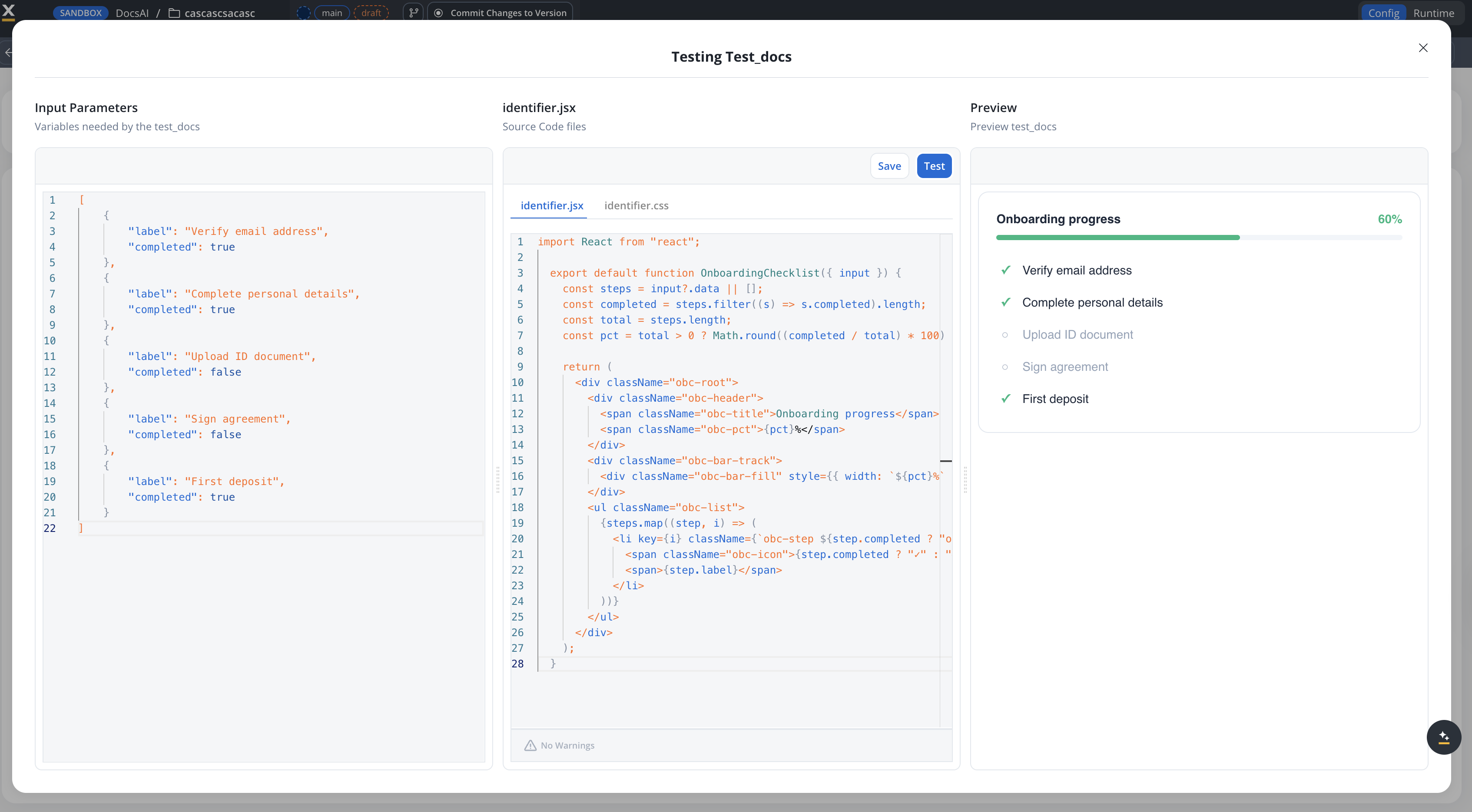
- identifier.jsx
- identifier.css
- Sample data
Key patterns in this example
Component API reference
Custom Components receive aninput prop with the following fields:
input is undefined on the first render, so guard with input?.data. For the full contract, including the registerValidation, saveData, and isSubmitted props, see Custom components in the React SDK.
Custom Components run in the React SDK runtime. They have access to standard React APIs and a set of pre-defined packages (React, Emotion, Lodash, Axios, date-fns). Custom npm packages cannot be added in Phase 1.
Troubleshooting
The component fails to load withthrew during initialization: input is not defined
The full message reads like Custom component "stepper" threw during initialization: input is not defined with identifier: stepper. The runtime runs the top-level code of your component file once, when it loads the component and before anything renders. input exists only inside the component function, as its prop, so code outside that function that reads input, such as a top-level const steps = input.data, fails while the component loads. Move that code into the component body:
Import and export
Custom Components support the standard FlowX import/export workflow:- Export: Select components and export as a ZIP file
- Import: Import ZIP files into other projects
- Conflict resolution: When importing, choose to Keep both, Replace, or Skip for each component
Permissions
Custom Components are controlled by theCUSTOM_COMPONENT resource type in the authorization system.
By default, the Project Owner role has full Custom Component permissions.
Limitations (Phase 1)
Related resources
Reusable UI Templates
Visual, no-code reusable UI patterns
Reusable Functions
Reusable business logic functions
UI Flows
Building user interfaces with FlowX
Event Handlers
Configuring event handlers on components