

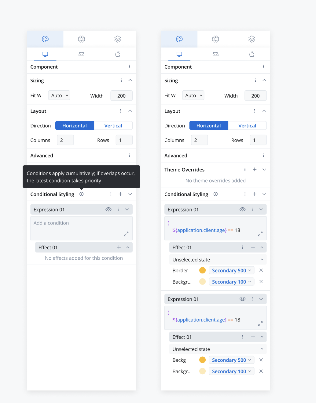
Conflict resolution: Conditions apply cumulatively. Every condition that evaluates to true applies its overrides, and when two of them set the same property, the latest one (lowest in the list) takes priority.
Configuring conditional styling
- Open the UI Designer.
- Select an element that supports conditional styling (see Availability).
- Navigate to the Styles tab.
- Locate the Conditional styling section.
- Click Add new (+) in the section header to add an expression. Expressions are numbered Expression 1, Expression 2, and so on.
- Write the condition in the expression’s inline editor, or click Open in editor next to the expression name to open it in the expression editor, where you can run it against test data.
- Click Add effect (+) next to Effects and pick the property to override, then set its value.
Conditional styling properties
Availability
Conditional styling is available on these components:Properties you can override
The properties available depend on the component. Across the supported set these are:Structure of conditional styling
-
Condition:
- A string expression, evaluated like the hide and disabled conditions.
- Reference data store keys with
${key}, for example${user.age} > 30. An empty or invalid expression evaluates to false.
-
Overrides:
- A key-value map defining specific property-value pairs.
- Overrides are applied when the condition evaluates to true.
- Color values are objects:
{ "value": "#hex" }for a custom color, or a themereferencewhen you pick a theme color. Border Width is a number.
conditionals array in the component’s style for each platform (Web, iOS, Android).
Example
Renderer behavior
- Real-Time Evaluation: Each condition is re-evaluated whenever the data it references changes, on Web, iOS, and Android.
- Priority Handling: If several conditions are met, all of their overrides apply. When two set the same property, the last condition in the sequence takes precedence.
- Dynamic Application: Styles are applied instantly upon condition satisfaction, enhancing UI responsiveness.
Contextual menu options
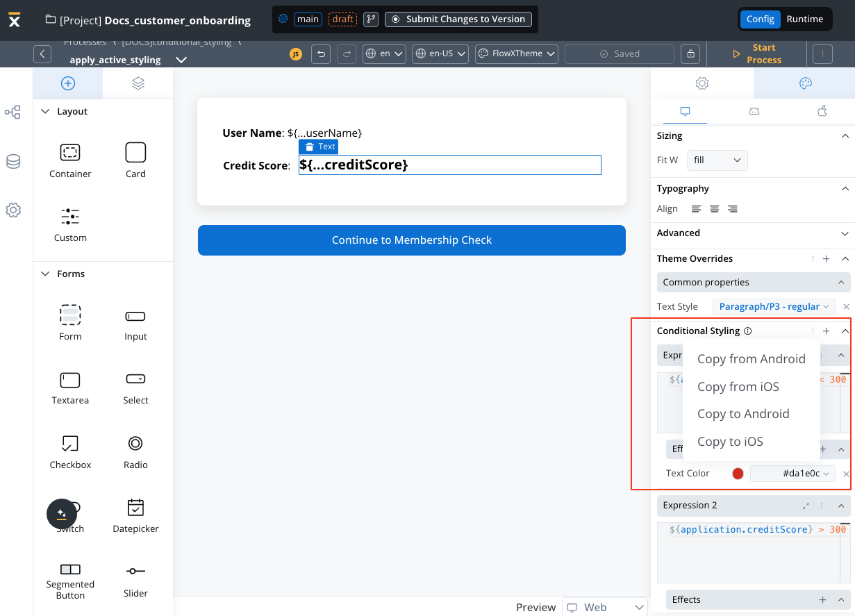
- Conditional styling section More (⋮) menu: Copy from <platform> and Copy to <platform> copy all expressions between Web, Android, and iOS. Copied expressions are added after the expressions already on the target platform.
- Expression More (⋮) menu: Copy to <platform> copies that one expression, and Delete removes it. To remove a single effect, use the Delete control on its row.
Key notes
- Dynamic Styling: Facilitates platform-specific style overrides driven by real-time data conditions.
- Scalability: Designed to support iterative and scalable UI implementations.
- Enhanced Usability: Simplifies user interaction with intuitive UI/UX components, making style management more accessible and efficient.