

Configuring a Download component
The component sits in the Basic category of the component palette. Drop it inside a container or card — it is available in both process user tasks and UI Flows, on web and mobile layouts, including collection prototypes and headers/footers. It cannot be placed directly inside forms or table cells.Properties
- Label: The button text. Default:
Download - Save-as file name: Optional file name used when saving the downloaded file (e.g.,
MyFile.pdf); supports${}expressions. When left empty, a file read through the Document Plugin source (UI Flows) keeps its original file name, and other Documents plugin downloads are saved asdocument. - Toast notification on success: Toggle ON to show a confirmation toast after the download completes, with a configurable Success message (default:
File downloaded). - Toast notification on error: Toggle ON to show a toast when the download fails, with a configurable Error message (default:
There was an error downloading the file). - Loading behavior: None or Overlay. With Overlay, a loading indicator with a configurable Loading message (default:
Downloading...) is shown while the file is being fetched.
The notification and loading options apply to the web renderer. On Android they are not available — the component downloads the file without toasts or a loading overlay.
Selecting the file to download
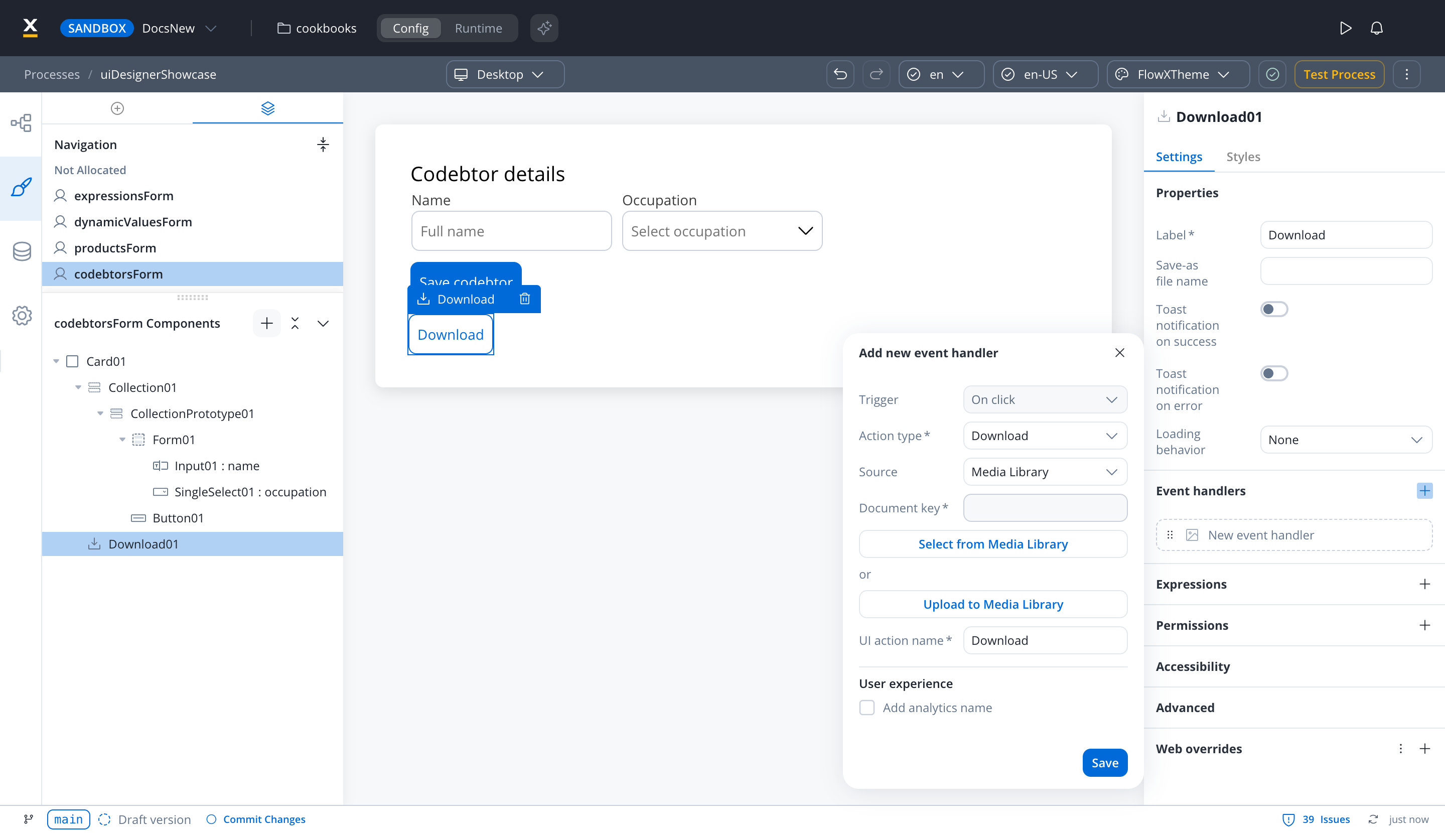
The Download component’s click actions are added in the component’s Event handlers section. In a process user task, it offers a single Download action. In a UI Flow, it also offers one Start workflow action, which becomes available once the component has a Download action (until then the option reads “Add a Download action first.”). On FlowX.AI 6.0.0, the component offers only the Download action in both contexts. The Source select determines where the file comes from, with the same options as File Preview:- Media Library: a PDF from the project’s Media Library. Pick one with Select from Media Library or add one with Upload to Media Library.
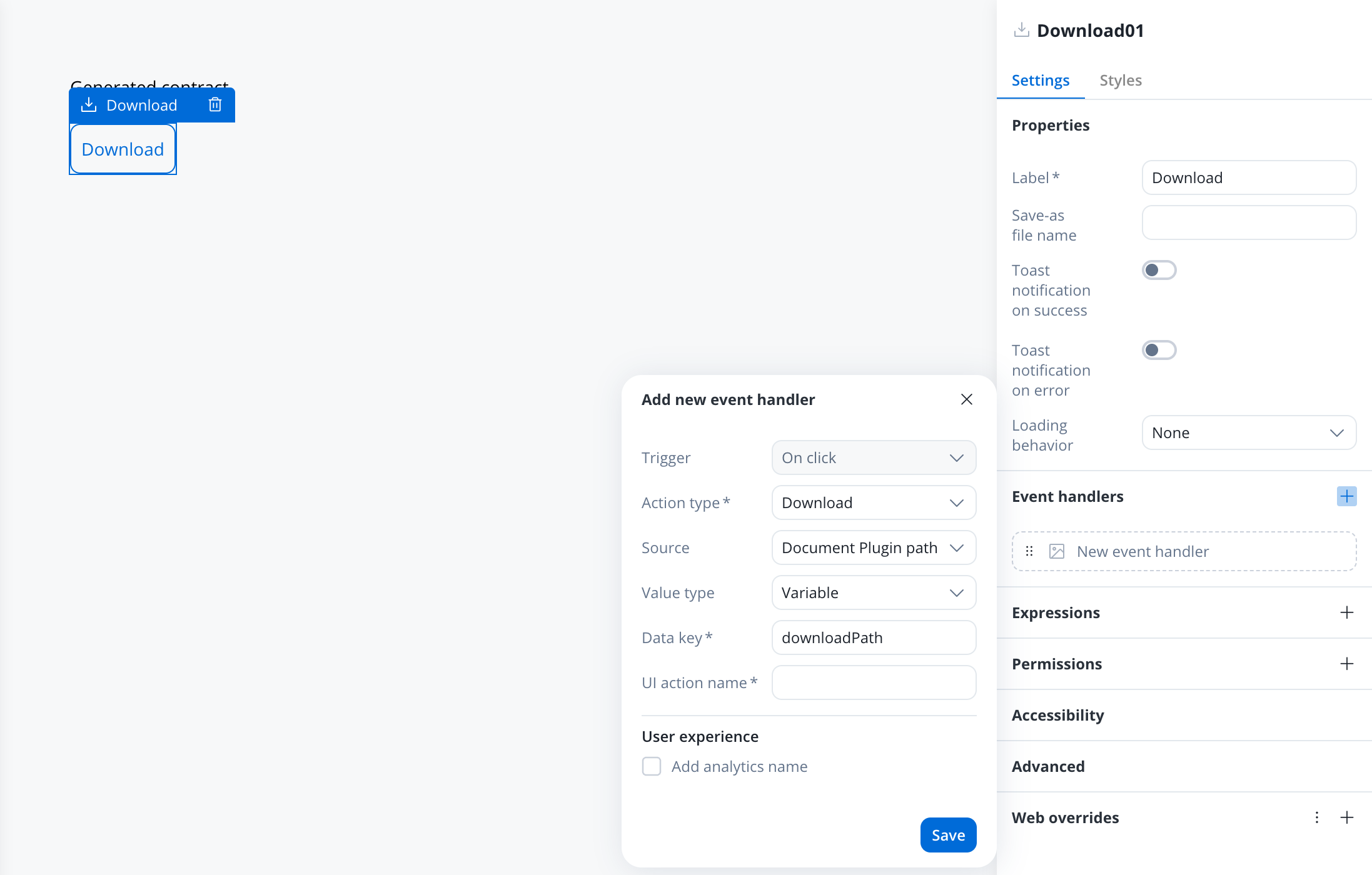
- Document Plugin path (process user tasks): a Documents plugin
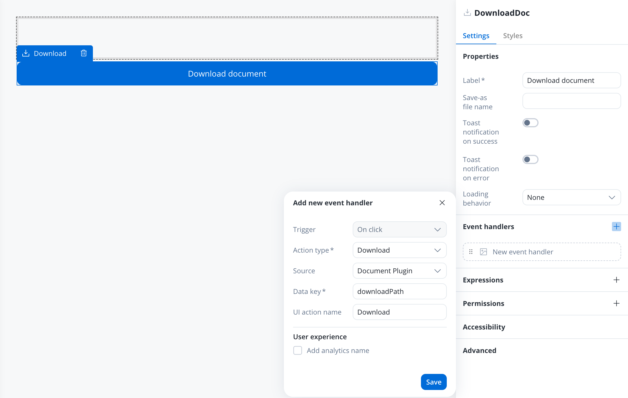
downloadPath, such as the one in an upload or document-generation reply. The renderer adds the Documents plugin base URL, so you don’t need a business rule to build the URL. - Document Plugin (UI Flows): the object that contains
downloadPath, for example an upload reply. When Save-as file name is empty, the file keeps its original file name. - URL: a complete, absolute URL.
document unless you set Save-as file name.
Files stored in the Documents plugin (and FlowX download URLs) are fetched and saved directly with the resolved file name. A plain external URL opens in a new browser tab instead of downloading, and the success/error notifications do not apply to it.
Styling
The Download component renders as a button and reuses button styling: a Type (defaultghost), an optional Icon with configurable position, and valid CSS properties per platform. For more information, see the styling documentation.
Platform support
Configured in the FlowX Designer, with runtime support on the web, React Native and Android renderers.Related resources
File preview
Preview file contents inside a UI without opening the file
Multiple file upload
Let users upload one or more files from a rendered app