Messages can be categorized into the following types:
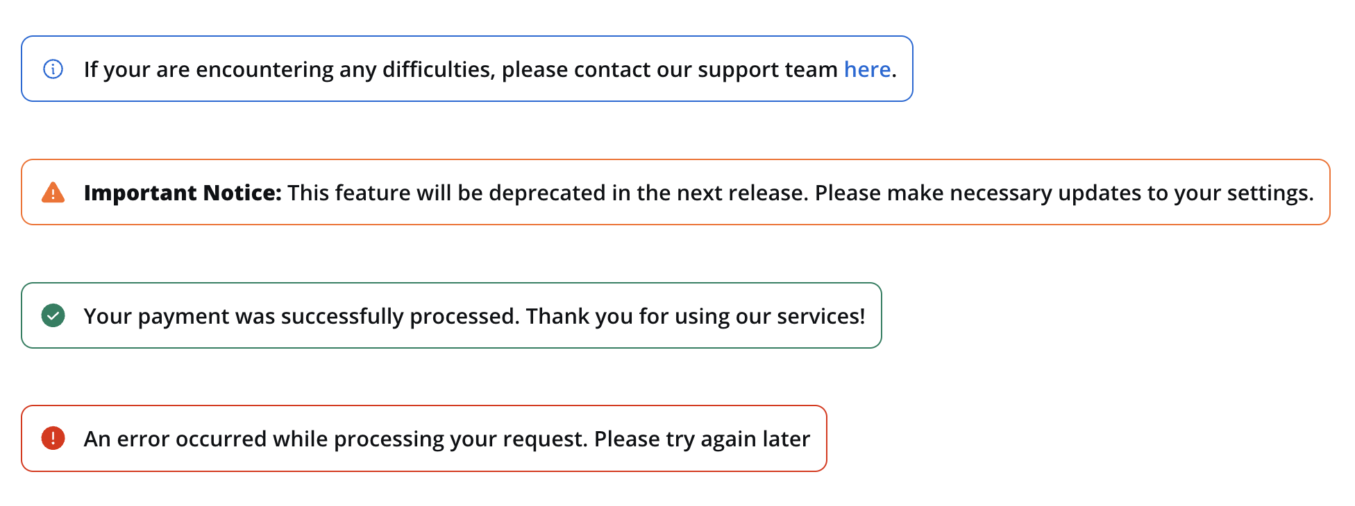
- Info: Used to convey general information to users.
- Warning: Indicates potential issues or important notices.
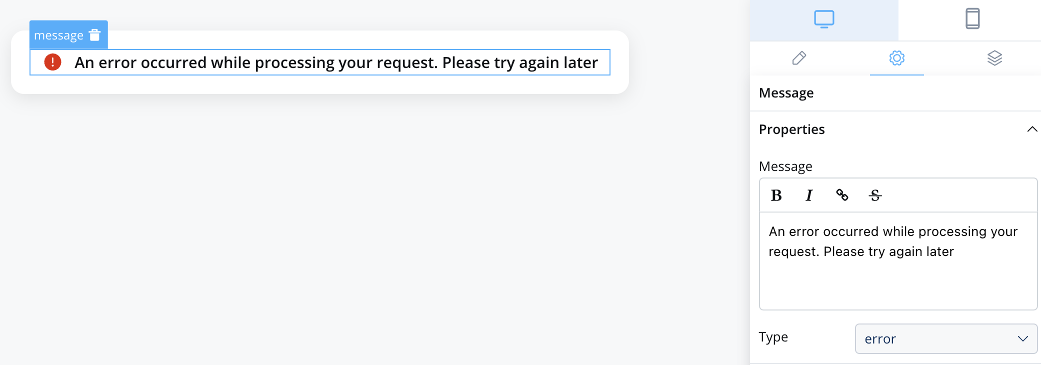
- Error: Highlights errors or critical issues.
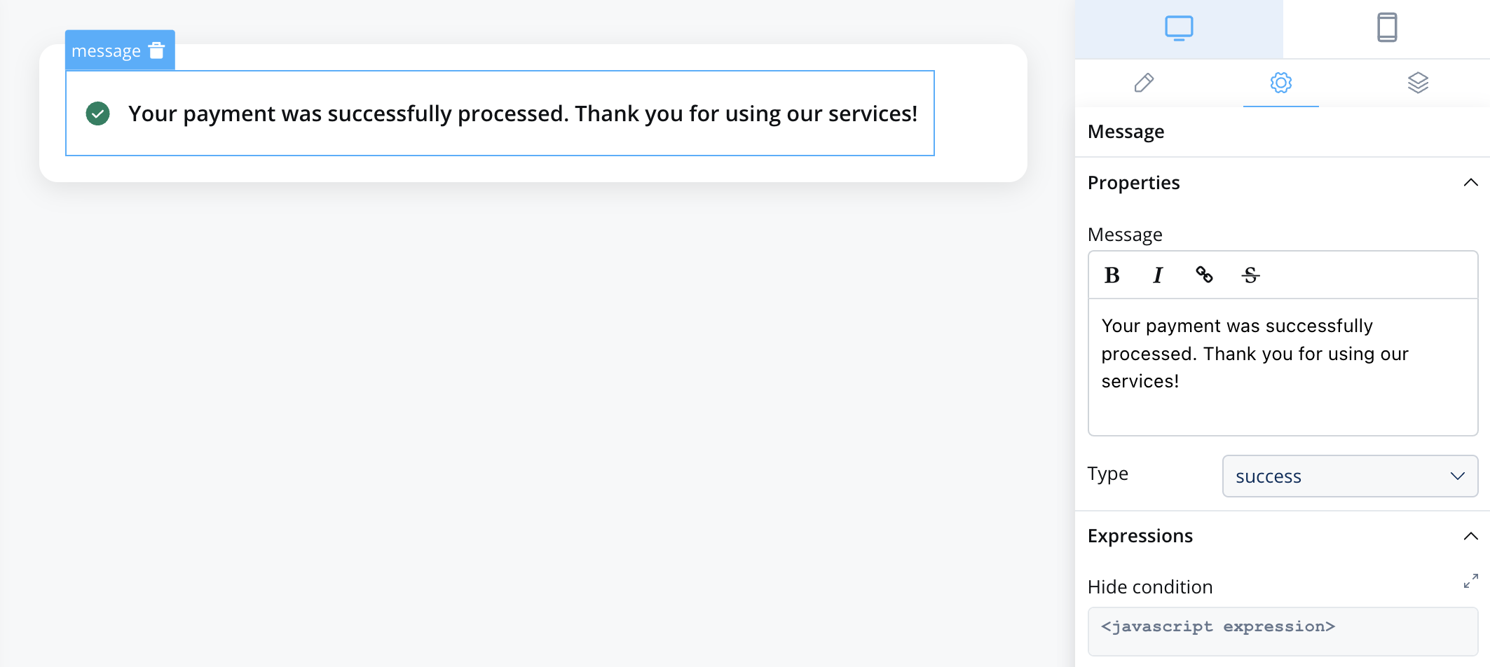
- Success: Communicates successful operations or completion.
Properties
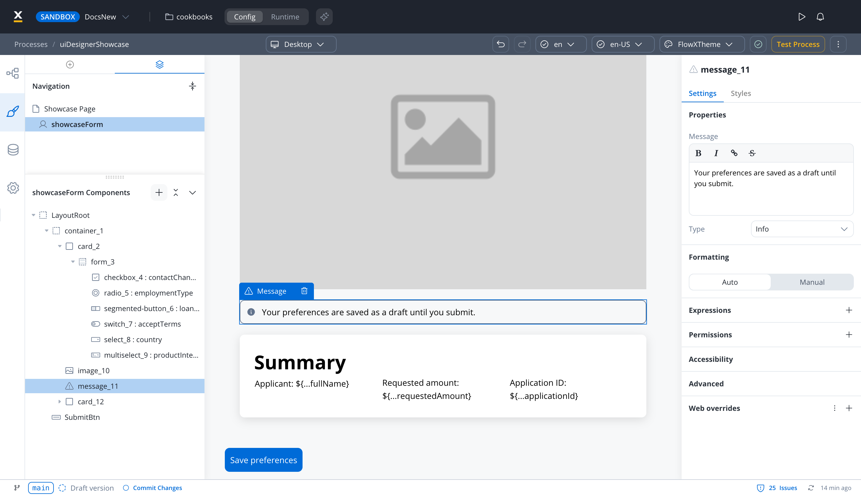
Select the message element and open the Settings tab to configure it:
- Properties:
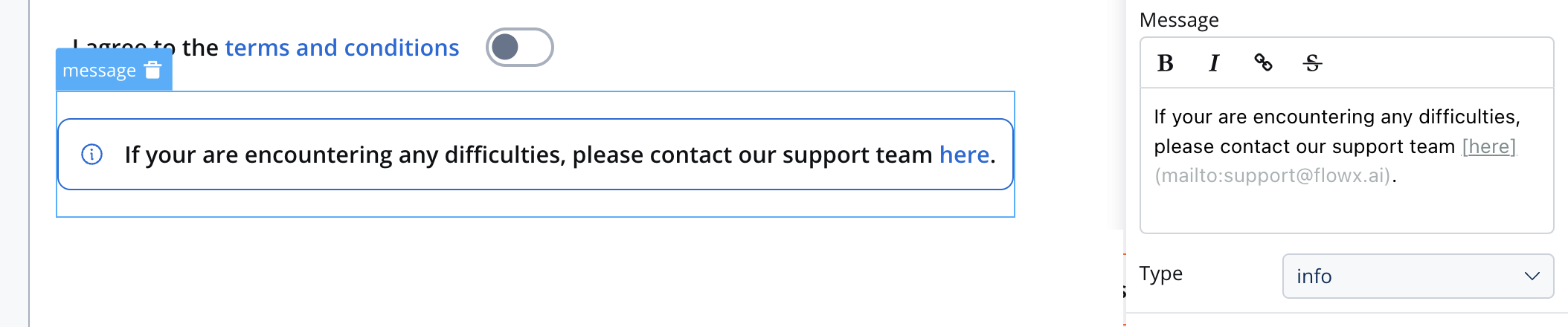
- Message: The content of the message body, this property supports markdown attributes such as: bold, italic, bold italic, strikethrough and URLs, allowing you to format the content of the message.
- Type: one of the four indicator types: Info, Warning, Error or Success. A new message starts as Success, with the Border style and the text
My message.
- Formatting: choose Auto or Manual. Manual shows the number, date and currency formatting options. For more information, see Localization and internationalization.
- Expressions: select + and add Hide to hide the message when the expression is true. The expression shows as Hide condition. This can be useful for dynamically showing or hiding messages based on specific conditions.
- Permissions: a message can only be hidden based on the user’s permissions; it has no disabled state. For more information, see Permission-based expressions.
- Accessibility: turn on Mark as decorative so assistive technologies ignore the message. A message has no accessibility label.
- Advanced: Data test ID sets the test identifier for automated tests.
The Message text and the Hide expression can be overridden per platform. In the Settings tab, open the Web overrides, iOS overrides or Android overrides section, select + and pick Properties → Message or Expressions → Hide. Use this to show a shorter message on mobile or hide the banner on one platform only.
In a UI Flow, the overrides sections are shown only when the device type is Mobile. In a process, they are always shown.
Info example with markdown:
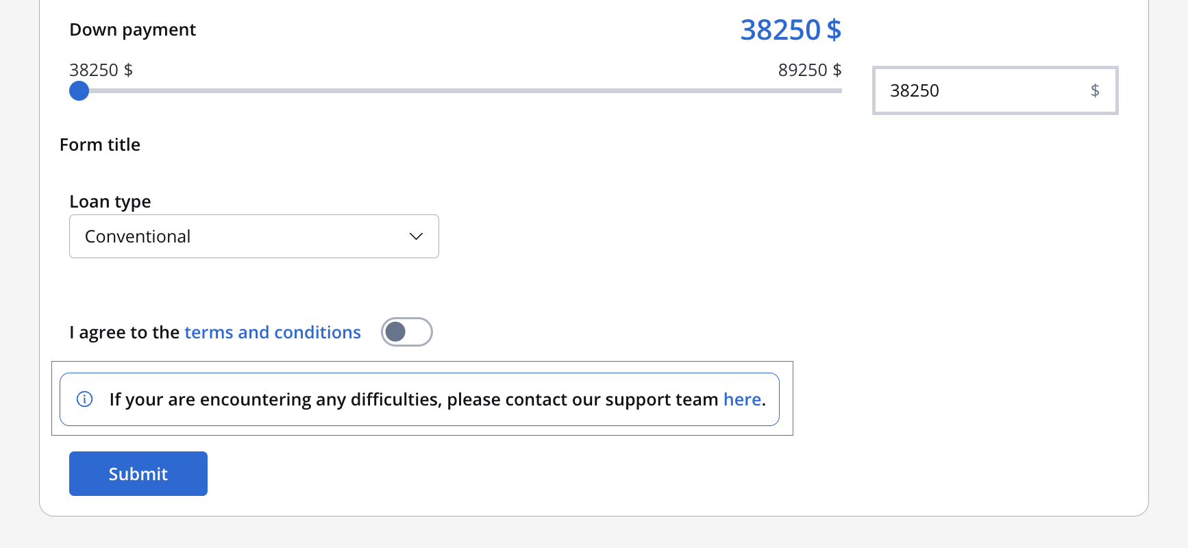
When executed, will look like this:
Types and usage
Here’s how you can use the Message UI element in your UI design:
Info
If you are encountering any difficulties, please contact our support team.
Warning
Your session will expire in 5 minutes. Save your changes to keep them.
Error
An error occurred while processing your request. Please try again later.
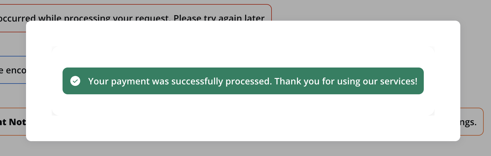
Success
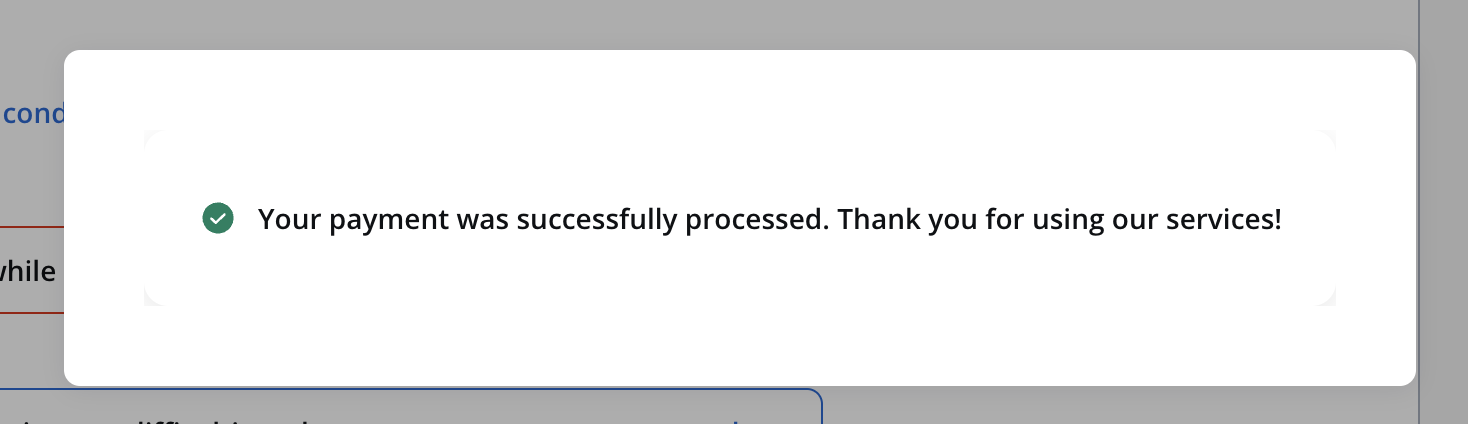
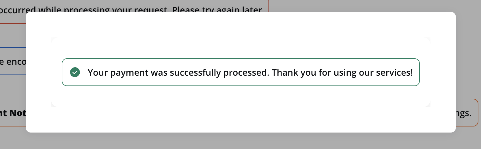
Your payment was successfully processed. Thank you for using our services!
Indicators styling
Open the Styles tab to style the message. It has the following sections:
- Properties → Style: how the message is drawn: Text, Border or Fill. A new message uses Border.
- Layout: sets how the content inside the message is laid out.
- Sizing: sets the width. By default, a message fits its content on Web and fills the available width on iOS and Android.
- Spacing: sets the margin and padding on each side.
- Grid child: shown only when the message sits inside a grid container.
Style
The Style option controls how the message is drawn:
- Text: Displays only the icon and the text.
- Border: Displays the icon, the text and the border.
- Fill: Fills the message area with the background color.
Theme overrides
In the Theme overrides section of the Styles tab, you can override the theme for this message only:
- Common Properties: Border radius, Border width, Font, and Shadow (only with the Fill style).
- State Properties: Background and Border (not available with the Text style), Text, Icon and Link.
Last modified on November 13, 2026