

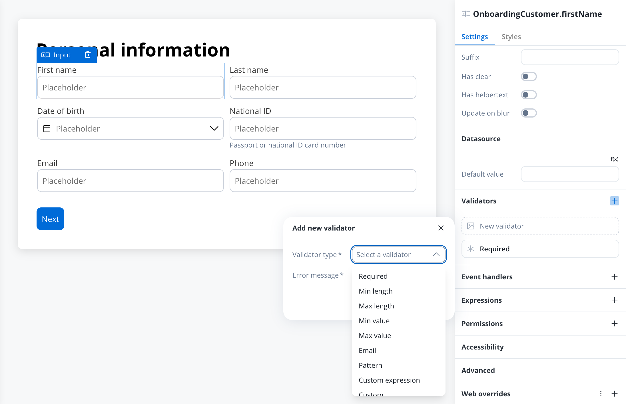
Add a validator
- Select the form element and find the Validators section in its Settings tab. An element with no validators shows No validators yet.
- Click Add new (+). A New validator card appears and the Add new validator popover opens.
- Choose a Validator type. The list shows only the validators that apply to the selected component, plus Custom expression and Custom.
- Fill in the fields for that type. The value field is named after the validator (Min value, Max value, Min length, Max length, Pattern), or Expression for a custom expression. Custom expression and Pattern also have a Label, which becomes the name shown on the validator card.
- Enter the Error message shown when the value is not valid.
Predefined validators
Each accordion title shows the label in the Validator type list, followed by the validator name saved in the configuration.Min value (min)
Min value (min)
This validator checks whether a numeric value is smaller than the specified value. If there are no characters at all, this validator will not trigger. It is advisable to use this validator with a required validator.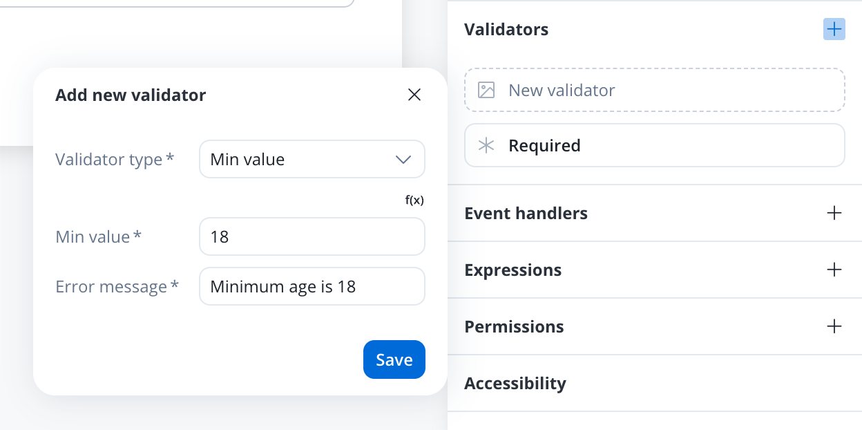
min validator
Refer to MDN documentation for more details about the min attribute.
Max value (max)
Max value (max)
This validator checks whether a numeric value is larger than the specified value. If there are no characters at all, this validator will not trigger. It is advisable to use this validator with a required validator.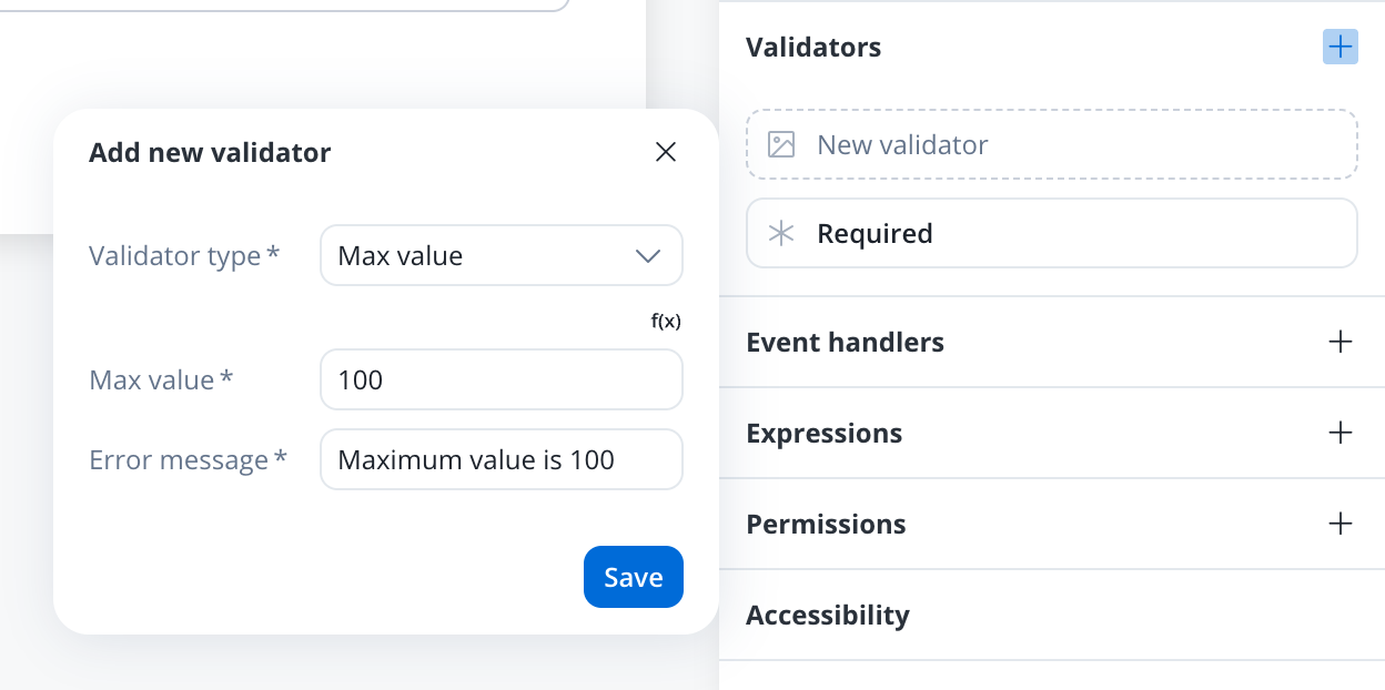
max validator
Refer to MDN documentation for more details about the max attribute.
Min length (minlength)
Min length (minlength)
This validator checks whether the input value has a minimum number of characters. If there are no characters at all, this validator will not trigger. It is advisable to use this validator with a required validator.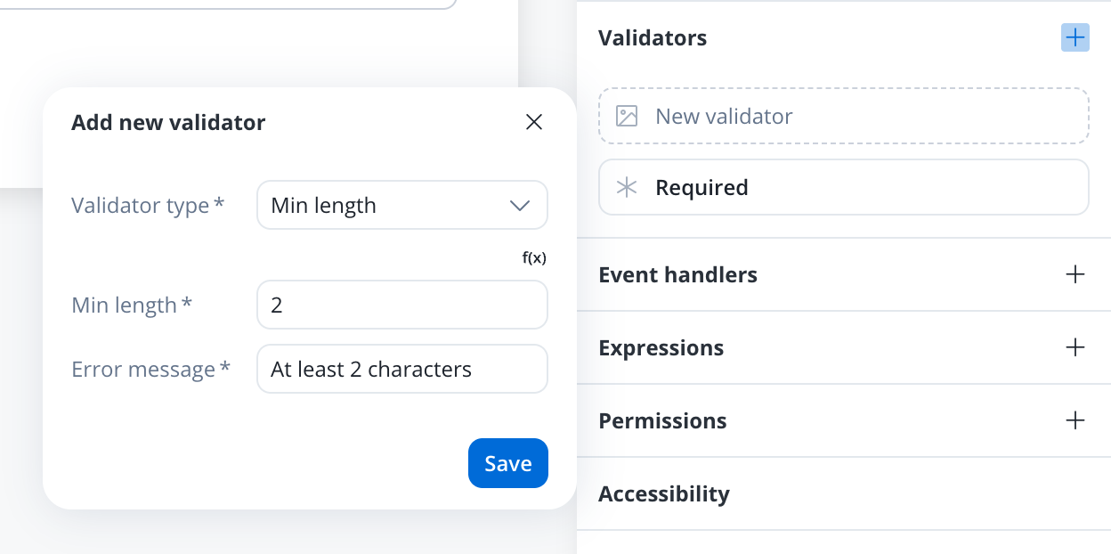
minlength
Refer to MDN documentation for more details about the minlength attribute.
Max length (maxlength)
Max length (maxlength)
This validator checks whether the input value has a maximum number of characters. If there are no characters at all, this validator will not trigger. It is advisable to use this validator with a required validator.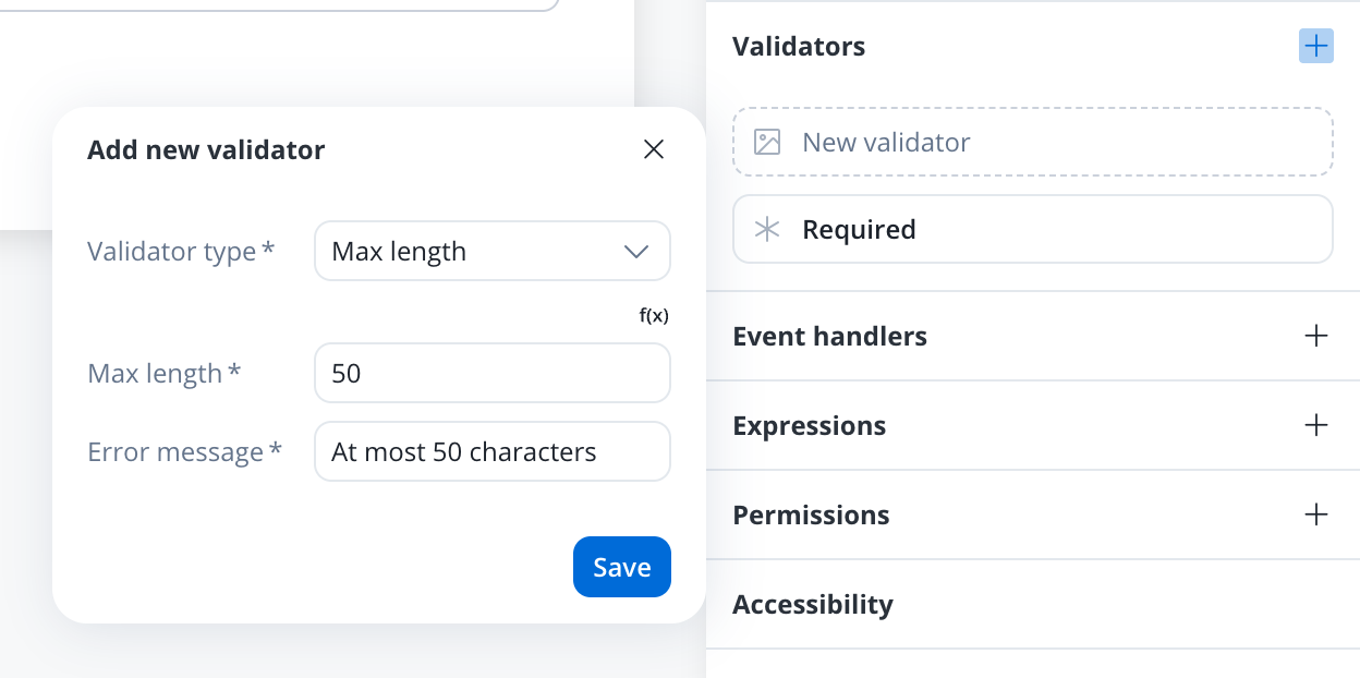
maxlength
Refer to MDN documentation for more details about the maxlength attribute.
Required (required)
Required (required)
This validator checks whether a value exists in the input field.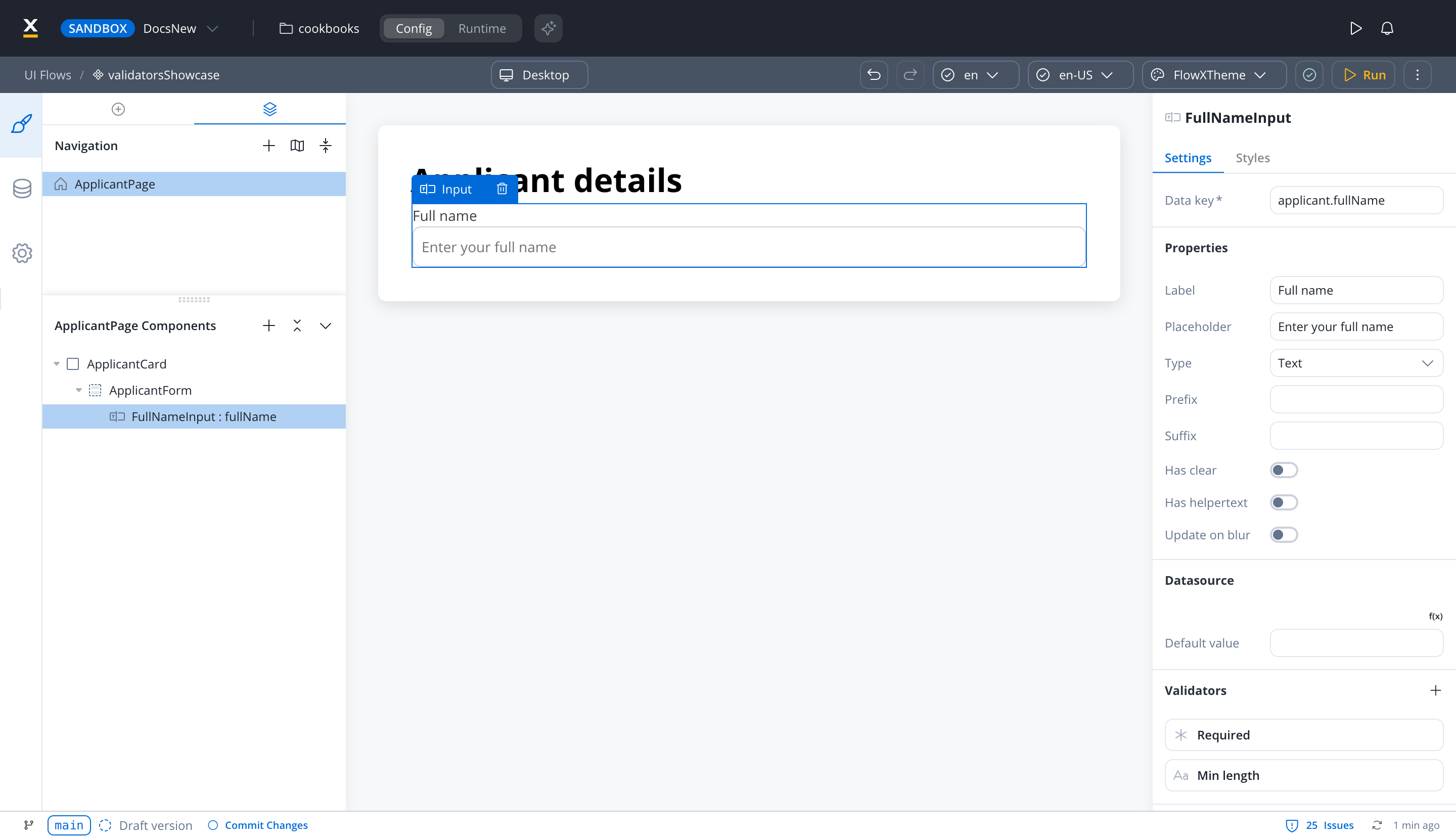 It is recommended to use this validator with other validators like minlength to check if there is no value at all.

required
Refer to MDN documentation for more details about the required attribute.
Required true (requiredTrue)
Required true (requiredTrue)
This validator checks that the value is
true. It is the only predefined validator available for a switch, where it makes the user turn the switch on before the form is valid (for example, to accept terms and conditions). It is also available for table cells.Email (email)
Email (email)
This validator checks whether the input value is a valid email. If there are no characters at all, this validator will not trigger. It is advisable to use this validator with a required validator.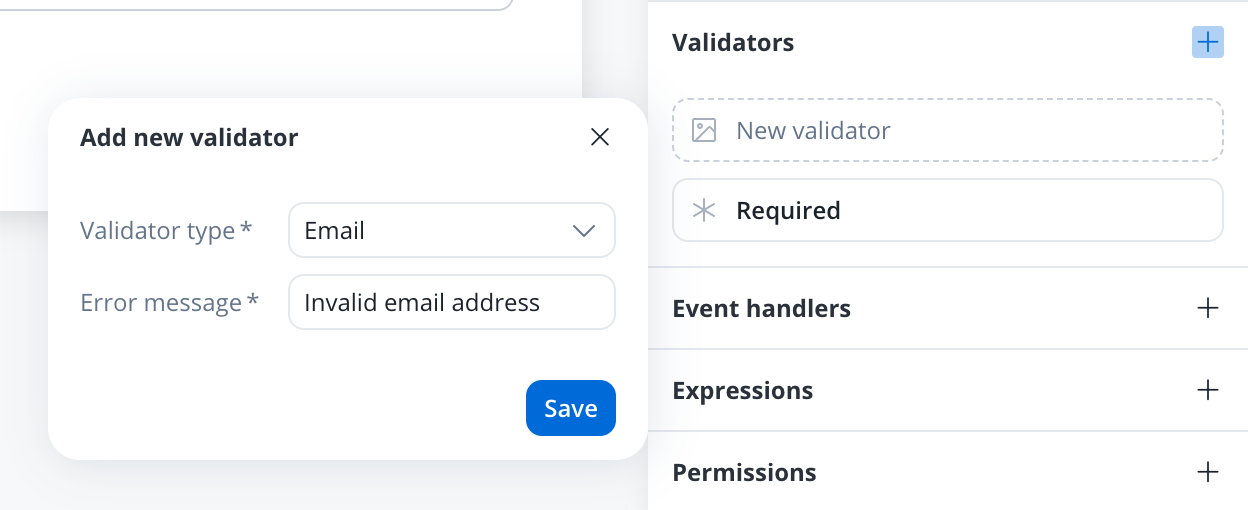
email
Refer to MDN documentation for more details about email input validation.
Pattern (pattern)
Pattern (pattern)
This validator checks whether the input value matches the specified pattern (for example, a regex expression).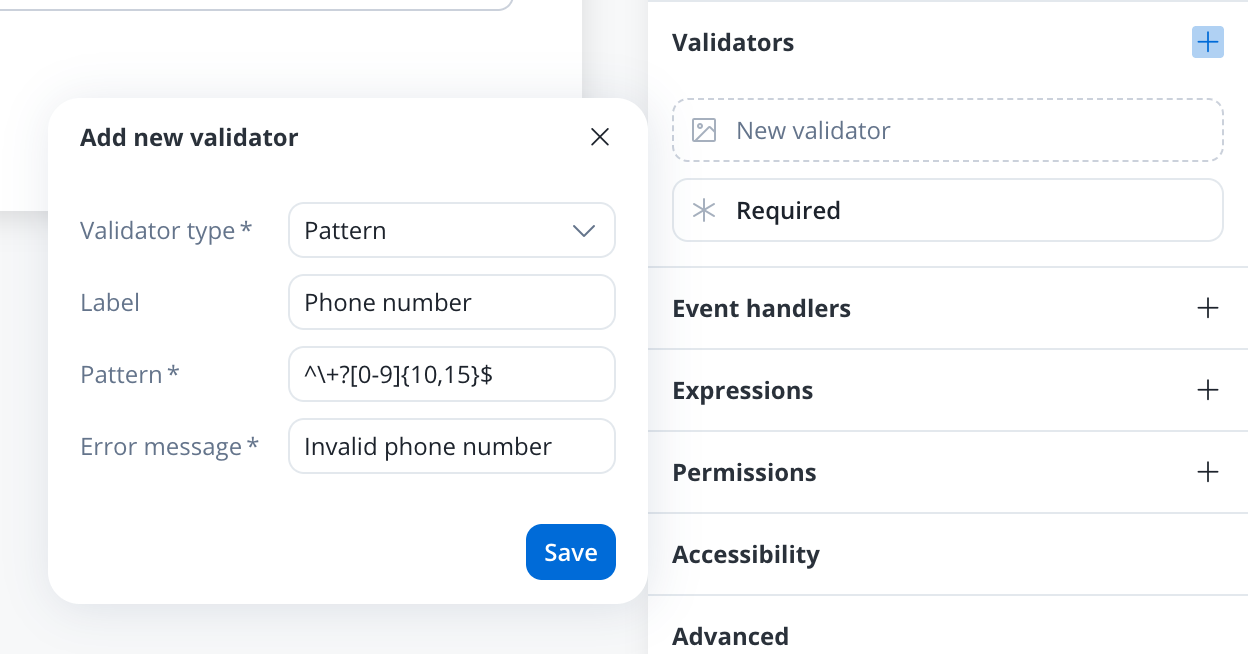
pattern validator
Refer to MDN documentation for more details about the pattern attribute.
Custom expression (customExpression)
Custom expression (customExpression)
This validator allows you to validate a form element based on computed expressions that can reference other values from the process data store, not just the current form element being validated.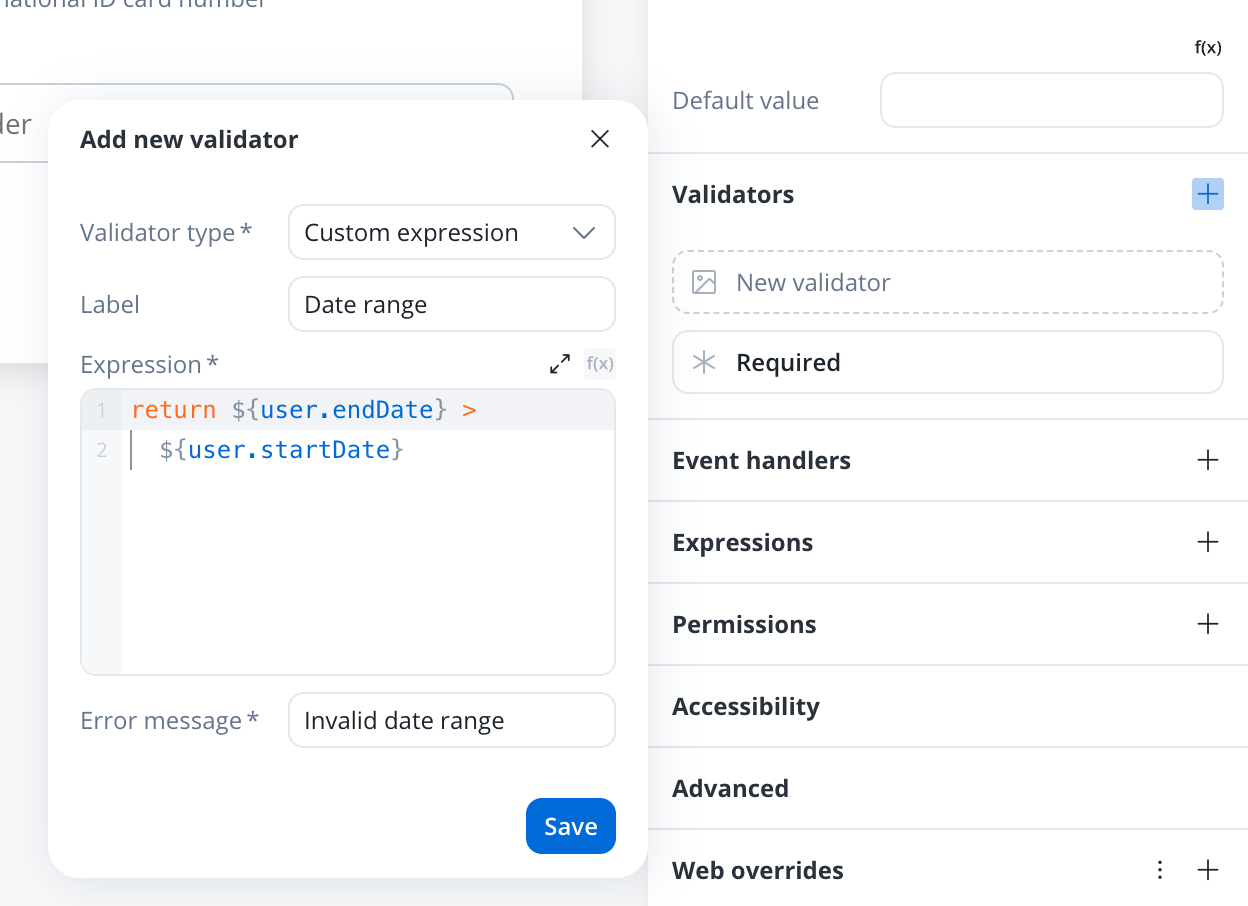 Example used:The validator uses a code editor where you can write computed expressions that must eventually return Key features:
Simple comparison
true (valid) or false (invalid). The expression can contain process data store values and will be evaluated dynamically.The
customExpression validator runs even when the field is empty. If the field is optional, return true for an empty value in the expression (see Null and empty checks).- Dynamic validation: Based on other process values, not just the current field
- Computed expressions: Write JavaScript expressions that return boolean values
- Real-time updates: Re-evaluates when referenced process data changes
- Universal compatibility: Available for all form elements
Same or before today (isSameOrBeforeToday)
Same or before today (isSameOrBeforeToday)
This validator can be used to validate datepicker inputs. It checks whether the selected date is today or in the past. If there are no characters at all, this validator will not trigger. It is advisable to use this validator with a required validator.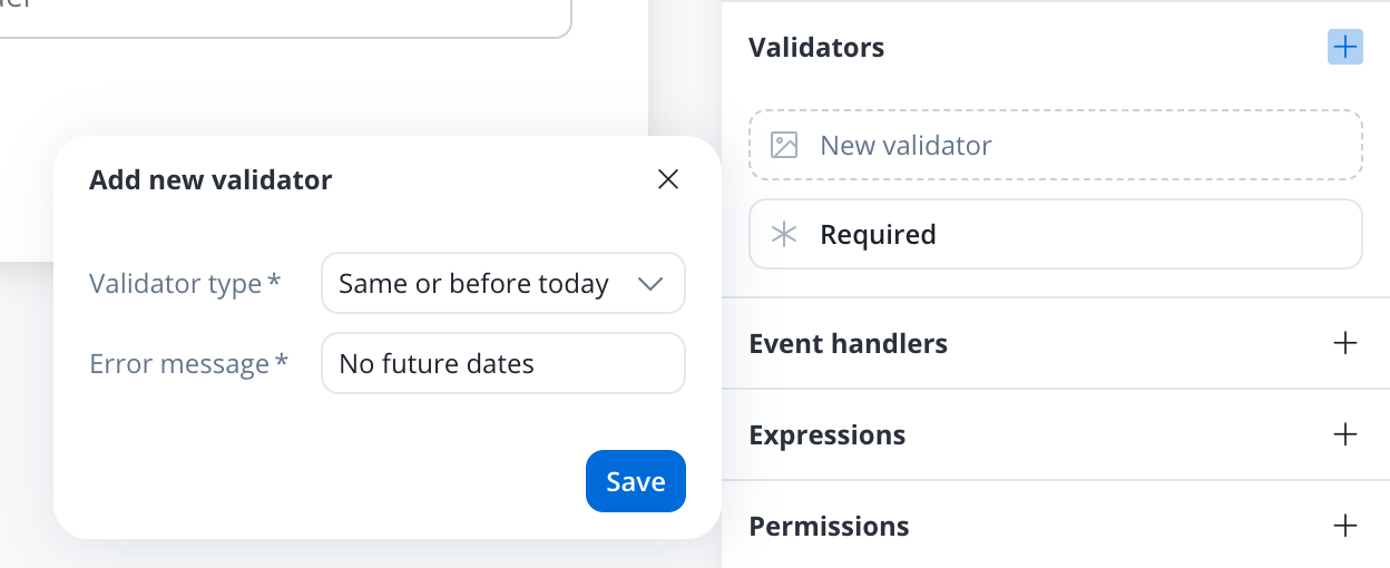
Same or after today (isSameOrAfterToday)
Same or after today (isSameOrAfterToday)
This validator can be used to validate datepicker inputs. It checks whether the selected date is today or in the future. If there are no characters at all, this validator will not trigger. It is advisable to use this validator with a required validator.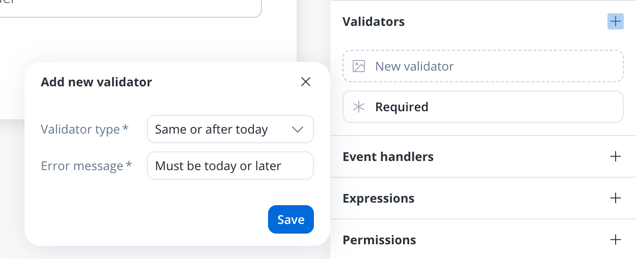
Validator compatibility with input field types
The Designer does not restrict validators by input type. The table shows which validators fit each kind of field:To ensure the validation of all form elements within a card upon executing a Save Data action such as “Submit” or “Continue,” follow these steps: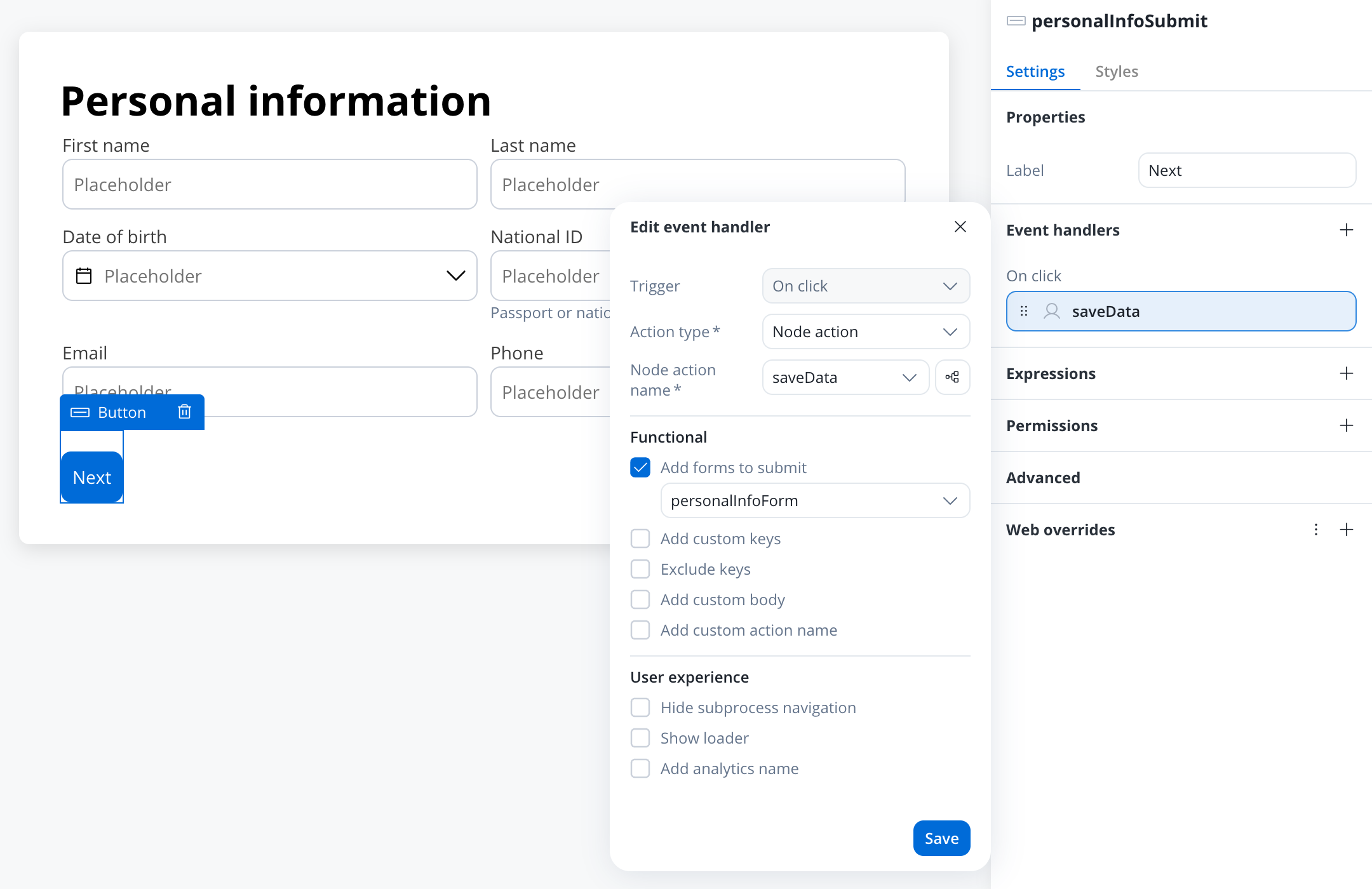
- When adding an event handler to a button inside a card, check Add forms to submit to show the forms dropdown. In a UI Flow, or in a collection prototype and its children, the option is labeled Add forms to validate.
- From the dropdown menu, select the specific form or individual form elements that you wish to validate.
- By choosing the appropriate form or elements from this dropdown, you can ensure comprehensive validation of your form.
Common expression patterns
ThecustomExpression validator supports JavaScript expressions that return true (valid) or false (invalid). Below are patterns for common validation scenarios.
Date comparison
Validate that one date comes after another:Required-if (conditional required)
Make a field required only when another field has a specific value:Regex patterns
Validate a string against a pattern usingmatch():
Null and empty checks
Handle optional fields that should be validated only when populated:Cross-field validation
Compare multiple field values:Hidden fields skip validation. When a form element is hidden via a hide condition, all its validators (including
customExpression) are disabled. Hidden fields do not block form submission. If you need to validate data regardless of field visibility, use a business rule action on the backend.For full details on how visibility affects validation, see Event Handlers — Form validation.Custom validators
Additionally, custom validators can be created within the web application and referenced by name. These custom validators can have various configurations such as execution type, name, parameters, and error message. To add one, set Validator type to Custom, then fill in:- Execution type - synchronous/asynchronous validator
- Name - name provided by the developer to uniquely identify the validator
- Params - if the validator needs inputs to decide if the field is valid or not, you can pass them using this list
- Error message - the message that will be displayed if the field is not valid
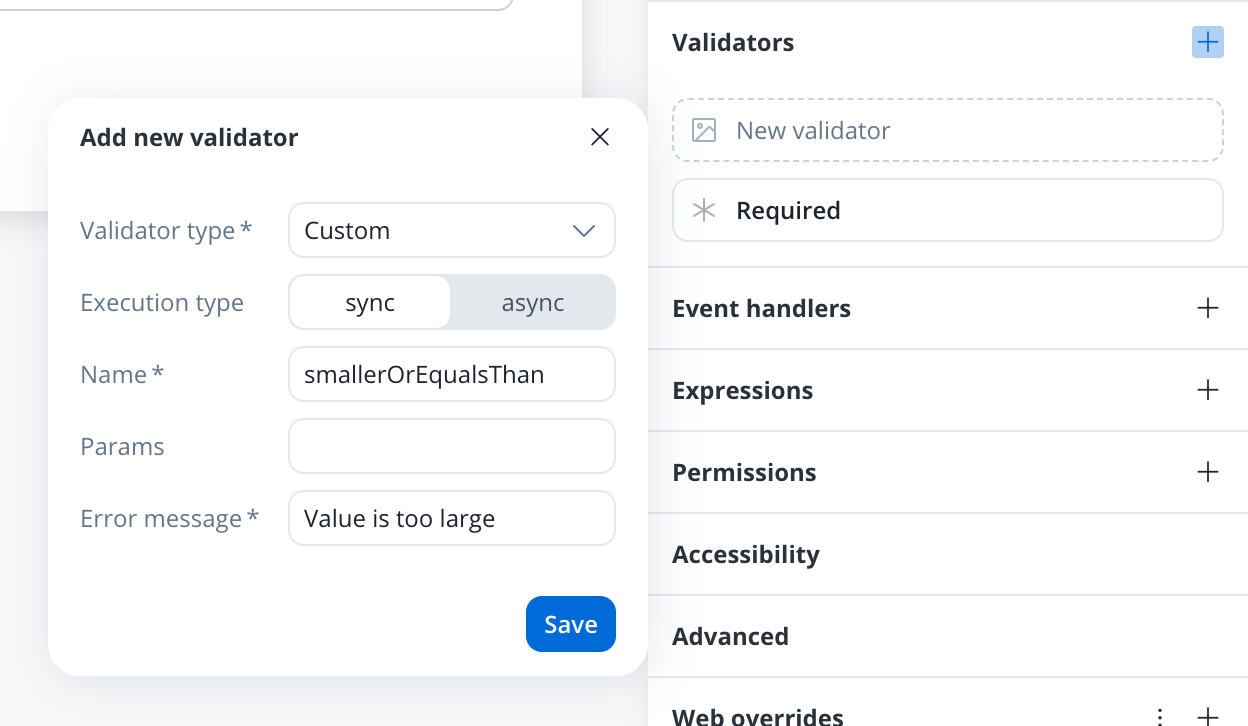
Custom validator example
Below you can find an example of a custom validator (currentOrLastYear) that restricts date selection to the current or the previous year:
currentOrLastYear
smallerOrEqualsToNumber
Below is another custom validator example that validates form input asynchronously. The validator is calledsmallerOrEqualsToNumber and takes an array of params as an input.
For this custom validator the execution type should be marked as
async using the UI Designer.null, indicating that the input is valid. If the input value is greater than the maximum loan amount value, the function returns a validation error object with a key smallerOrEqualsToNumber and a value of true, indicating that the input is invalid.
For more details about custom validators, see Custom validators in the Angular renderer and React renderer SDK pages.
Academy courses
Hide and Disable course
Academy course on building dynamic UI logic with hide and disable conditions, including validation behavior