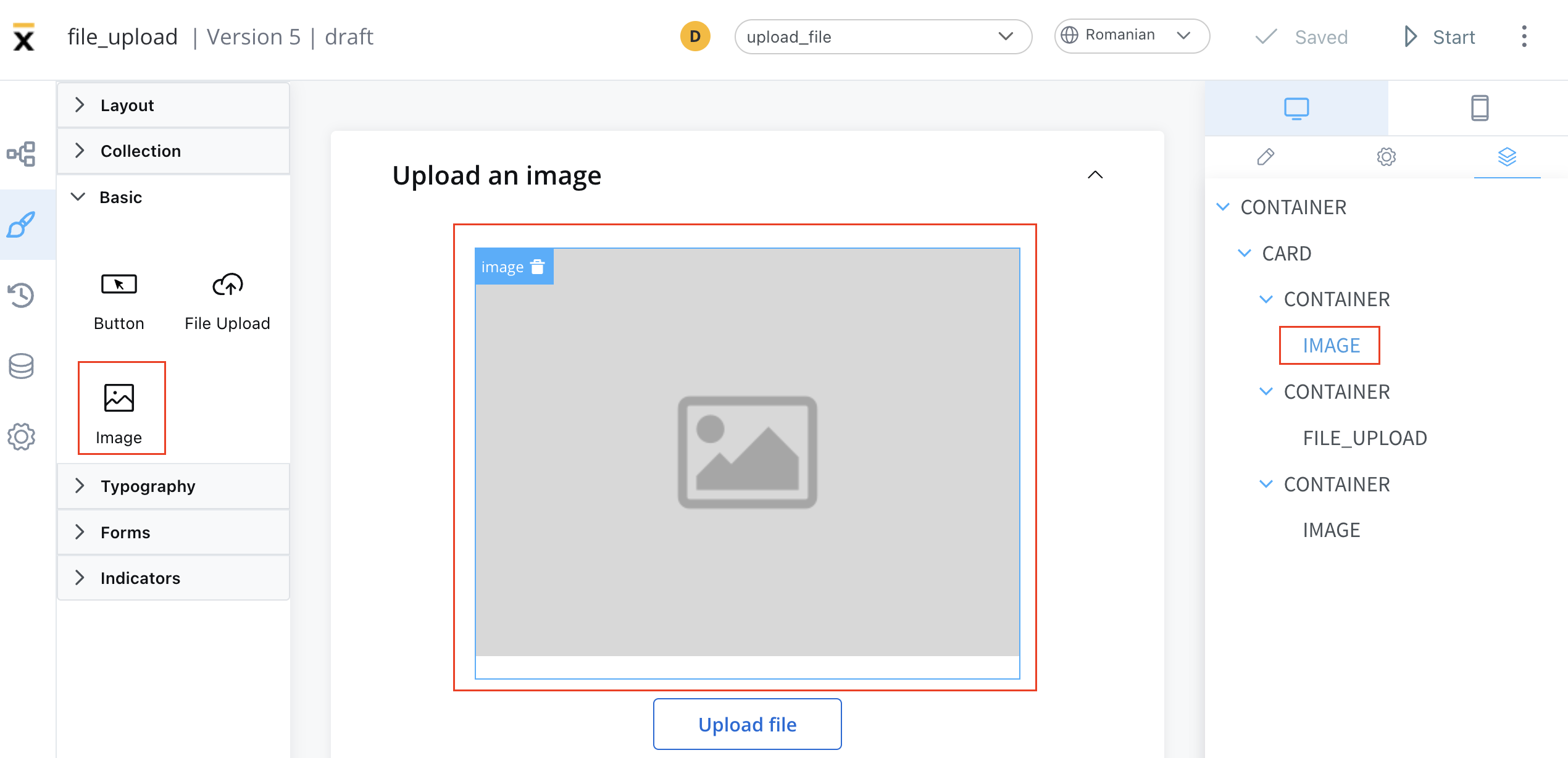
These elements can be added to your interface using the UI Designer tool, and they are often used to convey information, enhance the aesthetic appeal of an interface, provide visual cues and feedback, support branding and marketing efforts, or present complex data or concepts in a more intuitive and accessible way.
Configuring an image
Configuring an image in the UI Designer involves specifying various settings and properties. Here are the key aspects of configuring an image:
Image settings
The image settings consist of the following properties:
-
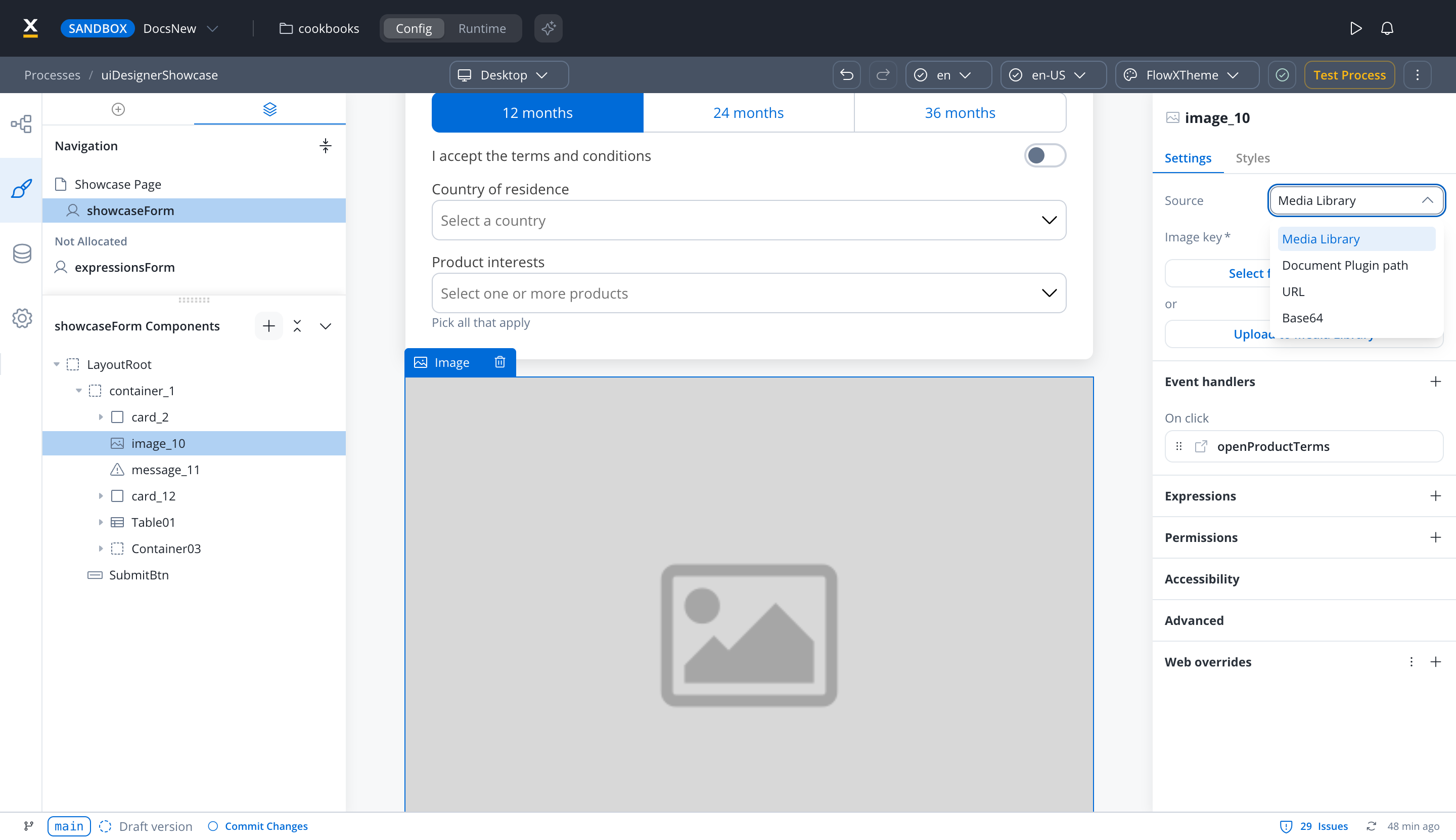
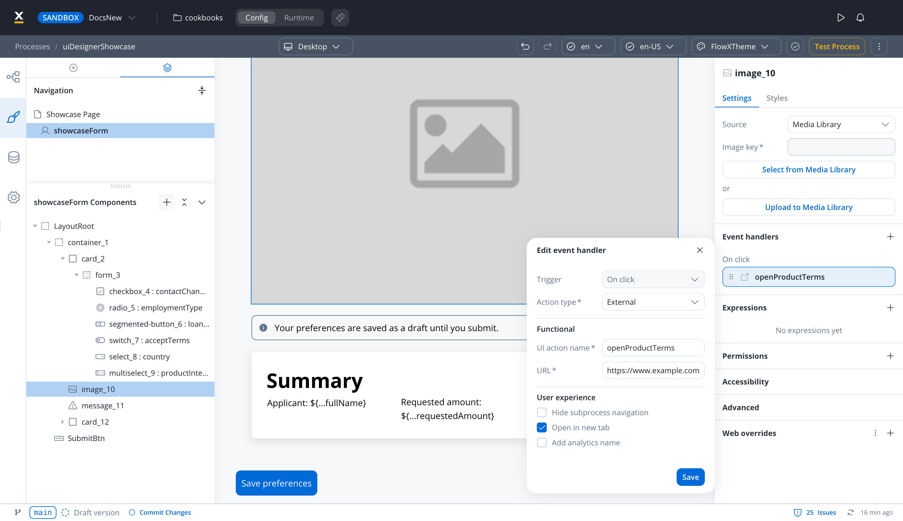
Source - where the image is loaded from:
- Media Library
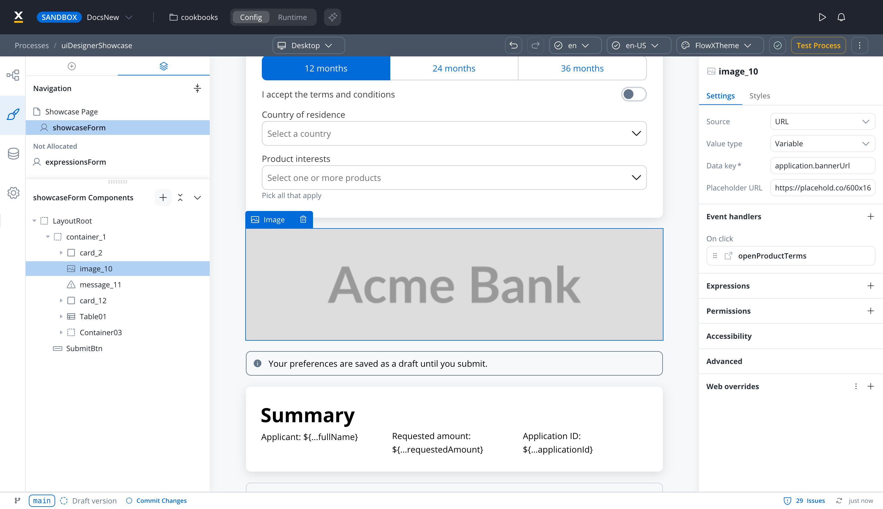
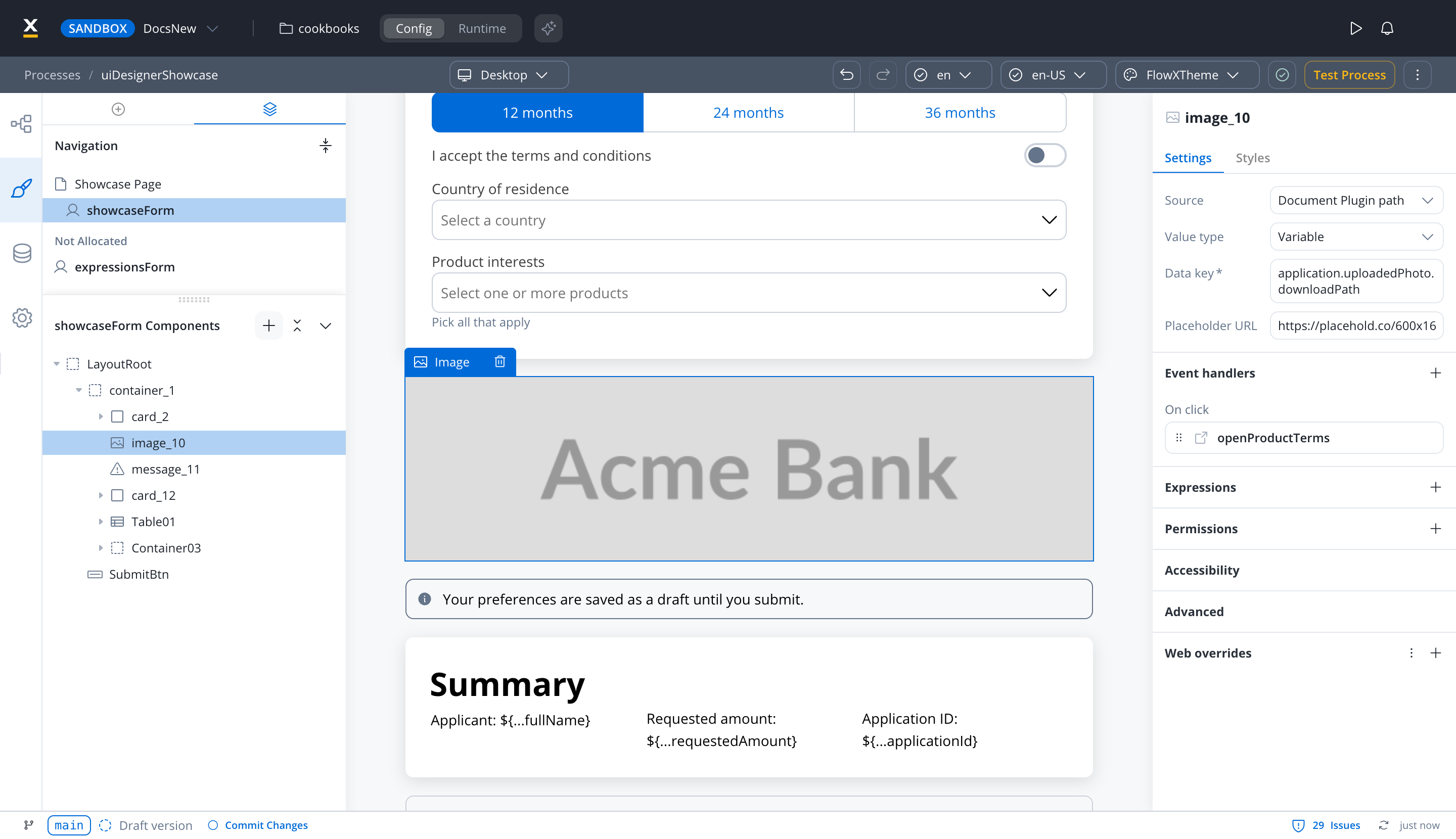
- Document Plugin path (process user tasks): a Documents plugin
downloadPath, such as the one in an upload reply. The renderer adds the Documents plugin base URL, so no business rule is needed.
- Document Plugin (UI Flows): an object that contains
downloadPath, such as an upload reply.
- URL: a complete, absolute URL, used as-is. The renderer attaches the user’s access token only when the URL ends in
download.
- Base64: a Base64-encoded image string.
-
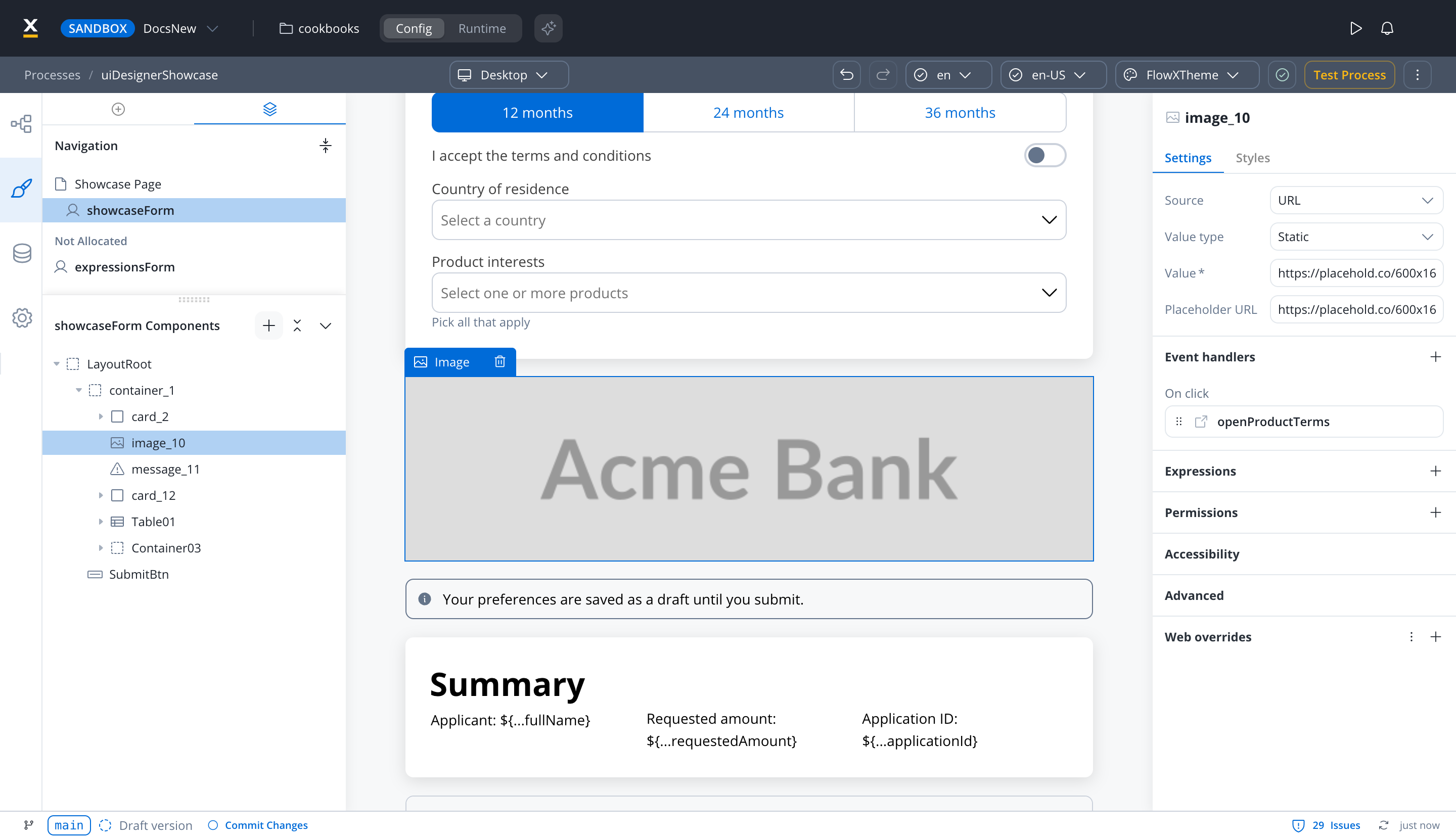
Value type - for Document Plugin path, URL, and Base64: Static for a fixed value, or Variable to read it from a data key. Document Plugin always reads a data key.
-
Placeholder URL - for every source except Media Library, the public URL where the image placeholder is available.
Depending on which Source is selected, different configurations are available:
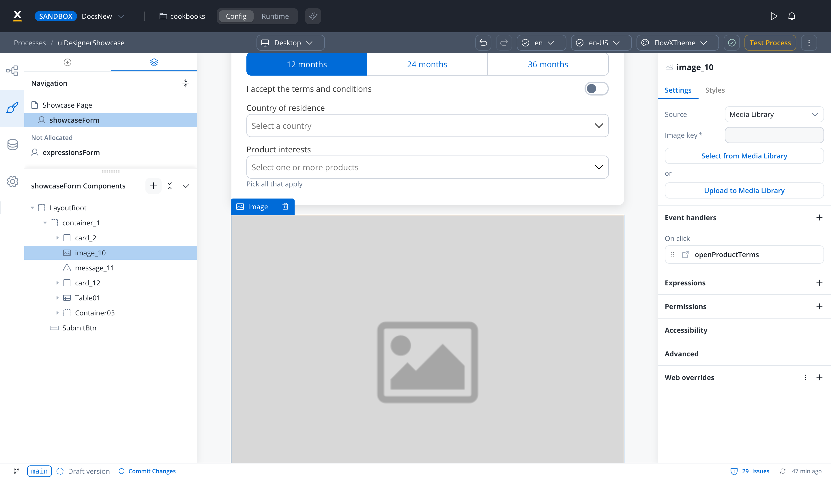
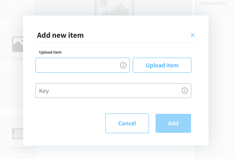
- Image key - the key of the image from the media library
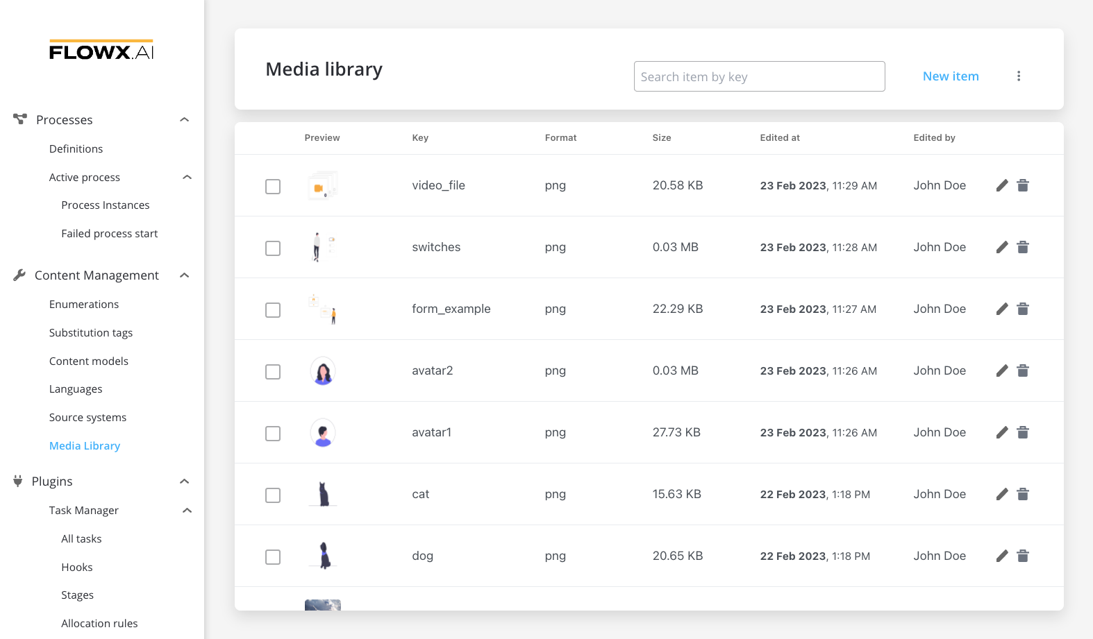
- Select from Media Library - search for an item by key and select it from the media library
- Upload to Media Library - add a new item (upload an image on the spot)
- upload item - supported formats: PNG, JPG, GIF, SVG, WebP; ❗️(maximum size - 50 MB by default)
- key - the key must be unique and cannot be changed afterwards
Variable value
- Set Value type to Variable and enter the Data key that holds the value.
- With URL, the value at that key is used as-is, so it must be a complete, absolute URL. With Base64, the key holds the encoded image.
- To show a file uploaded through the Documents plugin, set Source to Document Plugin path in a process user task and point the key at the upload reply’s
downloadPath. In a UI Flow, use Document Plugin and point the key at an object that contains downloadPath, such as an upload reply. In both cases the renderer builds the URL. See Preview an uploaded file for the upload reply.
- Provide a Placeholder URL for public access. This is the URL where the image placeholder is available.
Static value
- Source: URL or Base64, with Value type set to Static
- Value: the valid URL of the image, or the Base64 string.
- Placeholder URL: the public URL where the image placeholder is available
Event handlers
The image supports the On click trigger. In a process user task, the event handler offers Run local script, Node action, Dismiss, Start project, and External. A Node action runs an action configured on the same node. In a UI Flow, the event handler offers Run local script, Start process, Start workflow, External, Navigate to, and Dismiss. For more information, see the Event Handlers documentation.
Expressions
- Hide condition: hides the image when the expression evaluates to
true. Add it in the Expressions section. The image has no Disable condition.
Image settings overrides
You can override the image settings from the Generic tab for one platform (Web, iOS, or Android). Available override settings:
- Properties:
- Image source: override where the image is loaded from.
- Expressions:
- Hide: override the hide expression.
Accessibility
- Mark as decorative: marks the image as decorative so assistive technologies ignore it. Turn it on for images that carry no information.
- Alt text: a short text alternative that screen readers announce in place of the image. The field is unavailable while Mark as decorative is on.
Image styling
The image styling property allows you to add or to specify valid CSS properties for the image. For more information, see the styling documentation.
Theme overrides
You can override these style options from your theme for one platform (Web, iOS, or Android):
- Border Color
- Border Width
- Border Radius
- Shadow
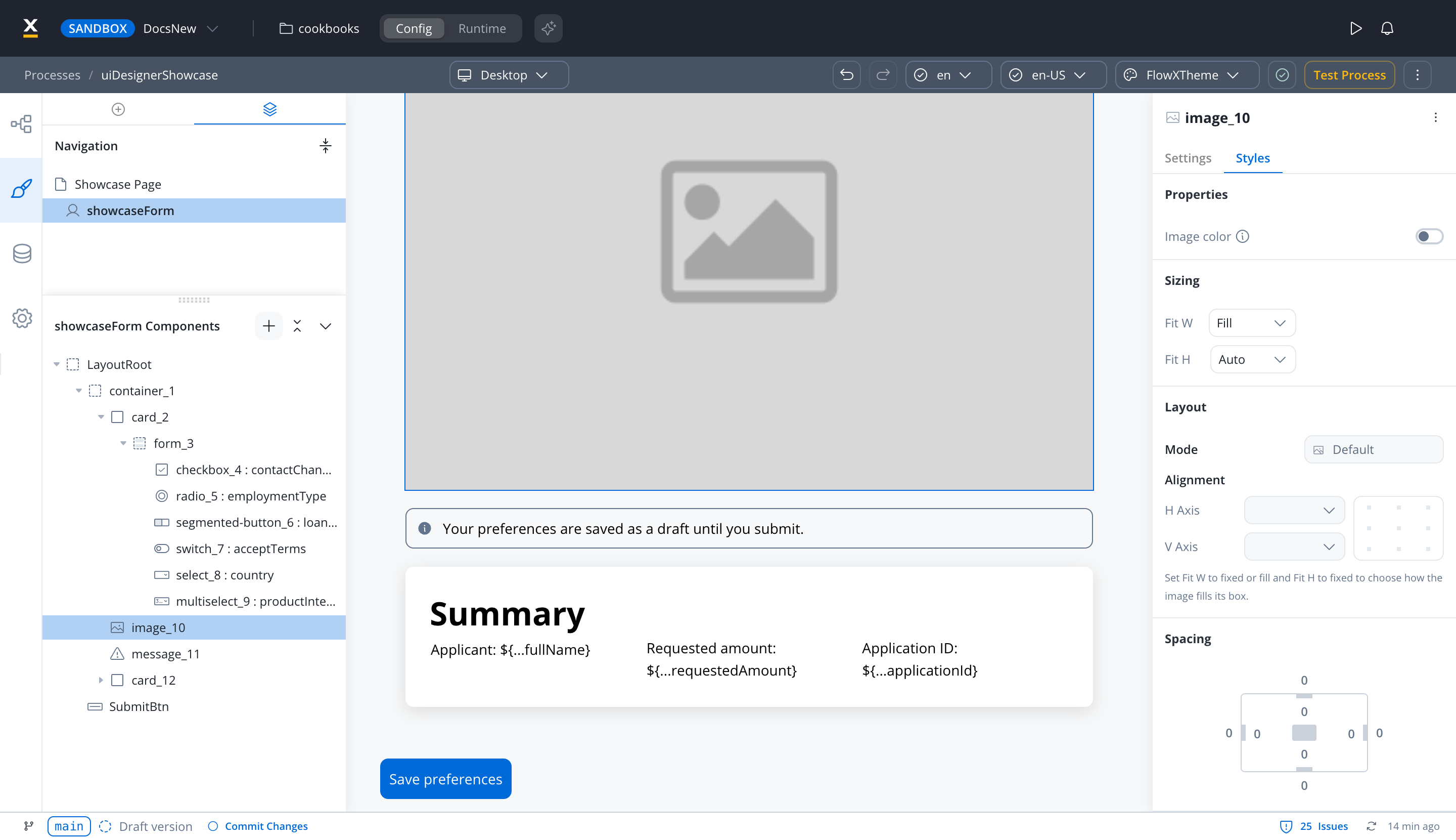
Color
The image component has a Color property that applies a color to the image, useful for tinting single-color icons and SVGs so they match a theme without editing the source asset. To set it, open the component’s Styles tab, turn on Image color in the Properties section, and pick the Color. SVG graphics are recolored while keeping their shapes. For other image formats, the color covers the entire image area. The web, Android, and iOS renderers apply the color. Last modified on November 13, 2026