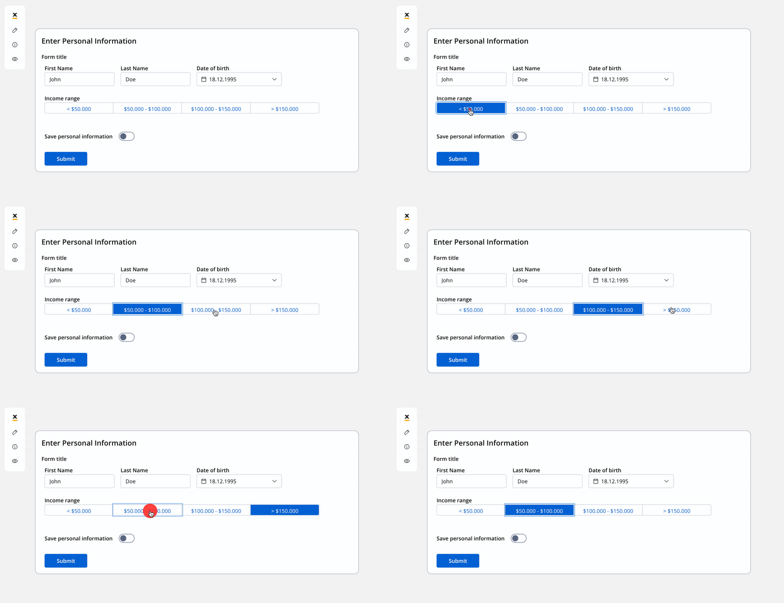
Configuring the segmented button
Segmented button generic settings
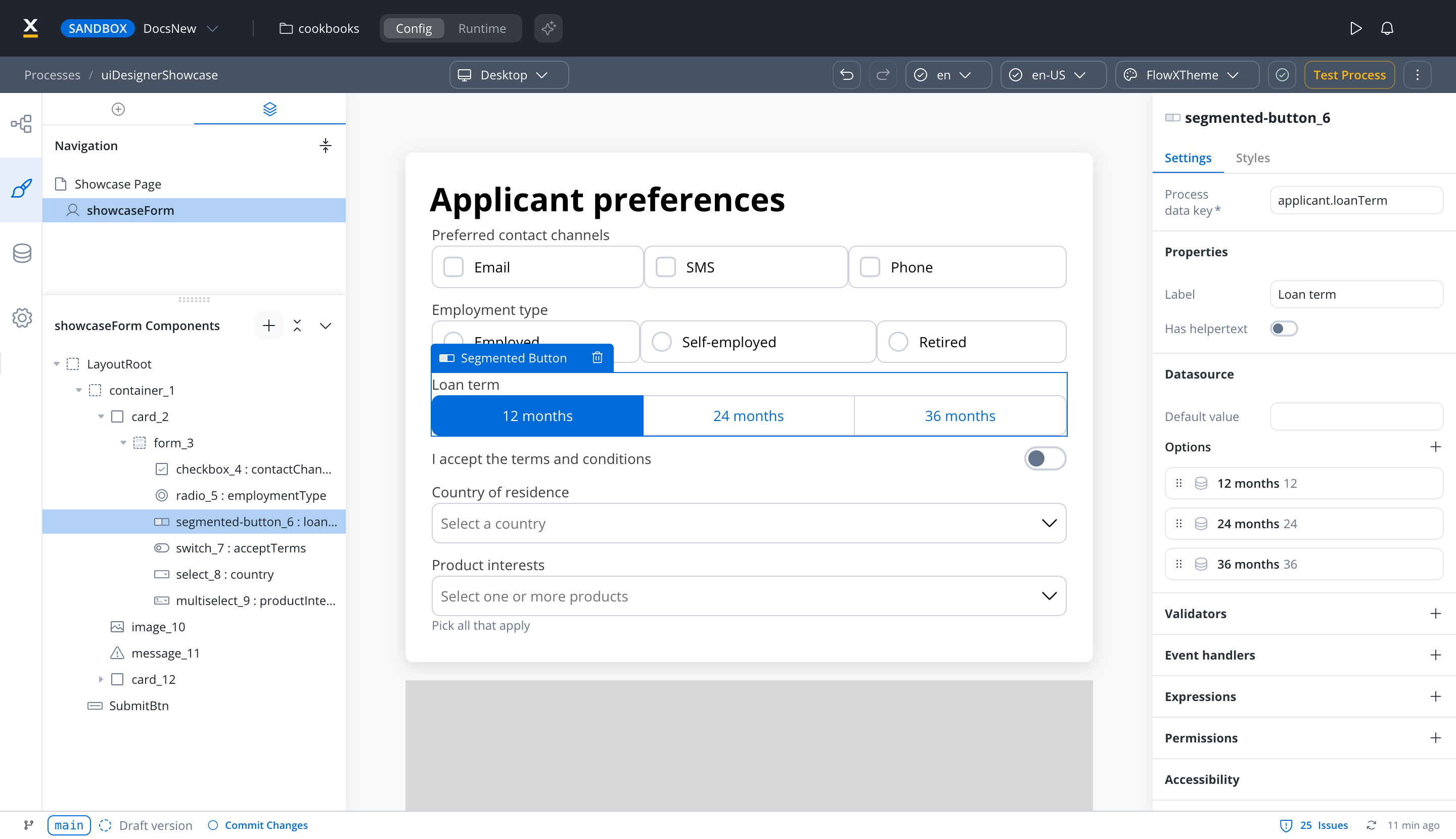
The available configuration options for this form element are:- Process data key
- Properties
- Datasource
- Validators
- Event handlers
- Expressions
- Segmented button styling
Process data key
Process data key establishes the binding between the segmented button and process data, enabling its later use in decisions, business rules or integrations.Properties
- Label: The visible label for the segmented button.
- Helpertext: Additional information about the segmented button, which can be optionally hidden within an infopoint.
Datasource configuration
- Default value: The option selected when the segmented button first renders. Type the value of one of the options defined below.
- Options → Add new (+): Define label and value pairs here. The options are always static, so there is no source type to choose. The group needs at least 2 and at most 5 options.
Validators
The following validators can be added to a segmented button:required, customExpression and custom. For more information, see the validators documentation.
Event handlers
Event handlers can be added to the segmented button element to define its behavior and interactions.- Trigger: On change (
CHANGE). - Action type: Select the action type.
Expressions
Use JavaScript expressions to hide or disable the segmented button:- Hide condition: Hides the segmented button when the expression evaluates to true.
- Disable condition: Disables the segmented button when the expression evaluates to true.
Segmented button settings overrides
There are instances where you may need to tailor settings configured in the Generic settings tab. This proves especially beneficial when you wish to adjust these settings to appear differently across various platforms such as Web, Android, or iOS. Available override settings:- Properties:
- Label: Override the segmented button label.
- Helper: Override helper text/info point.
- Expressions:
- Hide: Override the hide expression.
To reuse settings overrides on another platform, open the ⋮ menu next to <platform> overrides and pick Copy from <platform> or Copy to <platform>: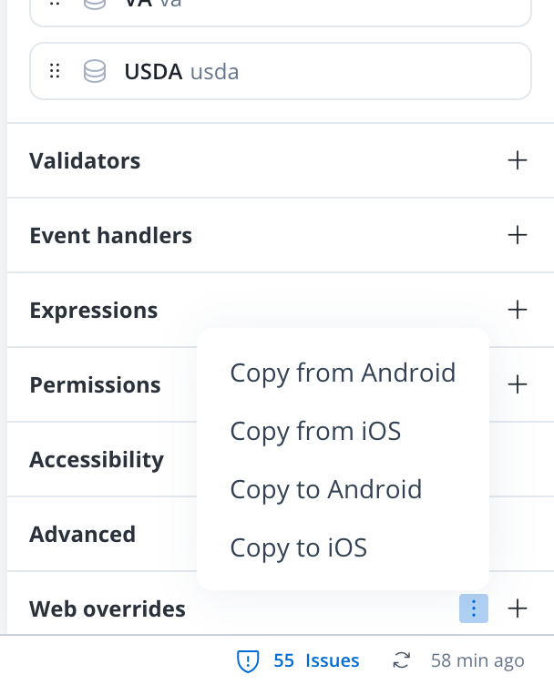
- Web
- iOS
- Android
- Sizing
- Spacing
- Grid child
Adjusting the size of components is crucial for a responsive design. Fit W (width) offers three options:
- Fill: Fills the available space.
- Fixed: Maintains a fixed width.
- Auto: Adjusts the width automatically based on content.
Segmented button style overrides options
Theme overrides refer to the ability to modify or customize the appearance and behavior of UI components by overriding default theme settings. This can be applied at various levels, such as specific elements or entire sections, and can be platform-specific (Web, iOS, Android).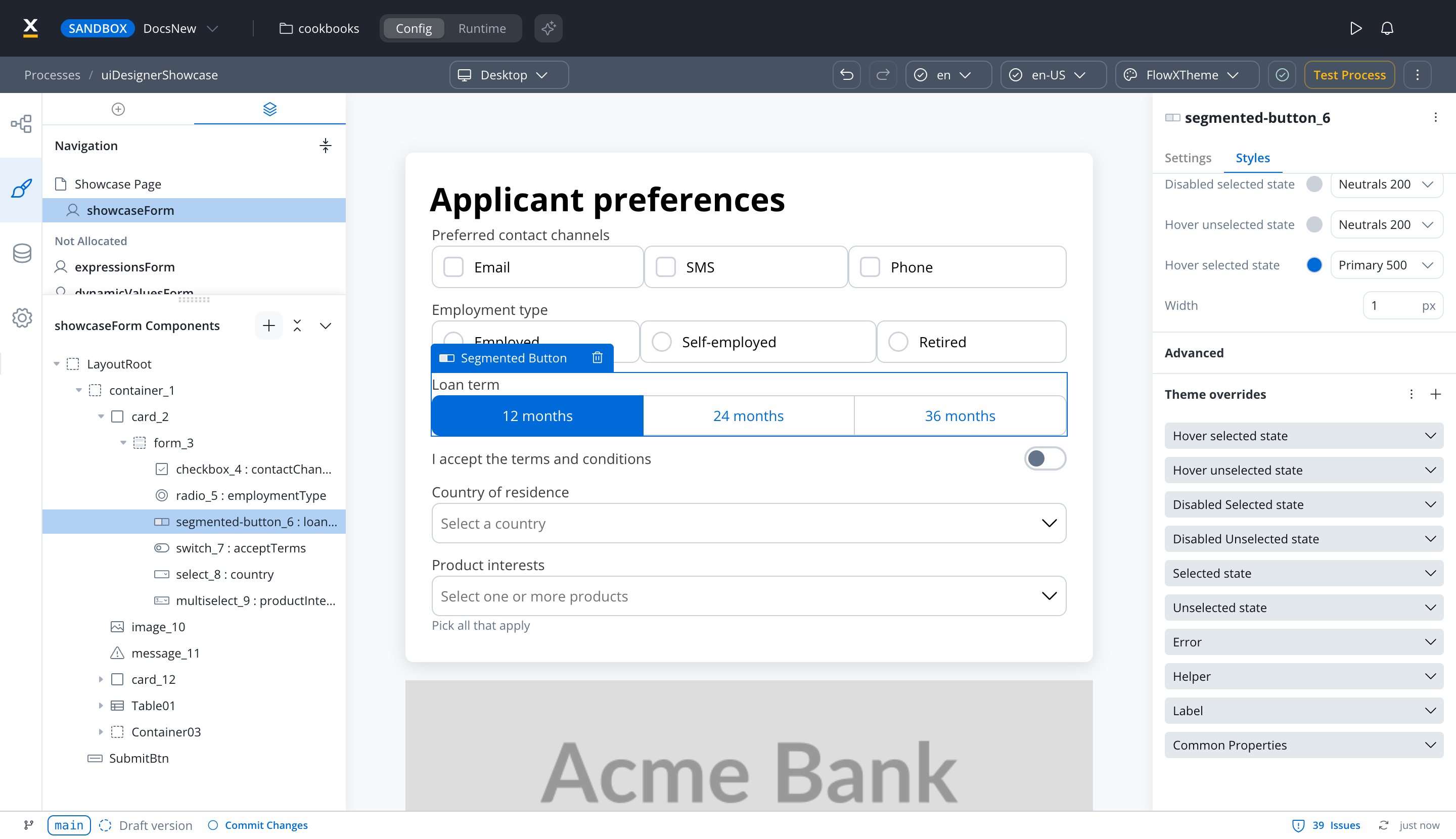
Common Properties
Common Properties
- Border radius [NUMBER]
- Border width [NUMBER]
- Font [FONT]
Label
Label
- Default state
- Text [COLOR]
- Disabled state
- Text [COLOR]
- Font [FONT]
Helper
Helper
- Text [COLOR]
- Font [FONT]
- Helper tooltip
- Font [FONT]
- Text [COLOR]
- Background [COLOR]
- Icon [COLOR]
Error
Error
- Text [COLOR]
- Font [FONT]
Unselected state
Unselected state
- Border [COLOR]
- Background [COLOR]
- Text [COLOR]
Selected state
Selected state
- Border [COLOR]
- Background [COLOR]
- Text [COLOR]
Disabled Unselected state
Disabled Unselected state
- Border [COLOR]
- Background [COLOR]
- Text [COLOR]
Disabled Selected state
Disabled Selected state
- Border [COLOR]
- Background [COLOR]
- Text [COLOR]
Hover unselected state (only for Web configuration)
Hover unselected state (only for Web configuration)
- Border [COLOR]
- Background [COLOR]
- Text [COLOR]
Hover selected state (only for Web configuration)
Hover selected state (only for Web configuration)
- Border [COLOR]
- Background [COLOR]
- Text [COLOR]
On iOS, Common Properties offers only Font, and the only states are Unselected state and Selected state, each with Background and Text.
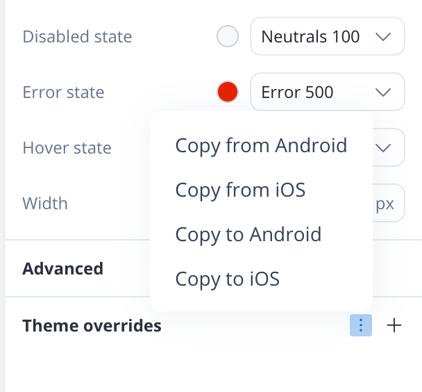
To reuse theme overrides on another platform without configuring them again, open the ⋮ menu next to Theme overrides and pick Copy from <platform> or Copy to <platform>.