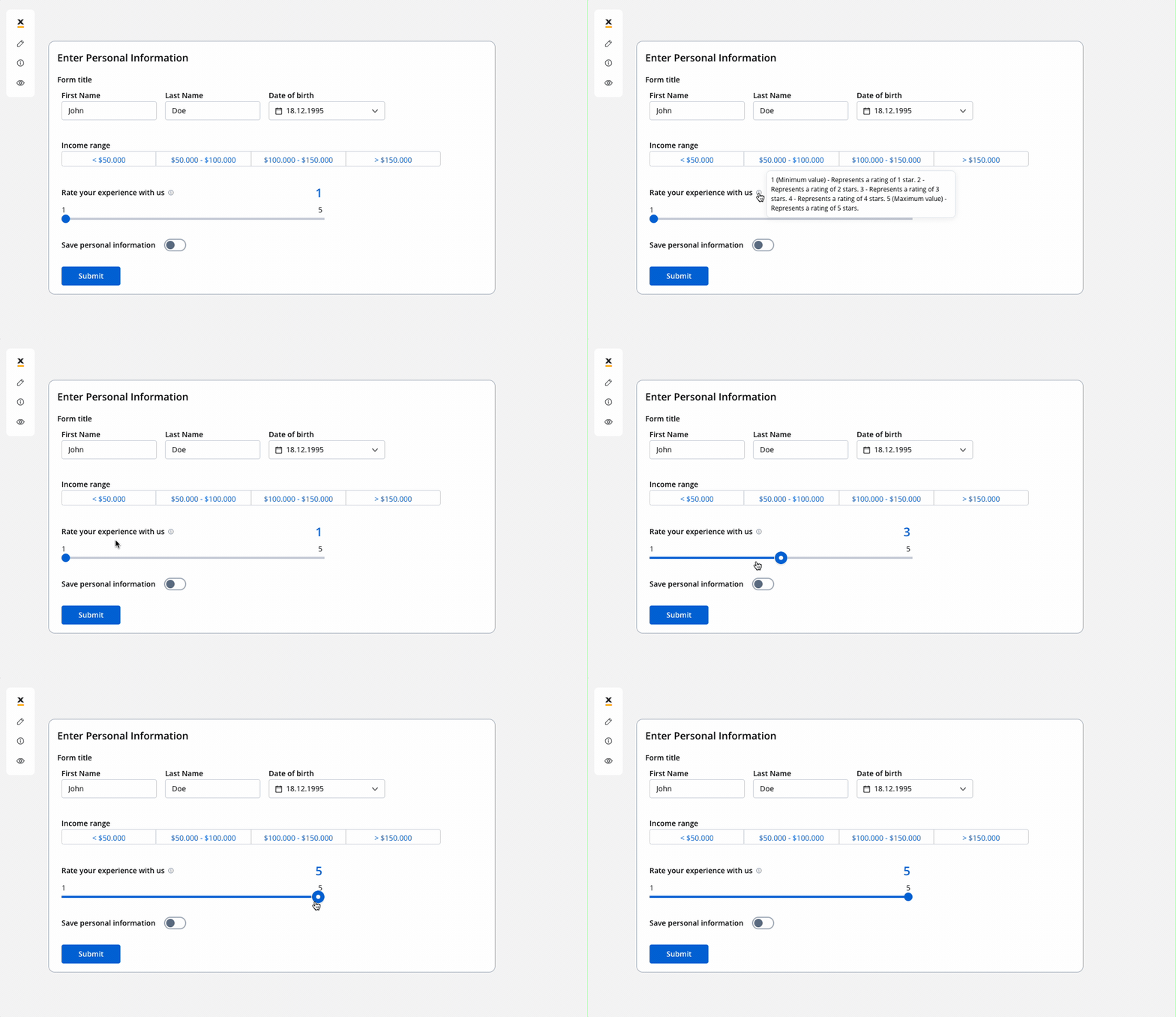
 The slider component lets end users pick a numeric value from a defined range by dragging a handle. You set the range with min and max values, control granularity with a step size, and can display the selected value with an optional suffix such as a unit of measurement. Like other form elements, the slider binds to a process data key so the selected value can drive business rules, decisions, and integrations.
Configuring the slider element
Slider generic settings
The available configuration options for this form element are:- Process data key
- General properties
- Formatting
- Datasource
- Validators
- Event handlers
- Expressions
- Slider styling
Process data key
Process data key establishes the binding between the slider element and process data, enabling its later use in decisions, business rules or integrations.General properties
- Label: The visible label for the slider element.
- Show value label: Shows the currently selected value as a label. On by default.
- Min value: The lowest selectable value. Required, default
1. Accepts a computed value (f(x)). Min value can’t be greater than Max value. - Max value: The highest selectable value. Required, default
100. Accepts a computed value (f(x)). - Suffix: Optional text, such as a unit of measurement, shown after the value label and after the min and max labels. The field is disabled when the process data key is of type currency.
- Step size: The increment by which the value changes when the handle moves. Required, default
1. - Helpertext: Additional information about the slider element, which can be optionally hidden within an infopoint.
Formatting
- Display formatting: When on, the slider shows its values in the localized currency format and hides the suffix.
Datasource configuration
Default value: The value the slider is set to when it first renders. Enter a number, or switch to a computed value (f(x)) to calculate it with a JavaScript expression.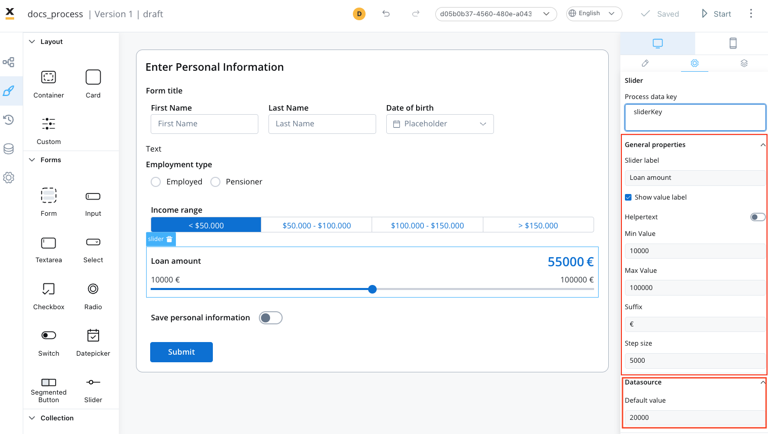
Validators
The following validators can be added to a slider:required, customExpression and custom. For more information, see the validators documentation.
Event handlers
Event handlers can be added to the slider element to define its behavior and interactions.- Trigger: On change (
CHANGE). - Action type: Select the action type. For more information, see the Event Handlers documentation.
Expressions
- Hide condition: A JavaScript expression that hides the slider element when it returns a truthy value.
- Disable condition: A JavaScript expression that disables the slider element when it returns a truthy value.
A disabled condition doesn’t need a matching hide condition: each one works on its own. Hidden and disabled fields are both left out of validation.
Multiple sliders
You can also use multiple sliders UI elements that are interdependent, as you can see in the following example: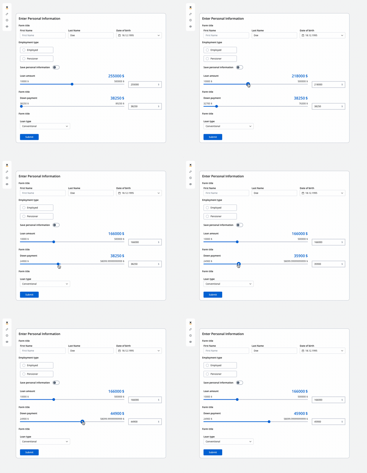
You can improve the configuration of the slider using computed values as in the example above. These values provide a more flexible approach for handling complex use cases. You can find an example by referring to the following documentation:Dynamic & computed values
Slider settings overrides
There are instances where you may need to tailor settings configured in the Generic settings tab. This proves especially beneficial when you wish to adjust these settings to appear differently across various platforms such as Web, Android, or iOS. Available override settings:- Properties:
- Label: Override the slider label.
- Helper: Override helper text/info point.
- Suffix: Override the suffix.
- Show value: Override the show value option.
- Expressions:
- Hide: Override the hide expression.
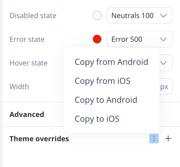
To reuse settings overrides on another platform, open the ⋮ menu next to <platform> overrides and pick Copy from <platform> or Copy to <platform>: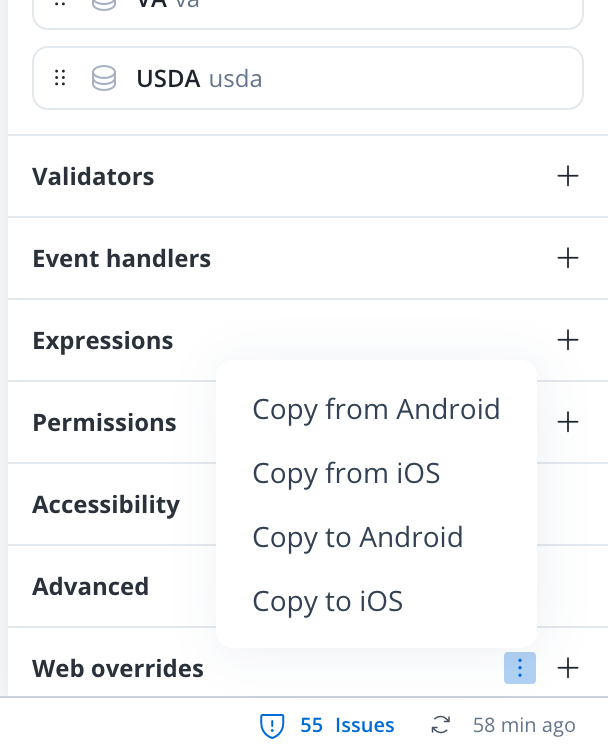
Slider styling
- Web
- iOS
- Android
- Sizing
- Spacing
- Grid child
Adjusting the size of components is crucial for a responsive design. Fit W (width) offers three options (default Fill):
- Fill: Fills the available space.
- Fixed: Maintains a fixed width.
- Auto: Adjusts the width automatically based on content.
Slider style overrides options
Theme overrides refer to the ability to modify or customize the appearance and behavior of UI components by overriding default theme settings. This can be applied at various levels, such as specific elements or entire sections, and can be platform-specific (Web, iOS, Android).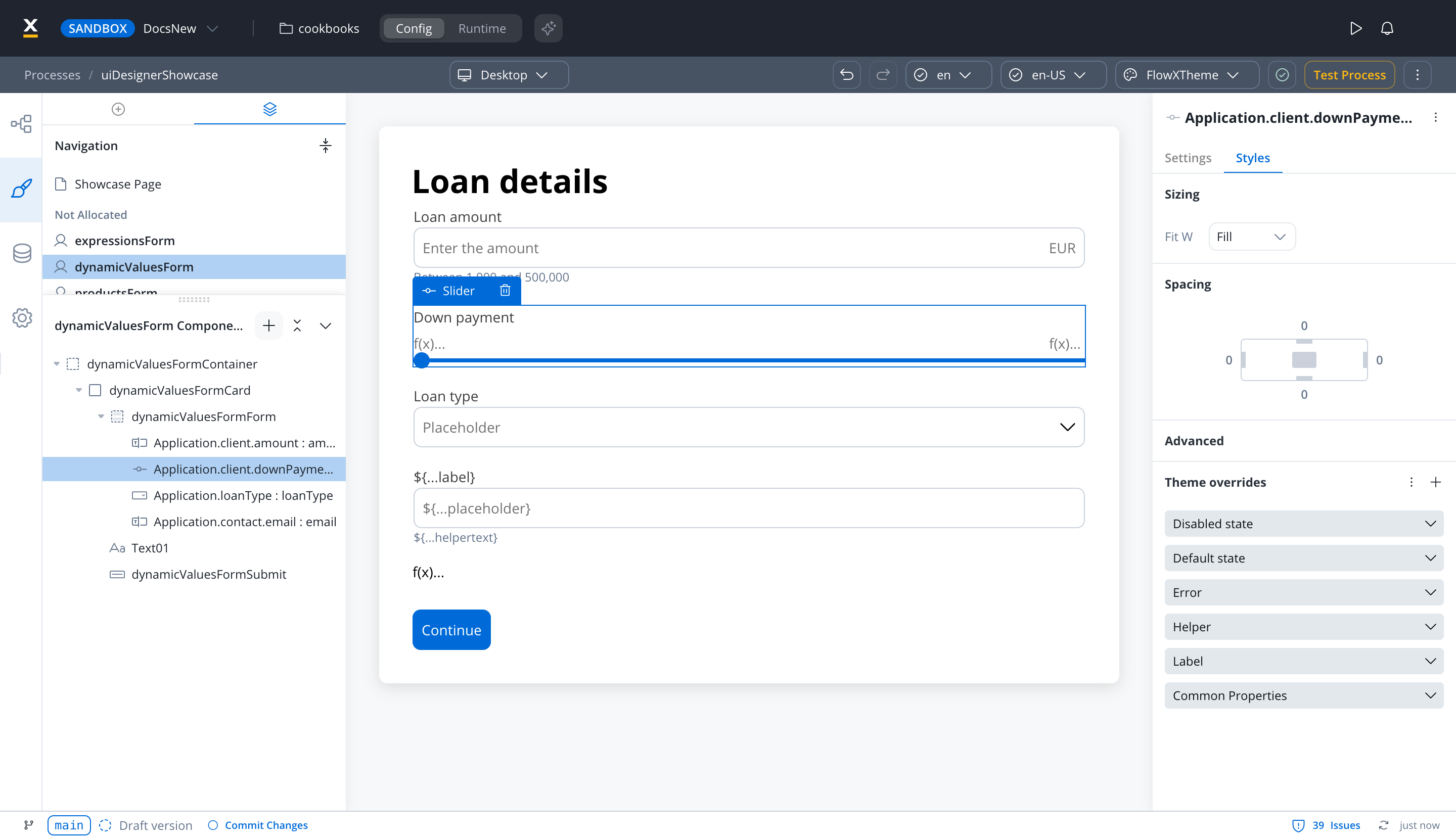
Common Properties
Common Properties
- Limits Font [FONT]
- Font [FONT]
Label
Label
- Default state
- Text [COLOR]
- Disabled state
- Text [COLOR]
- Font [FONT]
Helper
Helper
- Text [COLOR]
- Font [FONT]
- Helper tooltip
- Font [FONT]
- Text [COLOR]
- Background [COLOR]
- Icon [COLOR]
Error
Error
- Text [COLOR]
- Font [FONT]
Default state
Default state
- Limits [COLOR]
- Value [COLOR]
- Filled [COLOR]
- Empty [COLOR]
- Knob [COLOR]
On iOS, overrides for the Knob are not available.
Disabled state
Disabled state
- Limits [COLOR]
- Value [COLOR]
- Filled [COLOR]
- Empty [COLOR]
- Knob [COLOR]
On iOS, overrides for the Filled and Empty states, as well as the Knob, are not available.
To reuse theme overrides on another platform without configuring them again, open the ⋮ menu next to Theme overrides and pick Copy from <platform> or Copy to <platform>.