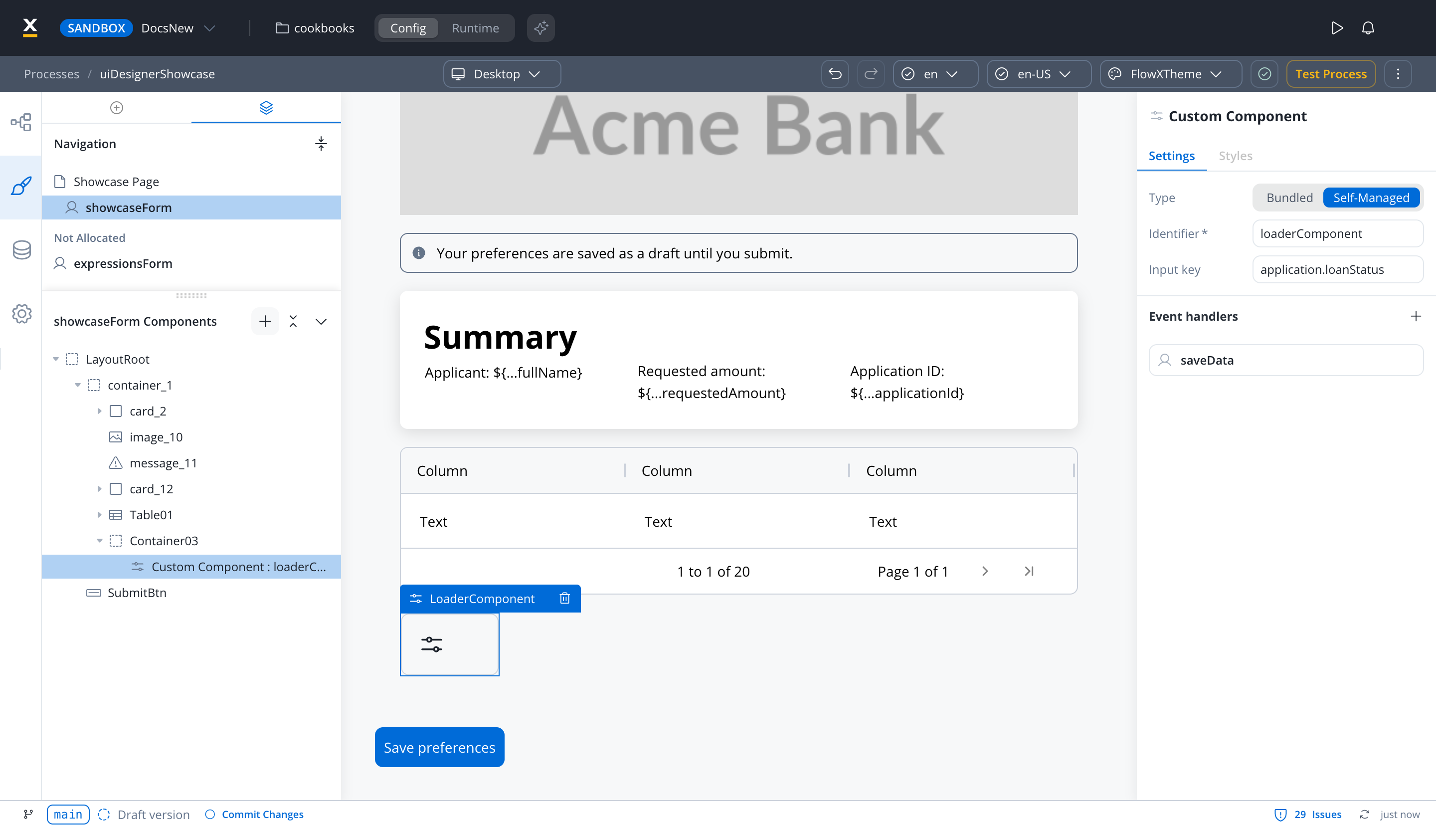
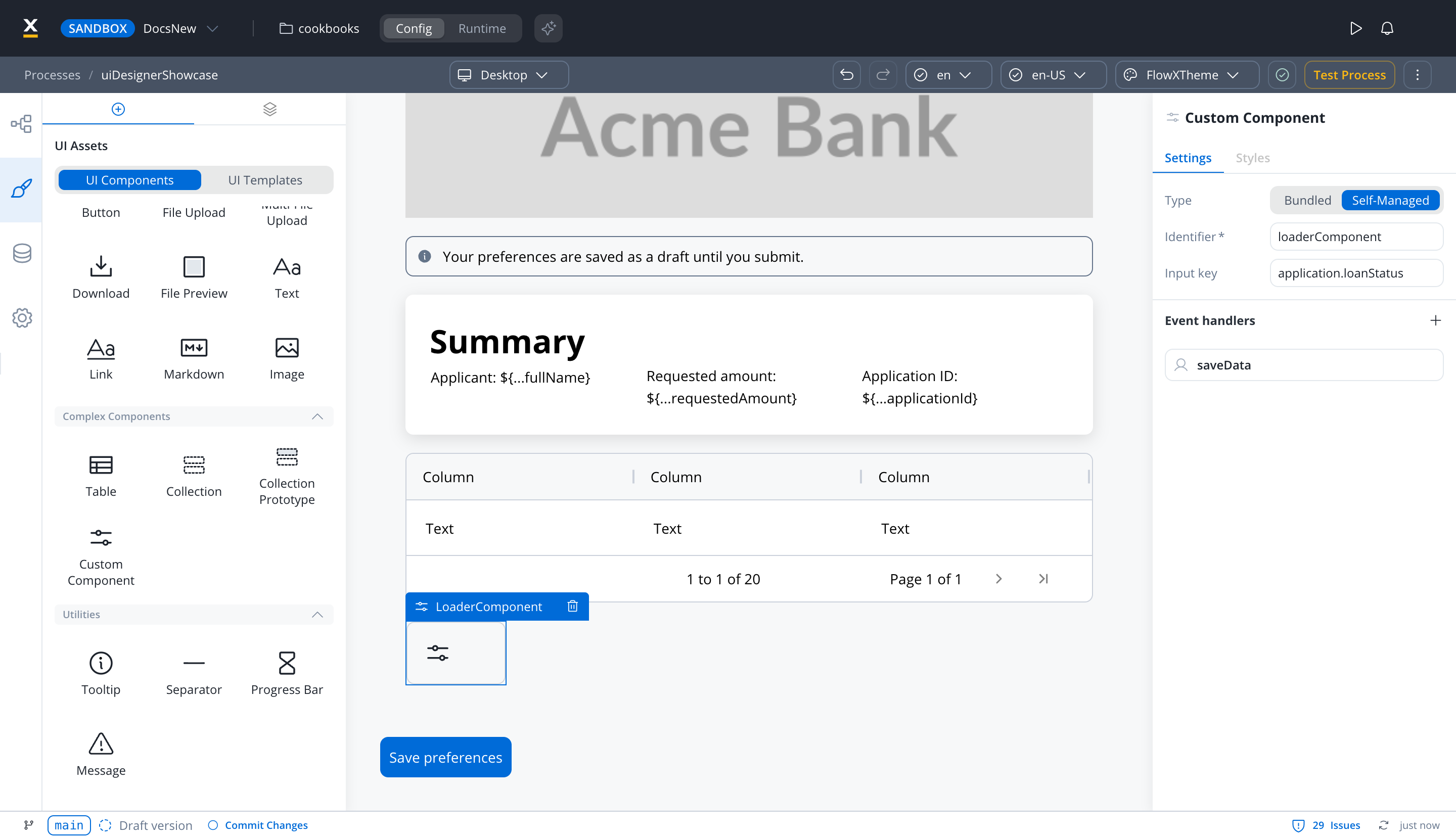
Custom components are developed in the web application and referenced here by component identifier. This will dictate where the component is displayed in the component hierarchy and what actions are available for the component.
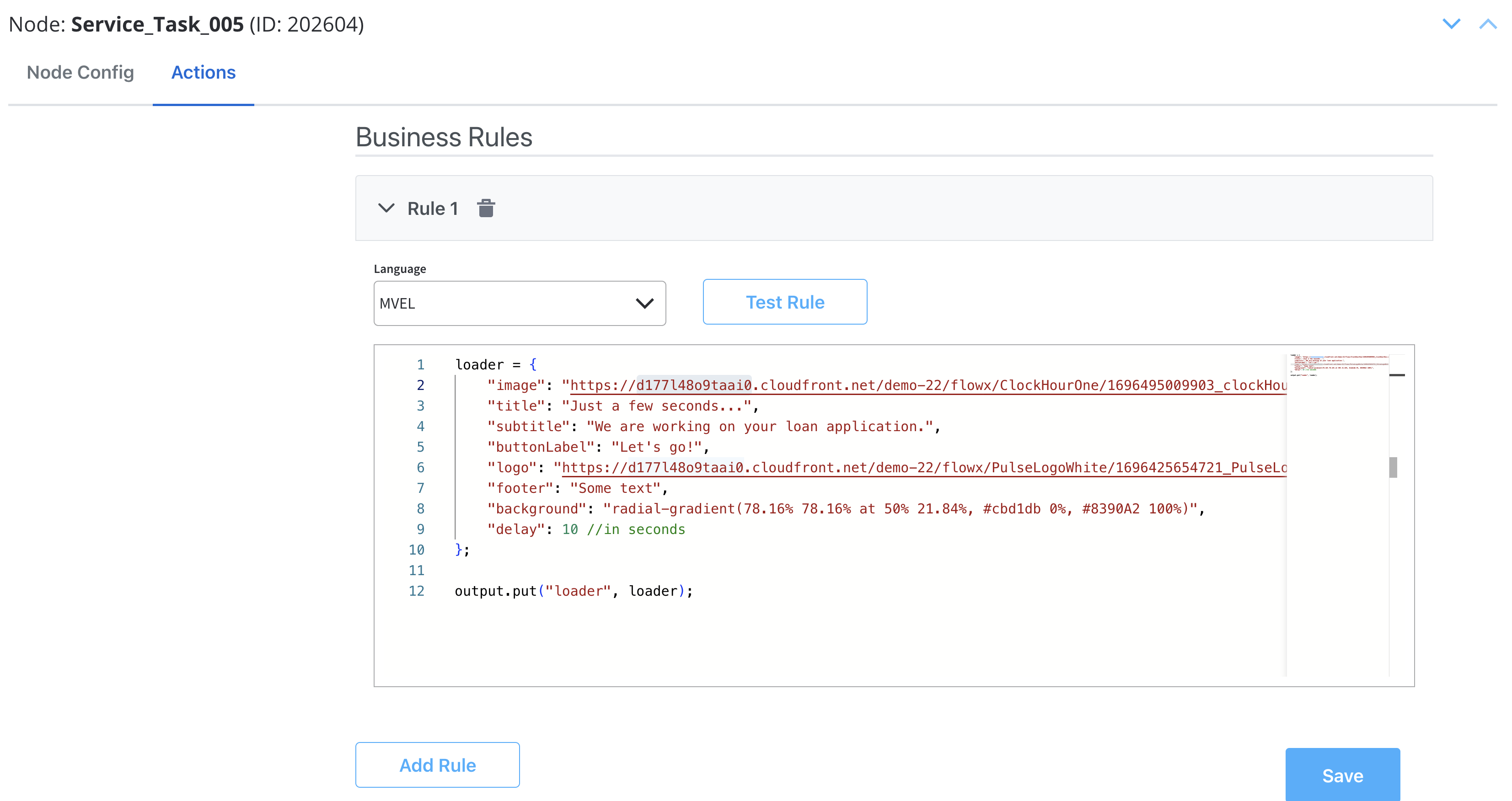
Starting with 3.4.7 platform version, for User Tasks containing UI Elements, when the page is rendered, the Backend (BE) should, by default, send to the Frontend (FE) all available data as process variables with matching keys.If the User Task also includes a custom component, the BE should send, in addition to default keys, objects listed in the Custom UI payload field of the root element.
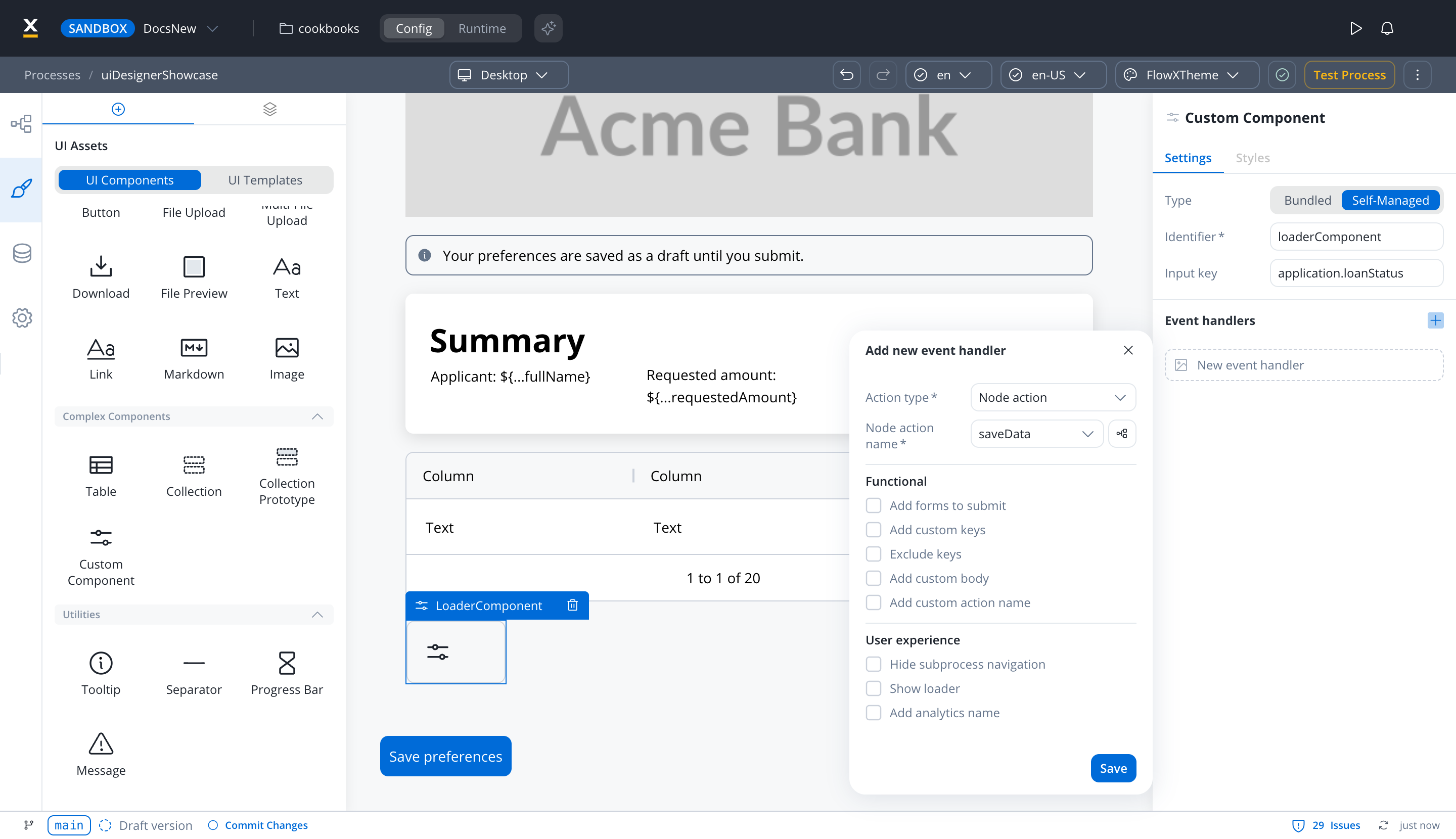
To add a custom component in the template config tree, we need to know its unique identifier and the data it should receive from the process model.
The properties that can be configured are as follows:
Type (Web platform only) - Bundled uses a Custom Component built in the Designer, whose inputs and outputs you map instead of the properties below. Self-Managed uses a component registered in your container app and configured with the properties below. On Android and iOS, the component is always Self-Managed.
Identifier - This enables the custom component to be displayed within the component hierarchy and determines the actions available for the component.
Input key - This is used to specify the pathway to the process data that the component will utilize to receive its information. The field takes a single key.
Event handlers - actions defined here will be made available to the custom component
Prerequisites (before creation)
Angular Knowledge: You should have a good understanding of Angular, as custom components for the Angular SDK are created and imported using Angular. React container apps register custom components through the components prop instead; see Custom components in the React SDK.
Angular CLI: Ensure that you have Angular CLI installed.
Development Environment: Set up a development environment for Angular development, including Node.js and npm (Node Package Manager).
Component Identifier: You need a unique identifier for your custom component. This identifier is used for referencing the component within the application.
Creating a custom component (Web)
To create a Custom Component in Angular, follow these steps:
Create a new Angular component using the Angular CLI or manually.
Implement the necessary HTML structure, TypeScript logic, and SCSS styling to define the appearance and behavior of your custom component.
Importing the component
After creating the Custom Component, you need to import it into your application.In your app.module.ts file (located at src → app → app.module.ts), add the following import statement:
import { YourComponent } from '@app/components/yourComponent.component'
Declaration in AppModule
Standalone components, the Angular default since Angular 19, need no declaration: registering them in FlxProcessModule.withConfig is enough, and listing a standalone component in declarations makes Angular throw an error. Only if your component sets standalone: false, declare it in the same app.module.ts file, within the declarations array in the @NgModule decorator:
To make your Custom Component available for use in processes created in FlowX.AI Designer, you need to declare it in FlxProcessModule.In your process.module.ts file (located at src > app > modules > process > process.module.ts), add the following import statement:
import { YourComponent } from '@app/components/yourComponent.component';
Then, declare your Custom Component in the FlxProcessModule.withConfig function. The key must match the component’s Identifier in the Designer. For the full component contract, see Custom components in the Angular SDK.
Once your Custom Component is declared, you can use it for configuration within your application.
Data input and actions
The Custom Component accepts input data from processes and can also include actions extracted from a process. These inputs and actions allow you to configure and interact with the component dynamically.
Extracting data from processes
There are multiple ways to extract data from processes to use within your Custom Component. You can utilize the data provided by the process or map actions from the BPMN process to Angular actions within your component.
Make sure that the Angular actions that you declare match the names of the process actions.
Styling with CSS
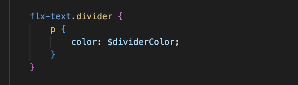
To apply CSS classes to UI elements within your Custom Component, you first need to identify the UI element identifiers within your component’s HTML structure. Once identified, you can apply defined CSS classes to style these elements as desired.Example:
Custom component example
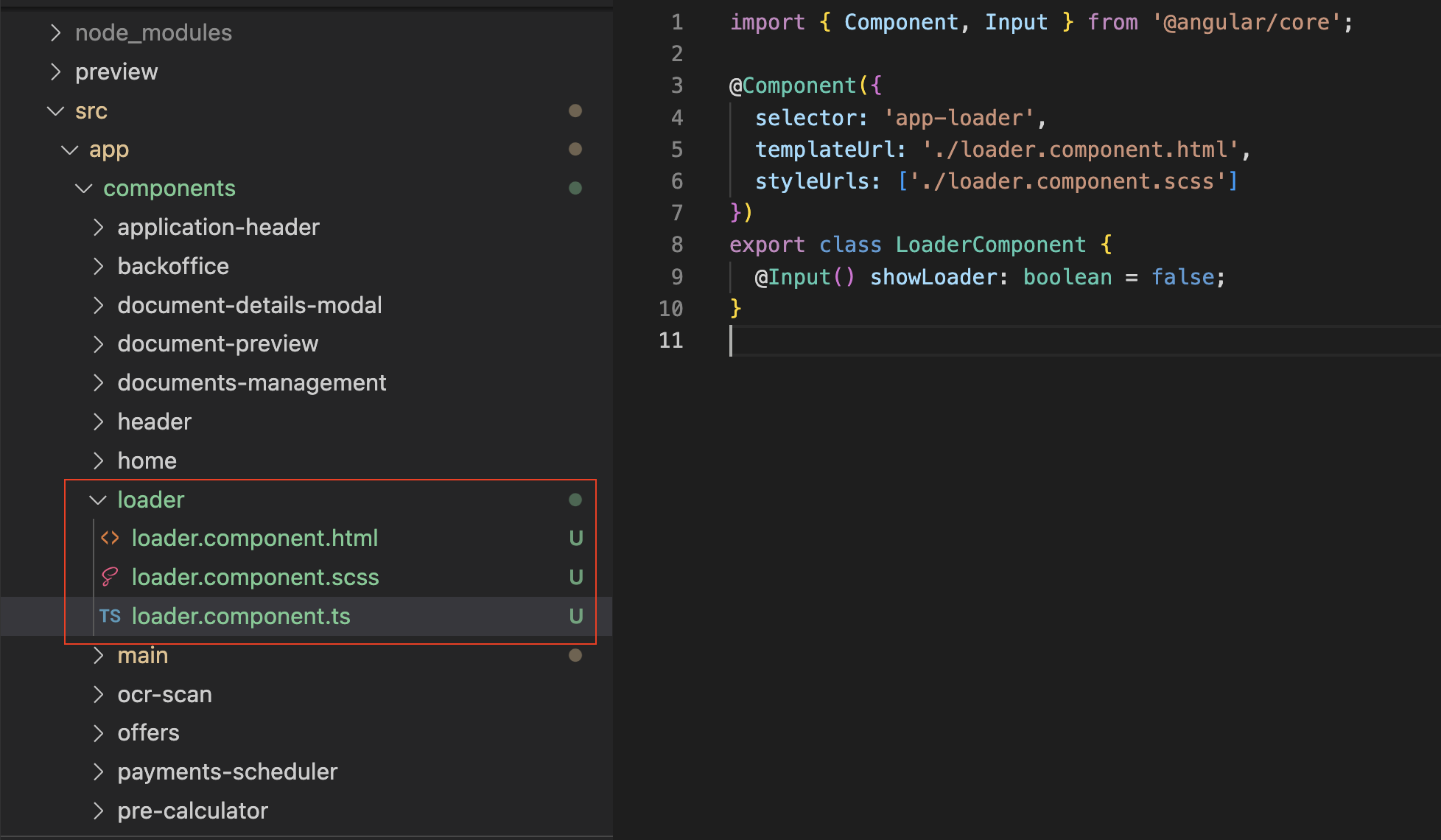
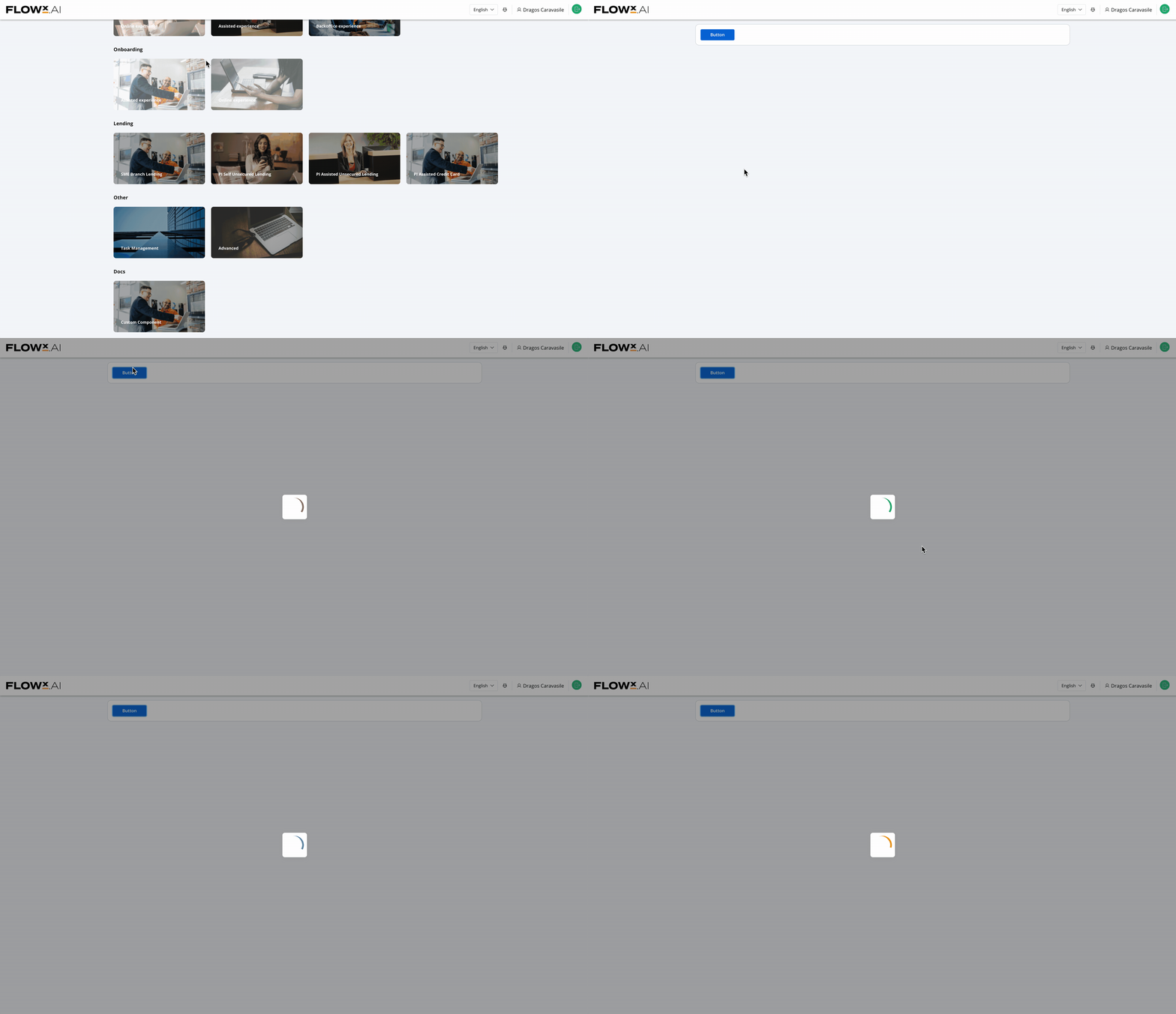
Below you can see an example of a basic custom loader component built with Angular:
Additional considerations
Naming Conventions: Be consistent with naming conventions for components, identifiers, and actions. Ensure that Angular actions match the names of process actions as mentioned in the documentation.
Component Hierarchy: Understand how the component fits into the overall component hierarchy of your application. This will help determine where the component is displayed and what actions are available for it.
Documentation and Testing: Document your custom component thoroughly for future reference. Additionally, testing is crucial to ensure that the component behaves as expected in various scenarios.
Security: If your custom component interacts with sensitive data or performs critical actions, consider security measures to protect the application from potential vulnerabilities.
Integration with FlowX.AI Designer: Ensure that your custom component integrates with FlowX.AI Designer, as it is part of the application’s process modeling capabilities.
Creating a custom component (iOS)
Enhance your skills with our academy course! Learn how to develop and integrate a custom iOS component with FlowX.AI:
iOS Custom Component
Last modified on November 12, 2026
{"docsConfig":{"theme":"mint","$schema":"https://mintlify.com/docs.json","name":"FlowX.AI","description":"Comprehensive documentation for FlowX.AI, the AI-driven process automation platform.","colors":{"primary":"#fcb813","light":"#fcb813","dark":"#fcb813"},"logo":{"light":"https://mintcdn.com/flowxai/38fXEM0a7v86Lg2m/logo/light.png?fit=max\u0026auto=format\u0026n=38fXEM0a7v86Lg2m\u0026q=85\u0026s=d767c06cef433b0a02f40a1f4f785eab","dark":"https://mintcdn.com/flowxai/38fXEM0a7v86Lg2m/logo/dark.png?fit=max\u0026auto=format\u0026n=38fXEM0a7v86Lg2m\u0026q=85\u0026s=6b8b8c3e7abd17acf6be8bffce4e599d"},"favicon":"https://mintcdn.com/flowxai/VVxnbzjz7JuL1Ngt/favicon2.svg?fit=max\u0026auto=format\u0026n=VVxnbzjz7JuL1Ngt\u0026q=85\u0026s=ef6a780a1ed3894c7b276bcc7b3c6c69","appearance":{"default":"dark","strict":false},"background":{"decoration":"grid","color":{"light":"#f4f4f5","dark":"#0a0b0d"}},"navbar":{"links":[],"primary":{"type":"button","label":"Academy","href":"https://academy.flowx.ai/"}},"footer":{"socials":{"linkedin":"https://www.linkedin.com/company/flowxai","x":"https://x.com/FlowX_ai","youtube":"https://www.youtube.com/@FlowX_AI"},"links":[{"header":"Documentation","items":[{"label":"Introduction","href":"https://docs.flowx.ai/5.9/docs/introduction"},{"label":"Platform overview","href":"https://docs.flowx.ai/5.9/docs/platform-overview/flowx-architecture"},{"label":"Designer","href":"https://docs.flowx.ai/5.9/docs/flowx-designer/overview"},{"label":"AI Platform","href":"https://docs.flowx.ai/5.9/ai-platform/ai-in-flowx"},{"label":"Use the docs with AI","href":"https://docs.flowx.ai/5.9/docs/getting-started/using-flowx-docs-with-ai"},{"label":"Release notes","href":"https://docs.flowx.ai/release-notes/overview"}]},{"header":"Resources","items":[{"label":"FlowX.AI Academy","href":"https://academy.flowx.ai"},{"label":"Support","href":"https://flowxai.zendesk.com/"}]},{"header":"Company","items":[{"label":"About FlowX.AI","href":"https://www.flowx.ai/about"},{"label":"Contact us","href":"mailto:hello@flowx.ai"},{"label":"Careers","href":"https://apply.workable.com/flowxai"}]},{"header":"Legal","items":[{"label":"Privacy Policy","href":"https://www.flowx.ai/privacy-policy"},{"label":"Cookie Policy","href":"https://www.flowx.ai/cookie-policy"},{"label":"Terms and Conditions","href":"https://www.flowx.ai/terms-and-conditions"}]}]},"search":{"prompt":"Search the docs"},"seo":{"metatags":{"zd-site-verification":"94tteg5ir5of8gkb4twzh"}},"fonts":{"heading":{"family":"Sora"},"body":{"family":"Geist"}},"styling":{"eyebrows":"breadcrumbs","codeblocks":"dark","latex":true},"integrations":{"ga4":{"measurementId":"G-CGW0FVK9YM"}},"banner":{"content":"🚀 [See the latest FlowX.AI releases →](/release-notes/overview)","dismissible":true},"contextual":{"options":["copy","view","chatgpt","claude","perplexity","mcp","cursor","vscode"],"display":"header"},"metadata":{"timestamp":true},"navigation":{"pages":[]}},"deployment":{"deploymentMetadataValue":{"subdomain":"flowxai","hasAudioNarration":false,"actualSubdomain":"flowxai","customDomains":["docs.flowx.ai"],"gitSource":{"type":"github","owner":"flowx-ai","repo":"flowx-docs","deployBranch":"main","contentDirectory":"","isPrivate":true,"mountPath":"","label":""},"feedback":{"thumbs":true,"contextualFeedback":{"allowEmail":true},"agentFeedback":true},"entitlements":{"AI_CHAT":{"status":"ENABLED"},"CONTEXTUAL_FEEDBACK":{"status":"ENABLED"},"CODE_SNIPPET_FEEDBACK":{"status":"ENABLED"},"WEB_MCP":{"status":"ENABLED"},"NARRATION":{"status":"ENABLED"}},"buildId":"6afc9aeb380eadd4d581eaa8","clientVersion":"0.0.4177","searchFilterCounts":[{"language":"default","tag":"Documentation","count":800},{"language":"default","tag":"Building blocks","count":331},{"language":"default","tag":"Platform deep dive","count":267},{"language":"default","tag":"Setup guides","count":192},{"language":"default","tag":"UI Designer","count":140},{"language":"default","tag":"Release notes","count":139},{"language":"default","tag":"Release Notes","count":139},{"language":"default","tag":"Microservices","count":112},{"language":"default","tag":"Core extensions","count":107},{"language":"default","tag":"v5.x","count":89}],"searchSettings":{"isFiltersEnabled":true}},"assistantConfig":{"enableAskAiButton":false,"enableStarterQuestions":false,"enableContextualStarterQuestions":true,"enableAskAiSearchBar":true,"deflection":{"enabled":true,"type":"email","email":"learning.team@flowx.ai","showHelpButton":true}},"basePath":"","hasChatPermissions":true,"hasWebMcpPermissions":true,"toggles":[{"name":"kill-isr","enabled":true,"variant":{"name":"disabled","enabled":false,"feature_enabled":true},"impressionData":false},{"name":"custom-rbac-roles","enabled":true,"variant":{"name":"disabled","enabled":false,"feature_enabled":true},"impressionData":false},{"name":"agent-mintlify-slack","enabled":true,"variant":{"name":"disabled","enabled":false,"feature_enabled":true},"impressionData":false},{"name":"agent-integrations-settings","enabled":true,"variant":{"name":"disabled","enabled":false,"feature_enabled":true},"impressionData":false},{"name":"rbac-expansion","enabled":true,"variant":{"name":"disabled","enabled":false,"feature_enabled":true},"impressionData":false},{"name":"automations-pr-grouping","enabled":true,"variant":{"name":"disabled","enabled":false,"feature_enabled":true},"impressionData":false},{"name":"custom-prefix","enabled":true,"variant":{"name":"disabled","enabled":false,"feature_enabled":true},"impressionData":false},{"name":"analytics-v7","enabled":true,"variant":{"name":"disabled","enabled":false,"feature_enabled":true},"impressionData":false},{"name":"user-flows-analytics","enabled":true,"variant":{"name":"disabled","enabled":false,"feature_enabled":true},"impressionData":false},{"name":"no-publish-flow","enabled":true,"variant":{"name":"disabled","enabled":false,"feature_enabled":true},"impressionData":false},{"name":"workos-onboarding","enabled":true,"variant":{"name":"disabled","enabled":false,"feature_enabled":true},"impressionData":false},{"name":"snapshot-serving-live","enabled":true,"variant":{"name":"disabled","enabled":false,"feature_enabled":true},"impressionData":false},{"name":"stripTemperatureMiddleware","enabled":true,"variant":{"name":"disabled","enabled":false,"feature_enabled":true},"impressionData":false},{"name":"support-platform-pylon-zendesk","enabled":true,"variant":{"name":"disabled","enabled":false,"feature_enabled":true},"impressionData":false},{"name":"snapshot-serving","enabled":true,"variant":{"name":"disabled","enabled":false,"feature_enabled":true},"impressionData":false},{"name":"instant-rollback","enabled":true,"variant":{"name":"disabled","enabled":false,"feature_enabled":true},"impressionData":false},{"name":"granular-notifications-server","enabled":true,"variant":{"name":"disabled","enabled":false,"feature_enabled":true},"impressionData":false},{"name":"granular-notifications","enabled":true,"variant":{"name":"disabled","enabled":false,"feature_enabled":true},"impressionData":false},{"name":"automations-fable","enabled":true,"variant":{"name":"disabled","enabled":false,"feature_enabled":true},"impressionData":false},{"name":"fixed-ai-action-pricing","enabled":true,"variant":{"name":"disabled","enabled":false,"feature_enabled":true},"impressionData":false},{"name":"automation-resolve-merge-conflict","enabled":true,"variant":{"name":"disabled","enabled":false,"feature_enabled":true},"impressionData":false},{"name":"scoped-publishing","enabled":true,"variant":{"name":"disabled","enabled":false,"feature_enabled":true},"impressionData":false},{"name":"mintql","enabled":true,"variant":{"name":"disabled","enabled":false,"feature_enabled":true},"impressionData":false},{"name":"page-level-analytics","enabled":true,"variant":{"name":"disabled","enabled":false,"feature_enabled":true},"impressionData":false},{"name":"editor-version-history-v2","enabled":true,"variant":{"name":"disabled","enabled":false,"feature_enabled":true},"impressionData":false},{"name":"billing-page-v2","enabled":true,"variant":{"name":"disabled","enabled":false,"feature_enabled":true},"impressionData":false},{"name":"full-page-search","enabled":true,"variant":{"name":"disabled","enabled":false,"feature_enabled":true},"impressionData":false},{"name":"workspace-projects","enabled":true,"variant":{"name":"disabled","enabled":false,"feature_enabled":true},"impressionData":false},{"name":"assistant-v5","enabled":true,"variant":{"name":"disabled","enabled":false,"feature_enabled":true},"impressionData":false},{"name":"fork-pr-previews","enabled":true,"variant":{"name":"disabled","enabled":false,"feature_enabled":true},"impressionData":false},{"name":"revalidation-jwt","enabled":true,"variant":{"name":"disabled","enabled":false,"feature_enabled":true},"impressionData":false},{"name":"workos-sso-scim","enabled":true,"variant":{"name":"disabled","enabled":false,"feature_enabled":true},"impressionData":false},{"name":"hobby-abuse-scan","enabled":true,"variant":{"name":"disabled","enabled":false,"feature_enabled":true},"impressionData":false},{"name":"dashboard-inbox","enabled":true,"variant":{"name":"disabled","enabled":false,"feature_enabled":true},"impressionData":false},{"name":"workos-signup","enabled":true,"variant":{"name":"disabled","enabled":false,"feature_enabled":true},"impressionData":false},{"name":"turbopuffer-dual-write","enabled":true,"variant":{"name":"disabled","enabled":false,"feature_enabled":true},"impressionData":false},{"name":"workos-enabled","enabled":true,"variant":{"name":"disabled","enabled":false,"feature_enabled":true},"impressionData":false},{"name":"approve-review-flow","enabled":true,"variant":{"name":"disabled","enabled":false,"feature_enabled":true},"impressionData":false},{"name":"editor-metadata","enabled":true,"variant":{"name":"disabled","enabled":false,"feature_enabled":true},"impressionData":false},{"name":"sso-setup-deadline-banner","enabled":true,"variant":{"name":"disabled","enabled":false,"feature_enabled":true},"impressionData":false},{"name":"turbopuffer-serve","enabled":true,"variant":{"name":"disabled","enabled":false,"feature_enabled":true},"impressionData":false},{"name":"live-agents","enabled":true,"variant":{"name":"disabled","enabled":false,"feature_enabled":true},"impressionData":false},{"name":"starter-pricing","enabled":true,"variant":{"name":"treatment","enabled":true,"payload":{"type":"string","value":"treatment"},"feature_enabled":true},"impressionData":false},{"name":"llms-txt-v2","enabled":true,"variant":{"name":"disabled","enabled":false,"feature_enabled":true},"impressionData":false}],"privacy":{"consentBanner":{"enabled":true}},"googleFontsInlined":true},"customCss":[{"filePath":"custom.css","content":"@import url('https://fonts.googleapis.com/css2?family=Geist+Mono:wght@400;500;600\u0026display=swap');code,pre,kbd,samp{font-family:\"Geist Mono\", ui-monospace, SFMono-Regular, Menlo, monospace}#topbar-cta-button{color:#131007!important}.label-version{display:inline-block;font-weight:bold;color:#ffffff;background-color:#007bff;padding:0.5px 15px;border-radius:12px;box-shadow:0 2px 4px rgba(0, 0, 0, 0.1);font-size:0.9em;text-transform:uppercase;letter-spacing:0.5px;margin-right:5px;transition:background-color 0.3s ease;text-decoration:none}.label-version:hover{background-color:#0056b3}#banner{background:linear-gradient(90deg, #0a0b0d 0%, #0e1013 55%, #2a2310 100%)!important;border-bottom:1px solid rgba(252, 184, 19, 0.30);backdrop-filter:saturate(120%)}#banner a{color:#fcb813!important;text-decoration-color:rgba(252, 184, 19, 0.55)!important;transition:opacity 0.2s ease}#banner a:hover{opacity:0.85}:root{--flowx-yellow-50: #fff8e7;--flowx-yellow-200: #ffdf92;--flowx-yellow-400: #ffc739;--flowx-yellow-500: #fcb813;--flowx-yellow-800: #8a5e00;--flowx-yellow-900: #6b4e08;--flowx-neutrals-50: #f7f8f9;--flowx-neutrals-100: #e3e8ed;--flowx-neutrals-200: #cbd1db;--flowx-neutrals-300: #a6b0be;--flowx-neutrals-400: #8390a2;--flowx-neutrals-500: #64748b;--flowx-neutrals-700: #475263;--flowx-neutrals-800: #2a313a;--flowx-neutrals-900: #1d232c;--flowx-blue-50: #e6f0fb;--flowx-blue-200: #8abbed;--flowx-blue-700: #004c99;--flowx-blue-900: #002d5b;--flowx-elevation-m: 0 8px 16px #1634621a}.cb-wrap{margin-top:32px}.cb-filters{display:flex;flex-wrap:wrap;gap:8px;margin-bottom:24px}.cb-filters input{position:absolute;width:1px;height:1px;overflow:hidden;clip:rect(0 0 0 0);white-space:nowrap}.cb-filters label{cursor:pointer;user-select:none;font-size:12px;line-height:16px;font-weight:600;padding:8px 16px;border-radius:120px;border:1px solid var(--flowx-neutrals-200);color:var(--flowx-neutrals-500);background:transparent;transition:border-color 0.15s ease, background 0.15s ease, color 0.15s ease}.cb-filters label span{margin-left:6px;opacity:0.55;font-variant-numeric:tabular-nums}.cb-filters label:hover{border-color:var(--flowx-yellow-500);color:var(--flowx-neutrals-900)}.cb-filters input:checked+label{background:var(--flowx-yellow-500);border-color:var(--flowx-yellow-500);color:var(--flowx-neutrals-900)}.cb-filters input:focus-visible+label{outline:2px solid var(--flowx-yellow-500);outline-offset:2px}.dark .cb-filters label{border-color:var(--flowx-neutrals-700);color:var(--flowx-neutrals-400)}.dark .cb-filters label:hover{border-color:var(--flowx-yellow-400);color:var(--flowx-neutrals-50)}.dark .cb-filters input:checked+label{background:var(--flowx-yellow-500);border-color:var(--flowx-yellow-500);color:var(--flowx-neutrals-900)}.cb-grid{display:grid;grid-template-columns:repeat(3, minmax(0, 1fr));gap:16px}@media (max-width: 1024px){.cb-grid{grid-template-columns:repeat(2, minmax(0, 1fr))}}@media (max-width: 640px){.cb-grid{grid-template-columns:1fr}}.cb-wrap:has(#cb-cookbook:checked) .cb-card:not([data-f~=\"cookbook\"]),.cb-wrap:has(#cb-tutorial:checked) .cb-card:not([data-f~=\"tutorial\"]),.cb-wrap:has(#cb-guide:checked) .cb-card:not([data-f~=\"guide\"]),.cb-wrap:has(#cb-pattern:checked) .cb-card:not([data-f~=\"pattern\"]),.cb-wrap:has(#cb-docs:checked) .cb-card:not([data-f~=\"docs\"]),.cb-wrap:has(#cb-conv:checked) .cb-card:not([data-f~=\"conversational\"]),.cb-wrap:has(#cb-integr:checked) .cb-card:not([data-f~=\"integrations\"]),.cb-wrap:has(#cb-ui:checked) .cb-card:not([data-f~=\"ui\"]){display:none}.cb-card{position:relative;display:flex;flex-direction:column;gap:12px;padding:24px;border:1px solid var(--flowx-neutrals-100);border-radius:16px;background:transparent;text-decoration:none!important;transition:border-color 0.2s ease, transform 0.2s ease, box-shadow 0.2s ease}.cb-card::after{content:\"\\2192\";position:absolute;top:20px;right:24px;font-size:14px;line-height:22px;color:var(--flowx-neutrals-300);transition:color 0.2s ease, transform 0.2s ease}.cb-card:hover{transform:translateY(-2px);border-color:var(--flowx-yellow-500);box-shadow:var(--flowx-elevation-m)}.cb-card:hover::after{color:var(--flowx-neutrals-900);transform:translateX(4px)}.dark .cb-card{border-color:var(--flowx-neutrals-800)}.dark .cb-card:hover{border-color:var(--flowx-yellow-400);box-shadow:0 8px 16px rgba(0, 0, 0, 0.4)}.dark .cb-card:hover::after{color:var(--flowx-yellow-400)}@media (prefers-reduced-motion: reduce){.cb-card,.cb-card::after{transition:none}.cb-card:hover{transform:none}.cb-card:hover::after{transform:none}}.cb-tags{display:flex;flex-wrap:wrap;gap:6px;padding-right:24px}.cb-tag{font-size:10px;line-height:12px;font-weight:600;letter-spacing:0.05em;text-transform:uppercase;padding:4px 8px;border-radius:4px;background:var(--flowx-neutrals-50);color:var(--flowx-neutrals-500)}.cb-tag-tut{background:var(--flowx-yellow-50);color:var(--flowx-yellow-800)}.cb-tag-pat{background:var(--flowx-neutrals-900);color:#ffffff}.cb-tag-cook{background:var(--flowx-yellow-500);color:var(--flowx-neutrals-900)}.cb-tag-gui{background:var(--flowx-blue-50);color:var(--flowx-blue-700)}.dark .cb-tag{background:var(--flowx-neutrals-800);color:var(--flowx-neutrals-400)}.dark .cb-tag-tut{background:var(--flowx-yellow-900);color:var(--flowx-yellow-200)}.dark .cb-tag-pat{background:var(--flowx-neutrals-50);color:var(--flowx-neutrals-900)}.dark .cb-tag-cook{background:var(--flowx-yellow-500);color:var(--flowx-neutrals-900)}.dark .cb-tag-gui{background:var(--flowx-blue-900);color:var(--flowx-blue-200)}.cb-title{display:block;font-size:14px;line-height:22px;font-weight:600;letter-spacing:-0.01em;color:var(--flowx-neutrals-900)}.dark .cb-title{color:var(--flowx-neutrals-50)}.cb-desc{display:block;font-size:12px;line-height:18px;font-weight:400;color:var(--flowx-neutrals-500)}.dark .cb-desc{color:var(--flowx-neutrals-400)}.cb-foot{display:flex;flex-wrap:wrap;align-items:baseline;gap:16px;margin-top:40px;padding-top:24px;border-top:1px solid var(--flowx-neutrals-100);font-size:12px;line-height:16px}.dark .cb-foot{border-top-color:var(--flowx-neutrals-800)}.cb-foot span{color:var(--flowx-neutrals-400)}.dark .cb-foot span{color:var(--flowx-neutrals-500)}.cb-foot a{font-weight:600;text-decoration:none;color:var(--flowx-neutrals-900);border-bottom:1px solid var(--flowx-yellow-500);padding-bottom:1px}.dark .cb-foot a{color:var(--flowx-neutrals-50)}.cb-foot a:hover{color:var(--flowx-yellow-800)}.dark .cb-foot a:hover{color:var(--flowx-yellow-400)}#content-area:has(.fxh-hero) #header{display:none}main#content-container:has(.fxh-hero){max-width:none}#content-area:has(.fxh-hero){width:100%!important}#content-area:has(.fxh-hero) #content{max-width:none;margin-top:0}#content-area:has(.fxh-hero) #content div[class*=\"--page-padding\"]{--page-padding: 0px}#content-area:has(.fxh-hero) #content>:not(.fxh-hero){max-width:1360px;margin-left:auto;margin-right:auto}.fxh-hero{position:relative;text-align:center}@media (min-width: 1024px){.fxh-hero{margin-top:-2.5rem}}.fxh-hero__bg{position:sticky;top:0;z-index:0;height:100dvh;overflow:clip;border-radius:18px;background:#0a0b0d;border:1px solid rgba(255, 255, 255, 0.08)}.fxh-hero__bg::before{content:\"\";position:absolute;inset:0;background-image:linear-gradient(rgba(255, 255, 255, 0.045) 1px, transparent 1px),\n linear-gradient(90deg, rgba(255, 255, 255, 0.045) 1px, transparent 1px);background-size:56px 56px;-webkit-mask-image:radial-gradient(ellipse at 50% 0%, #000 25%, transparent 75%);mask-image:radial-gradient(ellipse at 50% 0%, #000 25%, transparent 75%);pointer-events:none}.fxh-hero__bg::after{content:\"\";position:absolute;top:-45%;left:25%;width:50%;height:90%;background:radial-gradient(closest-side, rgba(252, 184, 19, 0.10), transparent 70%);pointer-events:none}.fxh-hero__steps{position:relative;z-index:1;margin-top:-100dvh}.fxh-hero__step{position:relative;min-height:calc(100dvh - 9.5rem);display:grid;grid-template-columns:minmax(0, 1fr);align-content:center;padding:48px clamp(24px, 5vw, 56px) 96px}.fxh-hero__step:not(:first-child){min-height:72dvh;padding-top:48px;padding-bottom:48px}.fxh-hero--single .fxh-hero__bg{position:absolute;inset:0;height:auto;z-index:0}.fxh-hero--single .fxh-hero__steps{margin-top:0}.fxh-hero--single .fxh-hero__step{min-height:calc(100dvh - 9.5rem)}.fxh-hero--slim .fxh-hero__step{min-height:min(46dvh, 480px);padding-top:clamp(40px, 6vh, 64px);padding-bottom:clamp(40px, 6vh, 64px)}.fxh-step-title{display:block;font-family:\"Sora\", sans-serif;font-size:clamp(1.7rem, 3.4vw, 2.6rem);font-weight:700;letter-spacing:-0.02em;line-height:1.1;color:#f5f5f0;max-width:20ch;margin:0 auto clamp(18px, 3vh, 28px)}.fxh-vs{display:flex;flex-wrap:wrap;justify-content:center;gap:clamp(9px, 1.1vw, 14px);max-width:min(780px, 100%);margin:clamp(14px, 3vh, 30px) auto 0;padding:0;list-style:none}.fxh-vs li{display:flex;align-items:center;gap:12px;padding:11px clamp(18px, 1.6vw, 24px);border:1px solid rgba(255, 255, 255, 0.14);background:rgba(255, 255, 255, 0.035);-webkit-backdrop-filter:blur(12px);backdrop-filter:blur(12px);border-radius:999px}.fxh-vs__no{font-family:\"Geist Mono\", ui-monospace, SFMono-Regular, Menlo, monospace;font-size:11px;color:rgba(255, 255, 255, 0.42)}.fxh-vs__name{font-family:\"Sora\", sans-serif;font-size:clamp(12.5px, 1.1vw, 15px);font-weight:600;letter-spacing:0.01em;color:rgba(255, 255, 255, 0.9)}.fxh-scroll{position:absolute;bottom:clamp(20px, 4vh, 40px);left:50%;transform:translateX(-50%);display:flex;flex-direction:column;align-items:center;gap:8px;font-family:\"Geist Mono\", ui-monospace, SFMono-Regular, Menlo, monospace;font-size:10px;letter-spacing:0.3em;text-transform:uppercase;color:rgba(255, 255, 255, 0.42)}.fxh-scroll-line{width:1px;height:46px;background:linear-gradient(rgba(255, 255, 255, 0.45), transparent)}.fxh-eyebrow{font-family:\"Geist Mono\", ui-monospace, SFMono-Regular, Menlo, monospace;display:inline-flex;align-items:center;gap:12px;font-size:13px;font-weight:400;letter-spacing:0.22em;text-transform:uppercase;color:#a3a39a;margin-bottom:28px}.fxh-tick{display:inline-block;width:8px;height:8px;flex-shrink:0;background:#fcb813;animation:fxh-tick-pulse 2.6s ease-in-out infinite}@keyframes fxh-tick-pulse{0%,100%{opacity:1}50%{opacity:0.35}}.fxh-title{display:block;font-family:\"Sora\", sans-serif;font-weight:700;letter-spacing:-0.02em;line-height:1.08;max-width:920px;margin:0 auto clamp(20px, 3vh, 28px);text-wrap:balance}.fxh-line{display:block;font-size:clamp(1.7rem, 3.4vw, 2.7rem);color:#f5f5f0}.fxh-line--dim{color:rgba(244, 245, 243, 0.58);margin-top:0.06em}.fxh-amber{color:#fcb813}.fxh-sub{display:block;max-width:62ch;margin:0 auto clamp(20px, 3vh, 28px);font-size:15px;line-height:1.55;color:#b9b9b1}.fxh-ctas{display:flex;flex-wrap:wrap;justify-content:center;gap:12px;position:relative}.fxh-cta{display:inline-flex;align-items:center;justify-content:center;gap:8px;white-space:nowrap;padding:12px 22px;border-radius:10px;font-size:15px;font-weight:550;text-decoration:none!important;transition:background 0.2s ease, border-color 0.2s ease, color 0.2s ease}.fxh-cta--primary{background:#fcb813;color:#131007!important;font-weight:640}.fxh-cta--primary:hover{background:#ffc739}.fxh-cta--ghost{border:1px solid rgba(255, 255, 255, 0.16);color:#f4f5f3!important}.fxh-cta--ghost:hover{border-color:rgba(255, 255, 255, 0.42);background:rgba(255, 255, 255, 0.04)}.fxh-term{position:relative;width:min(680px, 100%);margin:clamp(24px, 4vh, 36px) auto clamp(22px, 3.5vh, 32px);text-align:left;border:1px solid rgba(255, 255, 255, 0.12);border-radius:18px;overflow:hidden;background:linear-gradient(180deg, rgba(255, 255, 255, 0.10) 0, rgba(255, 255, 255, 0.03) 20%, rgba(255, 255, 255, 0.01) 60%, rgba(255, 255, 255, 0.045) 100%),\n rgba(10, 11, 13, 0.91);box-shadow:0 24px 60px rgba(0, 0, 0, 0.5)}.fxh-term__bar{display:flex;align-items:center;gap:16px;padding:14px 22px;font-family:\"Geist Mono\", ui-monospace, SFMono-Regular, Menlo, monospace;font-size:13px;letter-spacing:0.06em;color:rgba(255, 255, 255, 0.62);border-bottom:1px solid rgba(255, 255, 255, 0.12)}.fxh-term__dots{display:inline-flex;gap:7px}.fxh-term__dots i{width:11px;height:11px;border-radius:50%;border:1px solid rgba(255, 255, 255, 0.12)}.fxh-term__body{display:flex;flex-direction:column;gap:14px;padding:24px 26px 26px;font-family:\"Geist Mono\", ui-monospace, SFMono-Regular, Menlo, monospace;font-size:14px}.fxh-term__body p{margin:0;color:rgba(255, 255, 255, 0.72)}.fxh-term__prompt{color:#fcb813;margin-right:8px}.fxh-caret{display:inline-block;width:9px;height:1.05em;margin-left:6px;vertical-align:text-bottom;background:rgba(252, 184, 19, 0.85);animation:fxh-caret-blink 1.1s steps(1) infinite}@keyframes fxh-caret-blink{50%{opacity:0}}.fxh-term__log{display:grid;gap:5px;align-content:start}.fxh-term__log:empty{display:none}.fxh-term__log .ln{display:flex;justify-content:space-between;gap:16px;font-size:12.5px;color:rgba(255, 255, 255, 0.58);opacity:0;transform:translateY(6px);animation:fxh-ln-in 0.45s cubic-bezier(0.16, 1, 0.3, 1) forwards}.fxh-term__log .ok{color:#fcb813;margin-right:8px}.fxh-term__log .t{color:rgba(255, 255, 255, 0.34)}@keyframes fxh-ln-in{to{opacity:1;transform:none}}.fxh-term__ver{margin-left:auto;color:rgba(255, 255, 255, 0.34)}.fxh-field{position:absolute;inset:0;width:100%;height:100%;pointer-events:none;opacity:0.55}.fxh-hero--live .fxh-hero__bg::before{display:none}.fxh-hero--live .fxh-hero__step:first-child .fxh-eyebrow,.fxh-hero--live .fxh-hero__step:first-child .fxh-title,.fxh-hero--live .fxh-hero__step:first-child .fxh-sub,.fxh-hero--live .fxh-hero__step:first-child .fxh-ctas,.fxh-hero--live .fxh-hero__step:first-child .fxh-scroll{opacity:0;transform:translateY(26px);animation:fxh-rv-in 0.9s cubic-bezier(0.16, 1, 0.3, 1) forwards}.fxh-hero--live .fxh-hero__step:first-child .fxh-eyebrow{animation-delay:0.15s}.fxh-hero--live .fxh-hero__step:first-child .fxh-title{animation-delay:0.26s}.fxh-hero--live .fxh-hero__step:first-child .fxh-sub{animation-delay:0.48s}.fxh-hero--live .fxh-hero__step:first-child .fxh-ctas{animation-delay:0.59s}.fxh-hero--live .fxh-hero__step:first-child .fxh-scroll{animation-delay:0.92s}@keyframes fxh-rv-in{to{opacity:1;transform:none}}@media (max-width: 640px){.fxh-hero__step{padding:72px 20px}}@media (prefers-reduced-motion: reduce){.fxh-tick,.fxh-caret{animation:none}.fxh-hero--live .fxh-hero__step:first-child .fxh-eyebrow,.fxh-hero--live .fxh-hero__step:first-child .fxh-title,.fxh-hero--live .fxh-hero__step:first-child .fxh-sub,.fxh-hero--live .fxh-hero__step:first-child .fxh-ctas,.fxh-hero--live .fxh-hero__step:first-child .fxh-scroll{animation:none;opacity:1;transform:none}}.cb-grid--2{grid-template-columns:repeat(2, minmax(0, 1fr))}@media (max-width: 640px){.cb-grid--2{grid-template-columns:1fr}}:root{--fxl-mono: \"Geist Mono\", ui-monospace, SFMono-Regular, Menlo, monospace;--fxl-display: \"Sora\", sans-serif;--fxl-ease: cubic-bezier(0.16, 1, 0.3, 1);--fxl-text: #17181b;--fxl-dim: rgba(23, 24, 27, 0.64);--fxl-faint: rgba(23, 24, 27, 0.44);--fxl-line: rgba(24, 24, 27, 0.12);--fxl-line-soft: rgba(24, 24, 27, 0.07);--fxl-amber-text: #8a5e00;--fxl-bg: #f4f4f5;--fxl-panel: #fcfcfd;--fxl-amber-soft: rgba(252, 184, 19, 0.12)}.dark{--fxl-text: #f4f5f3;--fxl-dim: rgba(244, 245, 243, 0.58);--fxl-faint: rgba(244, 245, 243, 0.34);--fxl-line: rgba(255, 255, 255, 0.08);--fxl-line-soft: rgba(255, 255, 255, 0.05);--fxl-amber-text: #fcb813;--fxl-bg: #0a0b0d;--fxl-panel: #0c0e11;--fxl-amber-soft: rgba(252, 184, 19, 0.08)}.fxl-no{display:flex;align-items:center;gap:12px;font-family:var(--fxl-mono);font-size:12px;letter-spacing:0.18em;text-transform:uppercase;color:var(--fxl-faint);margin-top:8px}.fxl-no::after{content:\"\";flex:1;height:1px;background:var(--fxl-line-soft)}.fxl-no+h2{margin-top:10px}.fxl-grid{display:grid;grid-template-columns:repeat(2, 1fr);gap:1px;background:var(--fxl-line);border:1px solid var(--fxl-line);border-radius:16px;overflow:hidden}.fxl-cell{position:relative;display:block;background:var(--fxl-panel);padding:clamp(24px, 2.6vw, 34px);text-decoration:none!important;transition:background 0.2s ease}.fxl-cell:hover{background:var(--fxl-amber-soft)}.fxl-cell::after{content:\"\\2192\";position:absolute;top:24px;right:26px;font-family:var(--fxl-mono);font-size:14px;color:var(--fxl-faint);transition:color 0.2s ease, transform 0.2s ease}.fxl-cell:hover::after{color:var(--fxl-amber-text);transform:translateX(4px)}.fxl-cell__no{display:block;font-family:var(--fxl-mono);font-size:11px;letter-spacing:0.2em;color:var(--fxl-amber-text);margin-bottom:14px}.fxl-cell__title{display:block;font-family:var(--fxl-display);font-size:18px;font-weight:600;letter-spacing:-0.01em;color:var(--fxl-text);margin-bottom:6px}.fxl-cell__desc{display:block;font-size:13.5px;line-height:1.5;color:var(--fxl-dim);max-width:46ch}.fxl-grid--1{grid-template-columns:1fr}.fxl-grid--3{grid-template-columns:repeat(3, 1fr)}@media (max-width: 1024px){.fxl-grid--3{grid-template-columns:repeat(2, 1fr)}}@media (max-width: 640px){.fxl-grid,.fxl-grid--3{grid-template-columns:1fr}}.fxl-cell--eval{grid-column:1 / -1;display:grid;grid-template-columns:minmax(0, 1fr) minmax(0, 1.05fr);gap:32px;align-items:center}.fxl-cell--eval::after{content:none}.fxl-cell--eval:hover{background:var(--fxl-panel)}.fxl-eval__links{display:flex;flex-wrap:wrap;gap:8px 18px;margin-top:18px}.fxl-eval__links a{font-family:var(--fxl-mono);font-size:12px;color:var(--fxl-amber-text);text-decoration:none!important;border-bottom:1px solid rgba(252, 184, 19, 0.45);padding-bottom:1px}.fxl-eval__links a:hover{border-bottom-color:var(--fxl-amber-text)}.fxl-stack{font-family:var(--fxl-mono);font-size:12px;color:var(--fxl-faint)}.fxl-stack__row{position:relative;display:flex;align-items:center;justify-content:space-between;gap:12px;padding:7px 12px 7px 30px;border-bottom:1px solid var(--fxl-line-soft)}.fxl-stack__row:last-child{border-bottom:none}.fxl-stack__row span:last-child{font-size:10.5px;letter-spacing:0.08em;opacity:0.8}.fxl-stack__tick{position:absolute;left:10px;top:50%;width:7px;height:7px;margin-top:-3.5px;border-radius:2px;background:var(--fxl-line)}.fxl-stack__client{border:1px solid var(--fxl-line);border-radius:10px;color:var(--fxl-dim)}.fxl-stack__client .fxl-stack__tick{background:#fcb813}.fxl-stack__gw{display:flex;align-items:center;gap:10px;padding:10px 0 10px 30px;font-size:10.5px;letter-spacing:0.16em;text-transform:uppercase}.fxl-stack__gw::after{content:\"\";flex:1;height:1px;background:repeating-linear-gradient(90deg, var(--fxl-line) 0 4px, transparent 4px 8px)}.fxl-stack__svc{position:relative;border:1px solid var(--fxl-line);border-radius:10px;overflow:hidden}.fxl-stack__spine{position:absolute;left:13px;top:0;bottom:0;width:1px;background:var(--fxl-line)}.fxl-stack__pulse{position:absolute;left:10px;top:0;width:7px;height:7px;border-radius:50%;background:#fcb813;box-shadow:0 0 0 4px rgba(252, 184, 19, 0.18);opacity:0;animation:fxl-stack-ride 6.6s linear infinite}.fxl-stack__svc .fxl-stack__row,.fxl-stack__svc .fxl-stack__tick{animation:6.6s linear infinite}.fxl-stack__svc .fxl-stack__row{animation-name:fxl-stack-lit}.fxl-stack__svc .fxl-stack__tick{animation-name:fxl-stack-tick}.fxl-stack__svc .fxl-stack__row:nth-child(4),.fxl-stack__svc .fxl-stack__row:nth-child(4) .fxl-stack__tick{animation-delay:0.55s}.fxl-stack__svc .fxl-stack__row:nth-child(5),.fxl-stack__svc .fxl-stack__row:nth-child(5) .fxl-stack__tick{animation-delay:1.1s}.fxl-stack__svc .fxl-stack__row:nth-child(6),.fxl-stack__svc .fxl-stack__row:nth-child(6) .fxl-stack__tick{animation-delay:1.65s}.fxl-stack__svc .fxl-stack__row:nth-child(7),.fxl-stack__svc .fxl-stack__row:nth-child(7) .fxl-stack__tick{animation-delay:2.2s}.fxl-stack__svc .fxl-stack__row:nth-child(8),.fxl-stack__svc .fxl-stack__row:nth-child(8) .fxl-stack__tick{animation-delay:2.75s}.fxl-stack__foot{display:flex;justify-content:space-between;margin-top:8px;font-size:10.5px;letter-spacing:0.14em;text-transform:uppercase}.fxl-stack__bus{color:var(--fxl-amber-text)}@keyframes fxl-stack-ride{0%{top:0;opacity:0}4%{opacity:1}52%{top:calc(100% - 7px);opacity:1}58%,100%{top:calc(100% - 7px);opacity:0}}@keyframes fxl-stack-lit{0%,2%{color:var(--fxl-faint)}6%,18%{color:var(--fxl-text)}30%,100%{color:var(--fxl-faint)}}@keyframes fxl-stack-tick{0%,2%{background:var(--fxl-line)}6%,18%{background:#fcb813}30%,100%{background:var(--fxl-line)}}@media (prefers-reduced-motion: reduce){.fxl-stack__pulse,.fxl-stack__svc .fxl-stack__row,.fxl-stack__svc .fxl-stack__tick{animation:none}.fxl-stack__svc .fxl-stack__row{color:var(--fxl-dim)}}@media (max-width: 768px){.fxl-cell--eval{grid-template-columns:1fr;gap:24px}}.fxl-flow{display:flex;align-items:stretch;gap:14px}.fxl-flow__stage{flex:1;border:1px solid var(--fxl-line);background:var(--fxl-panel);border-radius:14px;padding:20px 22px}.fxl-flow__no{display:block;font-family:var(--fxl-mono);font-size:11px;letter-spacing:0.18em;text-transform:uppercase;color:var(--fxl-amber-text);margin-bottom:10px}.fxl-flow__title{display:block;font-family:var(--fxl-display);font-size:15px;font-weight:600;letter-spacing:-0.01em;color:var(--fxl-text)}.fxl-flow__desc{display:block;margin-top:6px;font-size:12.5px;line-height:1.5;color:var(--fxl-dim)}.fxl-flow__arrow{align-self:center;flex-shrink:0;font-family:var(--fxl-mono);font-size:16px;color:var(--fxl-amber-text)}@media (max-width: 768px){.fxl-flow{flex-direction:column}.fxl-flow__arrow{transform:rotate(90deg)}}.fxl-rails{list-style:none;padding:0;margin:0;font-family:var(--fxl-mono);font-size:13px;color:var(--fxl-dim)}.fxl-rails li{display:flex;align-items:baseline;gap:12px;padding:12px 0;border-bottom:1px solid var(--fxl-line-soft)}.fxl-rails li:last-child{border-bottom:none}.fxl-rails__state{align-self:center;flex-shrink:0;width:7px;height:7px;border-radius:2px;background:#fcb813}.fxl-rails a{color:var(--fxl-text);text-decoration:none;border-bottom:1px solid rgba(252, 184, 19, 0.45);padding-bottom:1px;transition:color 0.15s ease}.fxl-rails a:hover{color:var(--fxl-amber-text)}.fxl-rails em{margin-left:auto;padding-left:16px;flex-shrink:0;font-style:normal;font-size:11px;letter-spacing:0.1em;color:var(--fxl-faint)}.fxl-proc{display:grid;grid-template-columns:repeat(4, 1fr);gap:1px;list-style:none;padding:0;margin:0;background:var(--fxl-line);border:1px solid var(--fxl-line);border-radius:16px;overflow:hidden}.fxl-proc li{background:var(--fxl-bg);padding:clamp(22px, 2.4vw, 32px);margin:0}.fxl-proc__no{display:block;font-family:var(--fxl-mono);font-size:11px;letter-spacing:0.2em;color:var(--fxl-amber-text);margin-bottom:16px}.fxl-proc__title{display:block;font-family:var(--fxl-display);font-size:17px;font-weight:600;letter-spacing:-0.01em;color:var(--fxl-text);margin-bottom:8px}.fxl-proc__desc{display:block;font-size:13.5px;line-height:1.55;color:var(--fxl-dim)}.fxl-proc a{display:inline-block;margin-top:12px;font-family:var(--fxl-mono);font-size:12px;color:var(--fxl-amber-text);text-decoration:none;border-bottom:1px solid rgba(252, 184, 19, 0.45);padding-bottom:1px}.fxl-proc a:hover{border-bottom-color:var(--fxl-amber-text)}@media (max-width: 1024px){.fxl-proc{grid-template-columns:repeat(2, 1fr)}}@media (max-width: 640px){.fxl-proc{grid-template-columns:1fr}}.fxl-reg{border:1px solid var(--fxl-line);background:var(--fxl-panel);border-radius:16px;padding:clamp(16px, 2.5vw, 28px)}.fxl-reg__hd,.fxl-reg__row{display:grid;grid-template-columns:minmax(180px, 1.2fr) 2fr 150px 24px;gap:16px;align-items:baseline;font-family:var(--fxl-mono)}.fxl-reg__hd{font-size:11px;letter-spacing:0.08em;color:var(--fxl-faint);padding-bottom:10px;border-bottom:1px solid var(--fxl-line-soft)}.fxl-reg__item{border-bottom:1px solid var(--fxl-line-soft)}.fxl-reg__item:last-child{border-bottom:none}.fxl-reg__toggle{position:absolute;width:1px;height:1px;overflow:hidden;clip:rect(0 0 0 0);white-space:nowrap}.fxl-reg__row{padding:14px 0;cursor:pointer;font-size:12.5px;user-select:none}.fxl-reg__toggle:focus-visible+.fxl-reg__row{outline:2px solid #fcb813;outline-offset:2px}.fxl-reg__type{font-size:10px;letter-spacing:0.12em;color:var(--fxl-faint);margin-left:6px}.fxl-reg__type--lts{color:var(--fxl-amber-text)}a.fxl-reg__row{text-decoration:none!important;transition:background 0.15s ease}a.fxl-reg__row:hover{background:var(--fxl-amber-soft)}a.fxl-reg__row:hover .fxl-reg__name{color:var(--fxl-amber-text)}.fxl-reg__name{color:var(--fxl-text);font-weight:500}.fxl-reg__caps{color:var(--fxl-dim)}.fxl-reg__status{color:var(--fxl-amber-text);white-space:nowrap}.fxl-reg__mark{color:var(--fxl-amber-text);font-size:14px;text-align:right;transition:transform 0.3s var(--fxl-ease)}.fxl-reg__item:has(.fxl-reg__toggle:checked) .fxl-reg__mark{transform:rotate(45deg)}.fxl-reg__body{display:none;padding:2px 0 18px;font-size:13.5px;line-height:1.6;color:var(--fxl-dim);max-width:72ch}.fxl-reg__item:has(.fxl-reg__toggle:checked) .fxl-reg__body{display:block}.fxl-reg__body p{margin:0 0 8px}.fxl-reg__body strong{color:var(--fxl-text);font-weight:600}@media (max-width: 768px){.fxl-reg__hd,.fxl-reg__row{grid-template-columns:1fr 132px 20px;gap:10px}.fxl-reg__caps,.fxl-reg__hd span:nth-child(2){display:none}}.fxl-dgv{display:grid;gap:10px}.fxl-dgv__row{display:grid;grid-template-columns:150px 1fr;gap:18px;align-items:baseline;border:1px solid var(--fxl-line);border-radius:12px;padding:14px 20px}.fxl-dgv__key{font-family:var(--fxl-mono);font-size:12.5px;color:var(--fxl-amber-text)}.fxl-dgv__val{font-size:13.5px;line-height:1.55;color:var(--fxl-dim)}@media (max-width: 640px){.fxl-dgv__row{grid-template-columns:1fr;gap:6px}}.fxl-cta{position:relative;overflow:hidden;border-radius:18px;padding:clamp(40px, 6vw, 64px) clamp(24px, 5vw, 56px);background:#0a0b0d;border:1px solid rgba(255, 255, 255, 0.08);text-align:center}.fxl-cta::before{content:\"\";position:absolute;inset:0;background-image:linear-gradient(rgba(255, 255, 255, 0.045) 1px, transparent 1px),\n linear-gradient(90deg, rgba(255, 255, 255, 0.045) 1px, transparent 1px);background-size:56px 56px;-webkit-mask-image:radial-gradient(ellipse at 50% 100%, #000 25%, transparent 75%);mask-image:radial-gradient(ellipse at 50% 100%, #000 25%, transparent 75%);pointer-events:none}.fxl-cta>*{position:relative;z-index:1}.fxl-cta__title{display:block;font-family:var(--fxl-display);font-size:clamp(1.5rem, 3vw, 2.2rem);font-weight:700;letter-spacing:-0.02em;line-height:1.1;color:#f5f5f0;margin-bottom:12px}.fxl-cta__sub{display:block;font-size:14.5px;color:#b9b9b1;max-width:56ch;margin:0 auto 24px}html.fxl-js .rv{opacity:0;transform:translateY(12px);transition:opacity 0.6s var(--fxl-ease), transform 0.6s var(--fxl-ease);transition-delay:calc(var(--i, 0) * 0.06s)}html.fxl-js .rv.in{opacity:1;transform:none}@media (prefers-reduced-motion: reduce){html.fxl-js .rv{opacity:1;transform:none;transition:none}.fxl-rails__state{animation:none}}#footer a[href*=\"utm_campaign=poweredBy\"]{display:none}"}],"page":{"pagePath":"6.x/docs/building-blocks/ui-designer/ui-component-types/root-components/custom","slug":"/6.x/docs/building-blocks/ui-designer/ui-component-types/root-components/custom","pageMetadata":{"title":"Custom component","description":"Custom components are developed in the web application and referenced here by component identifier. This will dictate where the component is displayed in the component hierarchy and what actions are available for the component.","owner":"docs","last_reviewed":"2026-11-12T00:00:00.000Z","href":"/6.x/docs/building-blocks/ui-designer/ui-component-types/root-components/custom"},"description":{"compiledSource":"\"use strict\";\nconst {jsx: _jsx} = arguments[0];\nconst {useMDXComponents: _provideComponents} = arguments[0];\nfunction _createMdxContent(props) {\n const _components = {\n p: \"p\",\n ..._provideComponents(),\n ...props.components\n };\n return _jsx(_components.p, {\n children: \"Custom components are developed in the web application and referenced here by component identifier. This will dictate where the component is displayed in the component hierarchy and what actions are available for the component.\"\n });\n}\nfunction MDXContent(props = {}) {\n const {wrapper: MDXLayout} = {\n ..._provideComponents(),\n ...props.components\n };\n return MDXLayout ? _jsx(MDXLayout, {\n ...props,\n children: _jsx(_createMdxContent, {\n ...props\n })\n }) : _createMdxContent(props);\n}\nreturn {\n default: MDXContent\n};\n","frontmatter":{},"scope":{}},"pageType":"default","mdx":{"mdxSource":{"compiledSource":"\"use strict\";const{Fragment:_Fragment,jsx:_jsx,jsxs:_jsxs}=arguments[0];const{useMDXComponents:_provideComponents}=arguments[0];function _createMdxContent(props){const _components={a:`a`,code:`code`,img:`img`,li:`li`,ol:`ol`,p:`p`,pre:`pre`,span:`span`,strong:`strong`,ul:`ul`,..._provideComponents(),...props.components},{Card,CodeBlock,Frame,Heading,Warning}=_components;if(!Card)_missingMdxReference(`Card`,true);if(!CodeBlock)_missingMdxReference(`CodeBlock`,true);if(!Frame)_missingMdxReference(`Frame`,true);if(!Heading)_missingMdxReference(`Heading`,true);if(!Warning)_missingMdxReference(`Warning`,true);return _jsxs(_Fragment,{children:[_jsxs(Warning,{children:[_jsxs(_components.p,{children:[`Starting with `,_jsx(_components.strong,{children:`3.4.7`}),` platform version, for User Tasks containing UI Elements, when the page is rendered, the Backend (BE) should, by default, send to the Frontend (FE) all available data as process variables with matching keys.`]}),_jsxs(_components.p,{children:[`If the User Task also includes a `,_jsx(_components.strong,{children:`custom component`}),`, the BE should send, in addition to default keys, objects listed in the `,_jsx(_components.strong,{children:`Custom UI payload`}),` field of the root element.`]})]}),`\n`,_jsx(_components.p,{children:`To add a custom component in the template config tree, we need to know its unique identifier and the data it should receive from the process model.`}),`\n`,_jsx(Frame,{children:_jsx(_components.p,{children:_jsx(_components.img,{src:`https://s3.eu-west-1.amazonaws.com/docx.flowx.ai/6.x/custom-config-tree.png`,alt:`Custom component in the component tree with its Type, Identifier and Input key settings`})})}),`\n`,_jsx(_components.p,{children:`The properties that can be configured are as follows:`}),`\n`,_jsxs(_components.ul,{children:[`\n`,_jsxs(_components.li,{children:[_jsx(_components.strong,{children:`Type`}),` (Web platform only) - `,_jsx(_components.strong,{children:`Bundled`}),` uses a `,_jsx(_components.a,{href:`/6.x/docs/building-blocks/reusable-resources/custom-components`,children:`Custom Component`}),` built in the Designer, whose inputs and outputs you map instead of the properties below. `,_jsx(_components.strong,{children:`Self-Managed`}),` uses a component registered in your container app and configured with the properties below. On Android and iOS, the component is always Self-Managed.`]}),`\n`,_jsxs(_components.li,{children:[_jsx(_components.strong,{children:`Identifier`}),` - This enables the custom component to be displayed within the component hierarchy and determines the actions available for the component.`]}),`\n`,_jsxs(_components.li,{children:[_jsx(_components.strong,{children:`Input key`}),` - This is used to specify the pathway to the process data that the component will utilize to receive its information. The field takes a single key.`]}),`\n`,_jsxs(_components.li,{children:[_jsx(_components.a,{href:`/6.x/docs/building-blocks/ui-designer/event-handlers`,children:_jsx(_components.strong,{children:`Event handlers`})}),` - actions defined here will be made available to the custom component`]}),`\n`]}),`\n`,_jsx(Frame,{children:_jsx(_components.p,{children:_jsx(_components.img,{src:`https://s3.eu-west-1.amazonaws.com/docx.flowx.ai/6.x/custom-settings.png`,alt:`Custom component settings with Type Self-Managed, Identifier, Input key and the saveData event handler`})})}),`\n`,_jsx(Heading,{level:`2`,id:`prerequisites-before-creation`,children:`Prerequisites (before creation)`}),`\n`,_jsxs(_components.ul,{children:[`\n`,_jsxs(_components.li,{children:[`\n`,_jsxs(_components.p,{children:[_jsx(_components.strong,{children:`Angular Knowledge`}),`: You should have a good understanding of Angular, as custom components for the Angular SDK are created and imported using Angular. React container apps register custom components through the `,_jsx(_components.code,{children:`components`}),` prop instead; see `,_jsx(_components.a,{href:`/6.x/sdks/react-renderer#custom-components`,children:`Custom components in the React SDK`}),`.`]}),`\n`]}),`\n`,_jsxs(_components.li,{children:[`\n`,_jsxs(_components.p,{children:[_jsx(_components.strong,{children:`Angular CLI`}),`: Ensure that you have Angular CLI installed.`]}),`\n`]}),`\n`,_jsxs(_components.li,{children:[`\n`,_jsxs(_components.p,{children:[_jsx(_components.strong,{children:`Development Environment`}),`: Set up a development environment for Angular development, including Node.js and npm (Node Package Manager).`]}),`\n`]}),`\n`,_jsxs(_components.li,{children:[`\n`,_jsxs(_components.p,{children:[_jsx(_components.strong,{children:`Component Identifier`}),`: You need a unique identifier for your custom component. This identifier is used for referencing the component within the application.`]}),`\n`]}),`\n`]}),`\n`,_jsx(Heading,{level:`2`,id:`creating-a-custom-component-web`,children:`Creating a custom component (Web)`}),`\n`,_jsx(_components.p,{children:`To create a Custom Component in Angular, follow these steps:`}),`\n`,_jsxs(_components.ol,{children:[`\n`,_jsx(_components.li,{children:`Create a new Angular component using the Angular CLI or manually.`}),`\n`,_jsx(_components.li,{children:`Implement the necessary HTML structure, TypeScript logic, and SCSS styling to define the appearance and behavior of your custom component.`}),`\n`]}),`\n`,_jsx(_components.p,{children:_jsx(_components.img,{src:`https://s3.eu-west-1.amazonaws.com/docx.flowx.ai/release34/loader_comp.png`,alt:``})}),`\n`,_jsx(Heading,{level:`2`,id:`importing-the-component`,children:`Importing the component`}),`\n`,_jsx(_components.p,{children:`After creating the Custom Component, you need to import it into your application.`}),`\n`,_jsxs(_components.p,{children:[`In your `,_jsx(_components.code,{children:`app.module.ts`}),` file (located at src → app → app.module.ts), add the following import statement:`]}),`\n`,_jsx(CodeBlock,{filename:``,numberOfLines:`1`,language:`typescript`,children:_jsx(_components.pre,{className:`shiki shiki-themes dark-plus dark-plus`,style:{backgroundColor:`#0B0C0E`,\"--shiki-dark-bg\":`#0B0C0E`,color:`#D4D4D4`,\"--shiki-dark\":`#D4D4D4`},language:`typescript`,children:_jsxs(_components.code,{language:`typescript`,numberOfLines:`1`,children:[_jsxs(_components.span,{className:`line`,children:[_jsx(_components.span,{style:{color:`#C586C0`,\"--shiki-dark\":`#C586C0`},children:`import`}),_jsx(_components.span,{style:{color:`#D4D4D4`,\"--shiki-dark\":`#D4D4D4`},children:` { `}),_jsx(_components.span,{style:{color:`#9CDCFE`,\"--shiki-dark\":`#9CDCFE`},children:`YourComponent`}),_jsx(_components.span,{style:{color:`#D4D4D4`,\"--shiki-dark\":`#D4D4D4`},children:` } `}),_jsx(_components.span,{style:{color:`#C586C0`,\"--shiki-dark\":`#C586C0`},children:`from`}),_jsx(_components.span,{style:{color:`#CE9178`,\"--shiki-dark\":`#CE9178`},children:` '@app/components/yourComponent.component'`})]}),`\n`]})})}),`\n`,_jsx(_components.p,{children:_jsx(_components.img,{src:`https://s3.eu-west-1.amazonaws.com/docx.flowx.ai/release34/import_cus.gif`,alt:``})}),`\n`,_jsx(Heading,{level:`2`,id:`declaration-in-appmodule`,children:`Declaration in AppModule`}),`\n`,_jsxs(_components.p,{children:[`Standalone components, the Angular default since Angular 19, need no declaration: registering them in `,_jsx(_components.code,{children:`FlxProcessModule.withConfig`}),` is enough, and listing a standalone component in `,_jsx(_components.code,{children:`declarations`}),` makes Angular throw an error. Only if your component sets `,_jsx(_components.code,{children:`standalone: false`}),`, declare it in the same `,_jsx(_components.code,{children:`app.module.ts`}),` file, within the `,_jsx(_components.code,{children:`declarations`}),` array in the `,_jsx(_components.code,{children:`@NgModule`}),` decorator:`]}),`\n`,_jsx(CodeBlock,{filename:``,numberOfLines:`8`,language:`typescript`,children:_jsx(_components.pre,{className:`shiki shiki-themes dark-plus dark-plus`,style:{backgroundColor:`#0B0C0E`,\"--shiki-dark-bg\":`#0B0C0E`,color:`#D4D4D4`,\"--shiki-dark\":`#D4D4D4`},language:`typescript`,children:_jsxs(_components.code,{language:`typescript`,numberOfLines:`8`,children:[_jsxs(_components.span,{className:`line`,children:[_jsx(_components.span,{style:{color:`#D4D4D4`,\"--shiki-dark\":`#D4D4D4`},children:`@`}),_jsx(_components.span,{style:{color:`#DCDCAA`,\"--shiki-dark\":`#DCDCAA`},children:`NgModule`}),_jsx(_components.span,{style:{color:`#D4D4D4`,\"--shiki-dark\":`#D4D4D4`},children:`({`})]}),`\n`,_jsxs(_components.span,{className:`line`,children:[_jsx(_components.span,{style:{color:`#9CDCFE`,\"--shiki-dark\":`#9CDCFE`},children:` declarations:`}),_jsx(_components.span,{style:{color:`#D4D4D4`,\"--shiki-dark\":`#D4D4D4`},children:` [`})]}),`\n`,_jsx(_components.span,{className:`line`,children:_jsx(_components.span,{style:{color:`#6A9955`,\"--shiki-dark\":`#6A9955`},children:` // ...other components`})}),`\n`,_jsx(_components.span,{className:`line`,children:_jsx(_components.span,{style:{color:`#9CDCFE`,\"--shiki-dark\":`#9CDCFE`},children:` YourComponent`})}),`\n`,_jsx(_components.span,{className:`line`,children:_jsx(_components.span,{style:{color:`#D4D4D4`,\"--shiki-dark\":`#D4D4D4`},children:` ],`})}),`\n`,_jsx(_components.span,{className:`line`,children:_jsx(_components.span,{style:{color:`#6A9955`,\"--shiki-dark\":`#6A9955`},children:` // ...other module configurations`})}),`\n`,_jsx(_components.span,{className:`line`,children:_jsx(_components.span,{style:{color:`#D4D4D4`,\"--shiki-dark\":`#D4D4D4`},children:`})`})}),`\n`,_jsx(_components.span,{className:`line`}),`\n`]})})}),`\n`,_jsx(Heading,{level:`2`,id:`declaration-in-flxprocessmodule`,children:`Declaration in FlxProcessModule`}),`\n`,_jsxs(_components.p,{children:[`To make your Custom Component available for use in processes created in FlowX.AI Designer, you need to declare it in `,_jsx(_components.code,{children:`FlxProcessModule`}),`.`]}),`\n`,_jsx(_components.p,{children:`In your process.module.ts file (located at src > app > modules > process > process.module.ts), add the following import statement:`}),`\n`,_jsx(CodeBlock,{filename:``,numberOfLines:`1`,language:`typescript`,children:_jsx(_components.pre,{className:`shiki shiki-themes dark-plus dark-plus`,style:{backgroundColor:`#0B0C0E`,\"--shiki-dark-bg\":`#0B0C0E`,color:`#D4D4D4`,\"--shiki-dark\":`#D4D4D4`},language:`typescript`,children:_jsxs(_components.code,{language:`typescript`,numberOfLines:`1`,children:[_jsxs(_components.span,{className:`line`,children:[_jsx(_components.span,{style:{color:`#C586C0`,\"--shiki-dark\":`#C586C0`},children:`import`}),_jsx(_components.span,{style:{color:`#D4D4D4`,\"--shiki-dark\":`#D4D4D4`},children:` { `}),_jsx(_components.span,{style:{color:`#9CDCFE`,\"--shiki-dark\":`#9CDCFE`},children:`YourComponent`}),_jsx(_components.span,{style:{color:`#D4D4D4`,\"--shiki-dark\":`#D4D4D4`},children:` } `}),_jsx(_components.span,{style:{color:`#C586C0`,\"--shiki-dark\":`#C586C0`},children:`from`}),_jsx(_components.span,{style:{color:`#CE9178`,\"--shiki-dark\":`#CE9178`},children:` '@app/components/yourComponent.component'`}),_jsx(_components.span,{style:{color:`#D4D4D4`,\"--shiki-dark\":`#D4D4D4`},children:`;`})]}),`\n`]})})}),`\n`,_jsxs(_components.p,{children:[`Then, declare your Custom Component in the `,_jsx(_components.code,{children:`FlxProcessModule.withConfig`}),` function. The key must match the component’s `,_jsx(_components.strong,{children:`Identifier`}),` in the Designer. For the full component contract, see `,_jsx(_components.a,{href:`/6.x/sdks/angular-renderer#custom-components`,children:`Custom components in the Angular SDK`}),`.`]}),`\n`,_jsx(CodeBlock,{filename:``,numberOfLines:`7`,language:`typescript`,children:_jsx(_components.pre,{className:`shiki shiki-themes dark-plus dark-plus`,style:{backgroundColor:`#0B0C0E`,\"--shiki-dark-bg\":`#0B0C0E`,color:`#D4D4D4`,\"--shiki-dark\":`#D4D4D4`},language:`typescript`,children:_jsxs(_components.code,{language:`typescript`,numberOfLines:`7`,children:[_jsxs(_components.span,{className:`line`,children:[_jsx(_components.span,{style:{color:`#9CDCFE`,\"--shiki-dark\":`#9CDCFE`},children:`FlxProcessModule`}),_jsx(_components.span,{style:{color:`#D4D4D4`,\"--shiki-dark\":`#D4D4D4`},children:`.`}),_jsx(_components.span,{style:{color:`#DCDCAA`,\"--shiki-dark\":`#DCDCAA`},children:`withConfig`}),_jsx(_components.span,{style:{color:`#D4D4D4`,\"--shiki-dark\":`#D4D4D4`},children:`({`})]}),`\n`,_jsxs(_components.span,{className:`line`,children:[_jsx(_components.span,{style:{color:`#9CDCFE`,\"--shiki-dark\":`#9CDCFE`},children:` components:`}),_jsx(_components.span,{style:{color:`#D4D4D4`,\"--shiki-dark\":`#D4D4D4`},children:` {`})]}),`\n`,_jsx(_components.span,{className:`line`,children:_jsx(_components.span,{style:{color:`#6A9955`,\"--shiki-dark\":`#6A9955`},children:` // ...other components`})}),`\n`,_jsxs(_components.span,{className:`line`,children:[_jsx(_components.span,{style:{color:`#9CDCFE`,\"--shiki-dark\":`#9CDCFE`},children:` yourComponent:`}),_jsx(_components.span,{style:{color:`#9CDCFE`,\"--shiki-dark\":`#9CDCFE`},children:` YourComponent`})]}),`\n`,_jsx(_components.span,{className:`line`,children:_jsx(_components.span,{style:{color:`#D4D4D4`,\"--shiki-dark\":`#D4D4D4`},children:` },`})}),`\n`,_jsx(_components.span,{className:`line`,children:_jsx(_components.span,{style:{color:`#6A9955`,\"--shiki-dark\":`#6A9955`},children:` // ...other module configurations`})}),`\n`,_jsx(_components.span,{className:`line`,children:_jsx(_components.span,{style:{color:`#D4D4D4`,\"--shiki-dark\":`#D4D4D4`},children:`})`})}),`\n`]})})}),`\n`,_jsx(Heading,{level:`2`,id:`using-the-custom-component`,children:`Using the custom component`}),`\n`,_jsx(_components.p,{children:`Once your Custom Component is declared, you can use it for configuration within your application.`}),`\n`,_jsx(Frame,{children:_jsx(_components.p,{children:_jsx(_components.img,{src:`https://s3.eu-west-1.amazonaws.com/docx.flowx.ai/6.x/custom-add-from-palette.png`,alt:`UI Components palette with Custom Component under Complex Components, and a custom component added to the screen`})})}),`\n`,_jsx(Heading,{level:`2`,id:`data-input-and-actions`,children:`Data input and actions`}),`\n`,_jsx(_components.p,{children:`The Custom Component accepts input data from processes and can also include actions extracted from a process. These inputs and actions allow you to configure and interact with the component dynamically.`}),`\n`,_jsx(Frame,{children:_jsx(_components.p,{children:_jsx(_components.img,{src:`https://s3.eu-west-1.amazonaws.com/docx.flowx.ai/6.x/custom-input-data-actions.png`,alt:`Custom component with an Input key and the Add new event handler dialog set to a Node action`})})}),`\n`,_jsx(Heading,{level:`2`,id:`extracting-data-from-processes`,children:`Extracting data from processes`}),`\n`,_jsx(_components.p,{children:`There are multiple ways to extract data from processes to use within your Custom Component. You can utilize the data provided by the process or map actions from the BPMN process to Angular actions within your component.`}),`\n`,_jsx(Frame,{children:_jsx(_components.p,{children:_jsx(_components.img,{src:`https://s3.eu-west-1.amazonaws.com/docx.flowx.ai/release34/cst_loader_input.png`,alt:``})})}),`\n`,_jsx(Warning,{children:_jsx(_components.p,{children:`Make sure that the Angular actions that you declare match the names of the process actions.`})}),`\n`,_jsx(Heading,{level:`2`,id:`styling-with-css`,children:`Styling with CSS`}),`\n`,_jsx(_components.p,{children:`To apply CSS classes to UI elements within your Custom Component, you first need to identify the UI element identifiers within your component’s HTML structure. Once identified, you can apply defined CSS classes to style these elements as desired.`}),`\n`,_jsx(_components.p,{children:`Example:`}),`\n`,_jsx(Frame,{children:_jsx(_components.p,{children:_jsx(_components.img,{src:`https://s3.eu-west-1.amazonaws.com/docx.flowx.ai/release34/Screenshot%202023-10-10%20at%2012.29.51.png`,alt:``})})}),`\n`,_jsx(Heading,{level:`2`,id:`custom-component-example`,children:`Custom component example`}),`\n`,_jsx(_components.p,{children:`Below you can see an example of a basic custom loader component built with Angular:`}),`\n`,_jsx(_components.p,{children:_jsx(_components.img,{src:`https://s3.eu-west-1.amazonaws.com/docx.flowx.ai/release34/2023-10-10%2012.01.58.gif`,alt:``})}),`\n`,_jsx(Heading,{level:`2`,id:`additional-considerations`,children:`Additional considerations`}),`\n`,_jsxs(_components.ul,{children:[`\n`,_jsxs(_components.li,{children:[`\n`,_jsxs(_components.p,{children:[_jsx(_components.strong,{children:`Naming Conventions`}),`: Be consistent with naming conventions for components, identifiers, and actions. Ensure that Angular actions match the names of process actions as mentioned in the documentation.`]}),`\n`]}),`\n`,_jsxs(_components.li,{children:[`\n`,_jsxs(_components.p,{children:[_jsx(_components.strong,{children:`Component Hierarchy`}),`: Understand how the component fits into the overall component hierarchy of your application. This will help determine where the component is displayed and what actions are available for it.`]}),`\n`]}),`\n`,_jsxs(_components.li,{children:[`\n`,_jsxs(_components.p,{children:[_jsx(_components.strong,{children:`Documentation and Testing`}),`: Document your custom component thoroughly for future reference. Additionally, testing is crucial to ensure that the component behaves as expected in various scenarios.`]}),`\n`]}),`\n`,_jsxs(_components.li,{children:[`\n`,_jsxs(_components.p,{children:[_jsx(_components.strong,{children:`Security`}),`: If your custom component interacts with sensitive data or performs critical actions, consider security measures to protect the application from potential vulnerabilities.`]}),`\n`]}),`\n`,_jsxs(_components.li,{children:[`\n`,_jsxs(_components.p,{children:[_jsx(_components.strong,{children:`Integration with FlowX.AI Designer`}),`: Ensure that your custom component integrates with FlowX.AI Designer, as it is part of the application’s process modeling capabilities.`]}),`\n`]}),`\n`]}),`\n`,_jsx(Heading,{level:`2`,id:`creating-a-custom-component-ios`,children:`Creating a custom component (iOS)`}),`\n`,_jsx(_components.p,{children:`Enhance your skills with our academy course! Learn how to develop and integrate a custom iOS component with FlowX.AI:`}),`\n`,_jsx(Card,{title:`iOS Custom Component`,href:`https://academy.flowx.ai/module/ios-custom-component`,icon:`school`})]})}function MDXContent(props={}){const{wrapper:MDXLayout}={..._provideComponents(),...props.components};return MDXLayout?_jsx(MDXLayout,{...props,children:_jsx(_createMdxContent,{...props})}):_createMdxContent(props)}return{default:MDXContent};function _missingMdxReference(id,component){throw new Error(`Expected `+(component?`component`:`object`)+\" `\"+id+\"` to be defined: you likely forgot to import, pass, or provide it.\")}","frontmatter":{},"scope":{"codeStyling":"dark","config":{},"pageMetadata":{"title":"Custom component","description":"Custom components are developed in the web application and referenced here by component identifier. This will dictate where the component is displayed in the component hierarchy and what actions are available for the component.","owner":"docs","last_reviewed":"2026-11-12T00:00:00.000Z","href":"/6.x/docs/building-blocks/ui-designer/ui-component-types/root-components/custom"}}},"mdxSourceWithNoJs":null},"mdxExtracts":{"tableOfContents":[{"title":"Prerequisites (before creation)","slug":"prerequisites-before-creation","depth":2,"children":[]},{"title":"Creating a custom component (Web)","slug":"creating-a-custom-component-web","depth":2,"children":[]},{"title":"Importing the component","slug":"importing-the-component","depth":2,"children":[]},{"title":"Declaration in AppModule","slug":"declaration-in-appmodule","depth":2,"children":[]},{"title":"Declaration in FlxProcessModule","slug":"declaration-in-flxprocessmodule","depth":2,"children":[]},{"title":"Using the custom component","slug":"using-the-custom-component","depth":2,"children":[]},{"title":"Data input and actions","slug":"data-input-and-actions","depth":2,"children":[]},{"title":"Extracting data from processes","slug":"extracting-data-from-processes","depth":2,"children":[]},{"title":"Styling with CSS","slug":"styling-with-css","depth":2,"children":[]},{"title":"Custom component example","slug":"custom-component-example","depth":2,"children":[]},{"title":"Additional considerations","slug":"additional-considerations","depth":2,"children":[]},{"title":"Creating a custom component (iOS)","slug":"creating-a-custom-component-ios","depth":2,"children":[]}],"codeExamples":{}},"jsLinks":["/_mintlify/custom/flowxai/9795f3937492dd76/snippets/zendesk-verification.js","/_mintlify/custom/flowxai/93d12cb97573b7cd/snippets/intro-hero.js","/_mintlify/custom/flowxai/90103fefc8b4bea0/snippets/footer-horizon.js"],"subdomain":"flowxai","siteName":"FlowX.AI","title":"Custom component - FlowX.AI","relatedPagesConfig":{"enabled":true,"limit":5,"mode":"automatic"},"contextualStarterQuestions":[{"_id":"6af59f36c02dd87b4d25e196","deploymentId":"694954a421c35c020852b639","questionText":"How do I configure a custom component?","status":"active","generatedBy":"contextual","path":"6.x/docs/building-blocks/ui-designer/ui-component-types/root-components/custom","createdAt":"2026-11-12T11:12:54.861Z","updatedAt":"2026-11-12T11:12:54.861Z","__v":0},{"_id":"6af59f36c02dd87b4d25e197","deploymentId":"694954a421c35c020852b639","questionText":"What data can components receive?","status":"active","generatedBy":"contextual","path":"6.x/docs/building-blocks/ui-designer/ui-component-types/root-components/custom","createdAt":"2026-11-12T11:12:54.861Z","updatedAt":"2026-11-12T11:12:54.861Z","__v":0},{"_id":"6af59f36c02dd87b4d25e195","deploymentId":"694954a421c35c020852b639","questionText":"What is a custom component?","status":"active","generatedBy":"contextual","path":"6.x/docs/building-blocks/ui-designer/ui-component-types/root-components/custom","createdAt":"2026-11-12T11:12:54.861Z","updatedAt":"2026-11-12T11:12:54.861Z","__v":0}],"navMaps":{"firstHrefInVersion":{"v6.x":{"href":"/6.x/docs/building-blocks/ui-designer/ui-component-types/root-components/custom","matchLevel":0},"v5.9.x":{"href":"/5.9/docs/building-blocks/ui-designer/ui-component-types/root-components/custom","matchLevel":1},"v5.1.x":{"href":"/5.1/docs/building-blocks/ui-designer/ui-component-types/root-components/custom","matchLevel":1},"v4.7.x":{"href":"/4.7.x/docs/building-blocks/ui-designer/ui-component-types/root-components/custom","matchLevel":1},"v4.1.x":{"href":"/4.1.x/docs/building-blocks/ui-designer/ui-component-types/root-components/custom","matchLevel":1,"noindex":true},"v3.x":{"href":"/3.x/docs/building-blocks/ui-designer/ui-component-types/root-components/custom","matchLevel":1,"noindex":true}},"firstHrefInLanguage":{}},"lastModified":"2026-11-12T11:12:47.852Z","gitLastModified":"2026-11-12T11:12:27.000Z","originalFileLocation":"6.x/docs/building-blocks/ui-designer/ui-component-types/root-components/custom.mdx"},"headHtml":"\u003cscript data-mint-head>(function(){var d=document.documentElement,p=null;if(!p){try{p=localStorage.getItem(\"isDarkMode\")}catch(e){}if(p==='true')p='dark';else if(p==='false')p='light';if(p!=='light'\u0026\u0026p!=='dark'\u0026\u0026p!=='system')p=\"dark\"}var r=p==='system'?(matchMedia(\"(prefers-color-scheme: dark)\").matches?'dark':'light'):p;d.classList.remove(r==='dark'?'light':'dark');d.classList.add(r);d.setAttribute(\"data-theme-preference\",p)})();\u003c/script>\u003cmeta data-mint-head name=\"description\" content=\"Custom components are developed in the web application and referenced here by component identifier. This will dictate where the component is displayed in the component hierarchy and what actions are available for the component.\">\u003cmeta data-mint-head name=\"application-name\" content=\"FlowX.AI\">\u003cmeta data-mint-head name=\"generator\" content=\"Mintlify\">\u003clink data-mint-head rel=\"icon\" type=\"image/png\" sizes=\"192x192\" href=\"/mintlify-assets/_mintlify/favicons/flowxai/tLAtpK66JQ6LptNv/_generated/favicon/android-chrome-192x192.png\" media=\"(prefers-color-scheme: light)\">\u003clink data-mint-head rel=\"apple-touch-icon\" type=\"image/png\" sizes=\"180x180\" href=\"/mintlify-assets/_mintlify/favicons/flowxai/tLAtpK66JQ6LptNv/_generated/favicon/apple-touch-icon.png\">\u003clink data-mint-head rel=\"icon\" type=\"image/png\" sizes=\"16x16\" href=\"/mintlify-assets/_mintlify/favicons/flowxai/tLAtpK66JQ6LptNv/_generated/favicon/favicon-16x16.png\" media=\"(prefers-color-scheme: light)\">\u003clink data-mint-head rel=\"icon\" type=\"image/png\" sizes=\"32x32\" href=\"/mintlify-assets/_mintlify/favicons/flowxai/tLAtpK66JQ6LptNv/_generated/favicon/favicon-32x32.png\" media=\"(prefers-color-scheme: light)\">\u003clink data-mint-head rel=\"shortcut icon\" type=\"image/x-icon\" href=\"/mintlify-assets/_mintlify/favicons/flowxai/tLAtpK66JQ6LptNv/_generated/favicon/favicon.ico\" media=\"(prefers-color-scheme: light)\">\u003clink data-mint-head rel=\"icon\" type=\"image/png\" sizes=\"192x192\" href=\"/mintlify-assets/_mintlify/favicons/flowxai/tLAtpK66JQ6LptNv/_generated/favicon-dark/android-chrome-192x192.png\" media=\"(prefers-color-scheme: dark)\">\u003clink data-mint-head rel=\"icon\" type=\"image/png\" sizes=\"16x16\" href=\"/mintlify-assets/_mintlify/favicons/flowxai/tLAtpK66JQ6LptNv/_generated/favicon-dark/favicon-16x16.png\" media=\"(prefers-color-scheme: dark)\">\u003clink data-mint-head rel=\"icon\" type=\"image/png\" sizes=\"32x32\" href=\"/mintlify-assets/_mintlify/favicons/flowxai/tLAtpK66JQ6LptNv/_generated/favicon-dark/favicon-32x32.png\" media=\"(prefers-color-scheme: dark)\">\u003clink data-mint-head rel=\"shortcut icon\" type=\"image/x-icon\" href=\"/mintlify-assets/_mintlify/favicons/flowxai/tLAtpK66JQ6LptNv/_generated/favicon-dark/favicon.ico\" media=\"(prefers-color-scheme: dark)\">\u003cmeta data-mint-head property=\"og:title\" content=\"Custom component - FlowX.AI\">\u003cmeta data-mint-head property=\"og:description\" content=\"Custom components are developed in the web application and referenced here by component identifier. This will dictate where the component is displayed in the component hierarchy and what actions are available for the component.\">\u003cmeta data-mint-head property=\"og:site_name\" content=\"FlowX.AI\">\u003cmeta data-mint-head property=\"og:url\" content=\"https://docs.flowx.ai/6.x/docs/building-blocks/ui-designer/ui-component-types/root-components/custom\">\u003cmeta data-mint-head property=\"og:type\" content=\"website\">\u003cmeta data-mint-head property=\"og:image\" content=\"https://flowxai.mintlify.site/_mintlify/api/og/v2?division=Root+components\u0026amp;title=Custom+component\u0026amp;description=Custom+components+are+developed+in+the+web+application+and+referenced+here+by+component+identifier.+This+will+dictate+where+the+component+is+displayed+in+the+co\u0026amp;theme=3cf14baeb844d8250f9e8ff4\u0026amp;signature=5851babc7b1a7720f1d60a5c86c109670b6a2f18add0b65d31c464d5df714fe0\">\u003cmeta data-mint-head property=\"og:image:width\" content=\"1200\">\u003cmeta data-mint-head property=\"og:image:height\" content=\"630\">\u003cmeta data-mint-head name=\"twitter:card\" content=\"summary_large_image\">\u003cmeta data-mint-head name=\"twitter:title\" content=\"Custom component - FlowX.AI\">\u003cmeta data-mint-head name=\"twitter:description\" content=\"Custom components are developed in the web application and referenced here by component identifier. This will dictate where the component is displayed in the component hierarchy and what actions are available for the component.\">\u003cmeta data-mint-head name=\"twitter:image\" content=\"https://flowxai.mintlify.site/_mintlify/api/og/v2?division=Root+components\u0026amp;title=Custom+component\u0026amp;description=Custom+components+are+developed+in+the+web+application+and+referenced+here+by+component+identifier.+This+will+dictate+where+the+component+is+displayed+in+the+co\u0026amp;theme=3cf14baeb844d8250f9e8ff4\u0026amp;signature=5851babc7b1a7720f1d60a5c86c109670b6a2f18add0b65d31c464d5df714fe0\">\u003cmeta data-mint-head name=\"twitter:image:width\" content=\"1200\">\u003cmeta data-mint-head name=\"twitter:image:height\" content=\"630\">\u003cmeta data-mint-head name=\"msapplication-config\" content=\"/mintlify-assets/_mintlify/favicons/flowxai/tLAtpK66JQ6LptNv/_generated/favicon/browserconfig.xml\">\u003cmeta data-mint-head name=\"apple-mobile-web-app-title\" content=\"FlowX.AI\">\u003cmeta data-mint-head name=\"msapplication-TileColor\" content=\"#fcb813\">\u003cmeta data-mint-head name=\"zd-site-verification\" content=\"94tteg5ir5of8gkb4twzh\">\u003clink data-mint-head rel=\"canonical\" href=\"https://docs.flowx.ai/6.x/docs/building-blocks/ui-designer/ui-component-types/root-components/custom\">\u003clink data-mint-head rel=\"alternate\" type=\"application/xml\" href=\"/sitemap.xml\">\u003clink data-mint-head rel=\"alternate\" type=\"text/markdown\" href=\"/6.x/docs/building-blocks/ui-designer/ui-component-types/root-components/custom.md\">\u003cscript data-mint-head type=\"application/ld+json\">{\"@context\":\"https://schema.org\",\"@graph\":[{\"@type\":\"Organization\",\"@id\":\"https://docs.flowx.ai/#organization\",\"name\":\"FlowX.AI\",\"url\":\"https://docs.flowx.ai\",\"logo\":{\"@type\":\"ImageObject\",\"url\":\"https://mintcdn.com/flowxai/38fXEM0a7v86Lg2m/logo/light.png?fit=max\u0026auto=format\u0026n=38fXEM0a7v86Lg2m\u0026q=85\u0026s=d767c06cef433b0a02f40a1f4f785eab\"}},{\"@type\":\"WebSite\",\"@id\":\"https://docs.flowx.ai#website\",\"name\":\"FlowX.AI\",\"url\":\"https://docs.flowx.ai\",\"publisher\":{\"@id\":\"https://docs.flowx.ai/#organization\"}},{\"@type\":\"WebPage\",\"@id\":\"https://docs.flowx.ai/6.x/docs/building-blocks/ui-designer/ui-component-types/root-components/custom#webpage\",\"url\":\"https://docs.flowx.ai/6.x/docs/building-blocks/ui-designer/ui-component-types/root-components/custom\",\"name\":\"Custom component\",\"description\":\"Custom components are developed in the web application and referenced here by component identifier. This will dictate where the component is displayed in the component hierarchy and what actions are available for the component.\",\"dateModified\":\"2026-11-12T11:12:27.000Z\",\"isPartOf\":{\"@id\":\"https://docs.flowx.ai#website\"},\"breadcrumb\":{\"@id\":\"https://docs.flowx.ai/6.x/docs/building-blocks/ui-designer/ui-component-types/root-components/custom#breadcrumb\"}},{\"@type\":\"BreadcrumbList\",\"@id\":\"https://docs.flowx.ai/6.x/docs/building-blocks/ui-designer/ui-component-types/root-components/custom#breadcrumb\",\"itemListElement\":[{\"@type\":\"ListItem\",\"position\":1,\"name\":\"Building blocks\",\"item\":\"https://docs.flowx.ai/6.x/docs/building-blocks/process/process\"},{\"@type\":\"ListItem\",\"position\":2,\"name\":\"UI Designer\",\"item\":\"https://docs.flowx.ai/6.x/docs/building-blocks/ui-designer/ui-designer\"},{\"@type\":\"ListItem\",\"position\":3,\"name\":\"Root components\",\"item\":\"https://docs.flowx.ai/6.x/docs/building-blocks/ui-designer/ui-component-types/root-components/root-components\"},{\"@type\":\"ListItem\",\"position\":4,\"name\":\"Custom component\",\"item\":\"https://docs.flowx.ai/6.x/docs/building-blocks/ui-designer/ui-component-types/root-components/custom\"}]},{\"@type\":[\"Article\",\"TechArticle\"],\"@id\":\"https://docs.flowx.ai/6.x/docs/building-blocks/ui-designer/ui-component-types/root-components/custom#article\",\"headline\":\"Custom component\",\"name\":\"Custom component\",\"description\":\"Custom components are developed in the web application and referenced here by component identifier. This will dictate where the component is displayed in the component hierarchy and what actions are available for the component.\",\"url\":\"https://docs.flowx.ai/6.x/docs/building-blocks/ui-designer/ui-component-types/root-components/custom\",\"mainEntityOfPage\":{\"@id\":\"https://docs.flowx.ai/6.x/docs/building-blocks/ui-designer/ui-component-types/root-components/custom#webpage\"},\"dateModified\":\"2026-11-12T11:12:27.000Z\",\"publisher\":{\"@id\":\"https://docs.flowx.ai/#organization\"},\"isPartOf\":{\"@id\":\"https://docs.flowx.ai#website\"}}]}\u003c/script>\u003cscript data-mint-head type=\"application/ld+json\">{\"@context\":\"https://schema.org\",\"@type\":\"WebSite\",\"name\":\"FlowX.AI\",\"publisher\":{\"@type\":\"Organization\",\"name\":\"FlowX.AI\"},\"provider\":{\"@type\":\"Organization\",\"name\":\"Mintlify\",\"url\":\"https://mintlify.com\"}}\u003c/script>","agentPointerHref":"/6.x/docs/building-blocks/ui-designer/ui-component-types/root-components/custom.md","siteName":"FlowX.AI","nav":{"global":null,"versions":[{"version":"v6.x","tag":"Preview","tabs":[{"tab":"Documentation","icon":"book","groups":[{"group":"Getting Started","pages":[{"title":"FlowX.AI documentation","icon":"book-open","mode":"wide","href":"/6.x/docs/introduction"},{"title":"Tutorial: Build a credit card application","sidebarTitle":"Build your first process","icon":"rocket","href":"/6.x/docs/getting-started/building-your-first-proc"},{"title":"Tutorial: Build your first workflow","sidebarTitle":"Build your first workflow","icon":"diagram-next","href":"/6.x/docs/getting-started/building-your-first-workflow"},{"title":"Tutorial: Build your first UI Flow","sidebarTitle":"Build your first UI Flow","icon":"browser","href":"/6.x/docs/getting-started/building-your-first-ui-flow"},{"title":"Glossary","icon":"book","href":"/6.x/docs/getting-started/glossary"},{"title":"Using FlowX docs with AI assistants","icon":"robot","href":"/6.x/docs/getting-started/using-flowx-docs-with-ai"}]},{"group":"Concepts","pages":[{"title":"FlowX.AI architecture: services, layers, and data flow","sidebarTitle":"FlowX.AI architecture","icon":"diagram-project","href":"/6.x/docs/platform-overview/flowx-architecture"},{"title":"FlowX.AI data architecture: which service uses which store","sidebarTitle":"Data architecture","icon":"database","href":"/6.x/docs/platform-overview/data-architecture"},{"title":"Security","icon":"shield-check","href":"/6.x/docs/platform-overview/security"},{"title":"Intro to BPMN","icon":"diagram-project","href":"/6.x/docs/platform-overview/frameworks-and-standards/business-process-industry-standards/intro-to-bpmn"},{"group":"Infrastructure technologies","icon":"server","pages":[{"title":"Intro to Elasticsearch","href":"/6.x/docs/platform-overview/frameworks-and-standards/event-driven-architecture-frameworks/intro-to-elasticsearch"},{"title":"Intro to Kafka concepts","href":"/6.x/docs/platform-overview/frameworks-and-standards/event-driven-architecture-frameworks/intro-to-kafka-concepts"},{"title":"Intro to Kubernetes","href":"/6.x/docs/platform-overview/frameworks-and-standards/event-driven-architecture-frameworks/intro-to-kubernetes"},{"title":"Intro to NGINX","href":"/6.x/docs/platform-overview/frameworks-and-standards/event-driven-architecture-frameworks/intro-to-nginx"},{"title":"Intro to Redis","href":"/6.x/docs/platform-overview/frameworks-and-standards/event-driven-architecture-frameworks/intro-to-redis"}]}]},{"group":"FlowX.AI Designer","pages":[{"title":"FlowX.AI Designer","icon":"pen-ruler","href":"/6.x/docs/flowx-designer/overview"},{"title":"Notification center","icon":"bell","href":"/6.x/docs/flowx-designer/notification-center"},{"group":"Design Assets","icon":"pen","pages":[{"title":"Themes","href":"/6.x/docs/flowx-designer/design-assets/themes"},{"title":"Fonts","href":"/6.x/docs/flowx-designer/design-assets/font-files"},{"title":"Global Media Library","href":"/6.x/docs/flowx-designer/design-assets/global-media-library"}]},{"group":"Managing a project flow","icon":"arrow-progress","pages":[{"title":"Creating a new project","href":"/6.x/docs/flowx-designer/managing-a-project-flow/creating-a-project"},{"title":"Creating and managing process definitions","href":"/6.x/docs/flowx-designer/managing-a-project-flow/creating-a-new-process-definition"},{"title":"Adding a new node","href":"/6.x/docs/flowx-designer/managing-a-project-flow/adding-a-new-node"},{"title":"Adding an action to a node","href":"/6.x/docs/flowx-designer/managing-a-project-flow/adding-an-action-to-a-node"},{"title":"Handling decisions in the flow","href":"/6.x/docs/flowx-designer/managing-a-project-flow/handling-decisions-in-the-flow"},{"title":"Adding parallel flow branches","href":"/6.x/docs/flowx-designer/managing-a-project-flow/adding-more-flow-branches"},{"title":"Creating a user interface","href":"/6.x/docs/flowx-designer/managing-a-project-flow/creating-a-user-interface"},{"title":"Moving a token backwards in a process","href":"/6.x/docs/flowx-designer/managing-a-project-flow/moving-a-token-backwards-in-a-process"},{"title":"Exporting and importing projects","href":"/6.x/docs/flowx-designer/managing-a-project-flow/export-import-a-process-definition"},{"title":"Initiating/starting processes","href":"/6.x/docs/flowx-designer/managing-a-project-flow/starting-a-process"}]}]},{"group":"Building projects","pages":[{"title":"Workspaces","icon":"building-columns","href":"/6.x/docs/projects/workspaces"},{"title":"Resources","icon":"building-wheat","href":"/6.x/docs/projects/resources"},{"title":"Reference types in resources usage","icon":"link","href":"/6.x/docs/projects/reference-types"},{"group":"Configuration","icon":"box","pages":[{"title":"Projects","href":"/6.x/docs/projects/managing-applications/application"},{"title":"Libraries","href":"/6.x/docs/projects/managing-applications/libraries"},{"title":"Versioning","href":"/6.x/docs/projects/managing-applications/versioning"},{"title":"Checking a version for issues","icon":"triangle-exclamation","href":"/6.x/docs/projects/managing-applications/checking-for-issues"},{"title":"Dependencies","href":"/6.x/docs/projects/managing-applications/dependencies"}]},{"group":"Runtime","icon":"play","pages":[{"title":"Builds","href":"/6.x/docs/projects/runtime/builds"},{"title":"Active policy","href":"/6.x/docs/projects/runtime/active-policy"},{"title":"Configuration parameters overrides","href":"/6.x/docs/projects/runtime/configuration-parameters-overrides"},{"group":"Active process","pages":[{"title":"Process instance","href":"/6.x/docs/projects/runtime/active-process/process-instance"},{"title":"Update process variables","href":"/6.x/docs/projects/runtime/active-process/update-process-variables"},{"title":"Migrate process instances","href":"/6.x/docs/projects/runtime/active-process/migrate-process-instances"},{"title":"Move tokens","href":"/6.x/docs/projects/runtime/active-process/move-token"},{"title":"Failed process start (exceptions)","href":"/6.x/docs/projects/runtime/active-process/failed-process-start"}]},{"title":"Schedules","href":"/6.x/docs/projects/runtime/scheduled-processes"},{"title":"Manage Triggers","href":"/6.x/docs/projects/runtime/manage-triggers"},{"title":"Workflow instances","icon":"diagram-project","href":"/6.x/docs/projects/runtime/workflow-instances"},{"title":"UI Flow Sessions","href":"/6.x/docs/projects/runtime/ui-flow-sessions"},{"title":"Runtime content","href":"/6.x/docs/projects/runtime/runtime-content"}]}]},{"group":"Building blocks","pages":[{"group":"Processes","icon":"network-wired","pages":[{"title":"Process Designer","href":"/6.x/docs/building-blocks/process/process"},{"title":"Process definition","href":"/6.x/docs/building-blocks/process/process-definition"},{"title":"Permission-based expressions","href":"/6.x/docs/building-blocks/process/permission-based-expressions"},{"title":"Process data model","href":"/6.x/docs/building-blocks/process/data-model"},{"title":"Data mappers","href":"/6.x/docs/building-blocks/process/data-mappers"},{"title":"Passing data between nodes","href":"/6.x/docs/building-blocks/process/passing-data-between-nodes"},{"title":"Subprocess management","href":"/6.x/docs/building-blocks/process/subprocess"},{"title":"Navigation areas","href":"/6.x/docs/building-blocks/process/navigation-areas"},{"title":"Navigation best practices","href":"/6.x/docs/building-blocks/process/navigation-best-practices"},{"title":"Process design principles","href":"/6.x/docs/building-blocks/process/design-principles"}]},{"group":"Nodes","icon":"circle-nodes","pages":[{"title":"Process nodes (BPMN)","href":"/6.x/docs/building-blocks/node/node"},{"title":"Start/end nodes","href":"/6.x/docs/building-blocks/node/start-end-node"},{"title":"Send message/receive message tasks","href":"/6.x/docs/building-blocks/node/message-send-received-task-node"},{"title":"Service Task node","href":"/6.x/docs/building-blocks/node/task-node"},{"title":"User task node","href":"/6.x/docs/building-blocks/node/user-task-node"},{"title":"Exclusive gateway","href":"/6.x/docs/building-blocks/node/exclusive-gateway-node"},{"title":"Parallel gateway","href":"/6.x/docs/building-blocks/node/parallel-gateway"},{"group":"Call subprocess tasks","pages":[{"title":"Call activity node","href":"/6.x/docs/building-blocks/node/call-subprocess-tasks/call-activity-node"},{"title":"Start embedded subprocess","href":"/6.x/docs/building-blocks/node/call-subprocess-tasks/start-embedded-subprocess"}]},{"group":"Message events","pages":[{"title":"Message Events","href":"/6.x/docs/building-blocks/node/message-events/message-events"},{"title":"Message Start Event","href":"/6.x/docs/building-blocks/node/message-events/message-catch-start-event"},{"group":"Message intermediate events","pages":[{"title":"Message intermediate events overview","href":"/6.x/docs/building-blocks/node/message-events/message-intermediate/message-intermediate"},{"title":"Message throw intermediate event","href":"/6.x/docs/building-blocks/node/message-events/message-intermediate/message-throw-intermediate-event"},{"title":"Message catch intermediate event","href":"/6.x/docs/building-blocks/node/message-events/message-intermediate/message-catch-intermediate-event"},{"title":"Intermediate message events in business processes","href":"/6.x/docs/building-blocks/node/message-events/message-intermediate/example-intermediate-message-events"}]},{"title":"Message catch boundary events","href":"/6.x/docs/building-blocks/node/message-events/message-catch-boundary-event"}]},{"group":"Timer events","pages":[{"title":"Timer events","href":"/6.x/docs/building-blocks/node/timer-events/timer-events"},{"title":"Timer start event","href":"/6.x/docs/building-blocks/node/timer-events/timer-start-event"},{"title":"Timer Intermediate Event (interrupting)","href":"/6.x/docs/building-blocks/node/timer-events/timer-intermediate-event"},{"title":"Timer boundary event","href":"/6.x/docs/building-blocks/node/timer-events/timer-boundary-event"},{"title":"Timer expressions","href":"/6.x/docs/building-blocks/node/timer-events/timer-expressions"}]},{"title":"Error events","href":"/6.x/docs/building-blocks/node/error-events"}]},{"group":"Actions","icon":"bolt","pages":[{"title":"Node actions","href":"/6.x/docs/building-blocks/actions/actions"},{"group":"Business rule actions","pages":[{"title":"Business rules types","href":"/6.x/docs/building-blocks/actions/business-rule-action/business-rule-action"},{"title":"Extracting additional data in business rules","href":"/6.x/docs/building-blocks/actions/business-rule-action/extracting-additional-data"}]},{"title":"Send data to user interface","href":"/6.x/docs/building-blocks/actions/send-data-to-user-interface"},{"title":"Upload file action","href":"/6.x/docs/building-blocks/actions/upload-file-action"},{"title":"Start subprocess action","href":"/6.x/docs/building-blocks/actions/start-subprocess-action"},{"title":"Append params to parent process","href":"/6.x/docs/building-blocks/actions/append-params-to-parent-process"},{"title":"Kafka send action","href":"/6.x/docs/building-blocks/actions/kafka-send-action"},{"title":"Start integration workflow action","href":"/6.x/docs/building-blocks/actions/start-integration-workflow"},{"title":"Start new project instance","href":"/6.x/docs/building-blocks/actions/start-new-project-instance"},{"title":"Send notification action","href":"/6.x/docs/building-blocks/actions/send-notification-action"}]},{"group":"UI Designer","icon":"paintbrush","pages":[{"title":"UI Designer","href":"/6.x/docs/building-blocks/ui-designer/ui-designer"},{"title":"Platform-specific considerations","href":"/6.x/docs/building-blocks/ui-designer/platform-considerations"},{"title":"Screen configuration guide","href":"/6.x/docs/building-blocks/ui-designer/screen-configuration-guide"},{"title":"UI Designer best practices","href":"/6.x/docs/building-blocks/ui-designer/best-practices"},{"group":"Root components","pages":[{"title":"Root Components in UI Design","href":"/6.x/docs/building-blocks/ui-designer/ui-component-types/root-components/root-components"},{"title":"Container","href":"/6.x/docs/building-blocks/ui-designer/ui-component-types/root-components/container"},{"title":"Card","description":"A card in FlowX.AI is a graphical component designed for the purpose of grouping and aligning various elements. It offers added functionality by incorporating an accordion feature, allowing users to expand and collapse content as needed.","href":"/6.x/docs/building-blocks/ui-designer/ui-component-types/root-components/card"},{"title":"Custom component","href":"/6.x/docs/building-blocks/ui-designer/ui-component-types/root-components/custom"},{"title":"Global Header and Footer","description":"Add a global header and footer to a UI Flow so the same top and bottom areas display consistently across every page.","href":"/6.x/docs/building-blocks/ui-designer/ui-component-types/root-components/global-header-footer"}]},{"group":"Collections UI elements","pages":[{"title":"Collection","href":"/6.x/docs/building-blocks/ui-designer/ui-component-types/collection/collection"},{"title":"Collection Prototype","href":"/6.x/docs/building-blocks/ui-designer/ui-component-types/collection/collection-prototype"}]},{"group":"Form elements","pages":[{"title":"Input field","href":"/6.x/docs/building-blocks/ui-designer/ui-component-types/form-elements/input-form-field"},{"title":"Text area","href":"/6.x/docs/building-blocks/ui-designer/ui-component-types/form-elements/text-area"},{"title":"Single Select","href":"/6.x/docs/building-blocks/ui-designer/ui-component-types/form-elements/select-form-field"},{"title":"Multi select","href":"/6.x/docs/building-blocks/ui-designer/ui-component-types/form-elements/multi-select"},{"title":"Checkbox","href":"/6.x/docs/building-blocks/ui-designer/ui-component-types/form-elements/checkbox-form-field"},{"title":"Radio","href":"/6.x/docs/building-blocks/ui-designer/ui-component-types/form-elements/radio-form-field"},{"title":"Switch","href":"/6.x/docs/building-blocks/ui-designer/ui-component-types/form-elements/switch-form-field"},{"title":"Datepicker","href":"/6.x/docs/building-blocks/ui-designer/ui-component-types/form-elements/datepicker-form-field"},{"title":"Slider","href":"/6.x/docs/building-blocks/ui-designer/ui-component-types/form-elements/slider"},{"title":"Segmented button","href":"/6.x/docs/building-blocks/ui-designer/ui-component-types/form-elements/segmented-button"}]},{"title":"Buttons","href":"/6.x/docs/building-blocks/ui-designer/ui-component-types/buttons"},{"title":"Multiple file upload","href":"/6.x/docs/building-blocks/ui-designer/ui-component-types/multiple-file-upload"},{"title":"File preview","href":"/6.x/docs/building-blocks/ui-designer/ui-component-types/file-preview"},{"title":"File download","href":"/6.x/docs/building-blocks/ui-designer/ui-component-types/file-download"},{"title":"Table","href":"/6.x/docs/building-blocks/ui-designer/ui-component-types/table"},{"title":"Image","href":"/6.x/docs/building-blocks/ui-designer/ui-component-types/image"},{"title":"Indicators","href":"/6.x/docs/building-blocks/ui-designer/ui-component-types/indicators"},{"title":"Typography","href":"/6.x/docs/building-blocks/ui-designer/ui-component-types/typography"},{"title":"Chat","href":"/6.x/docs/building-blocks/ui-designer/ui-component-types/chat"},{"title":"Markdown","href":"/6.x/docs/building-blocks/ui-designer/ui-component-types/markdown"},{"title":"Separator","href":"/6.x/docs/building-blocks/ui-designer/ui-component-types/separator"},{"title":"Progress bar","href":"/6.x/docs/building-blocks/ui-designer/ui-component-types/progress-bar"},{"title":"Tooltip","href":"/6.x/docs/building-blocks/ui-designer/ui-component-types/tooltip"},{"title":"Event Handlers","href":"/6.x/docs/building-blocks/ui-designer/event-handlers"},{"title":"Validators","href":"/6.x/docs/building-blocks/ui-designer/validators"},{"title":"Dynamic \u0026 computed values","href":"/6.x/docs/building-blocks/ui-designer/dynamic-and-computed-values"},{"title":"Localization and internationalization","href":"/6.x/docs/building-blocks/ui-designer/localization-and-i18n"},{"title":"Layout configuration","href":"/6.x/docs/building-blocks/ui-designer/layout-configuration"},{"title":"Conditional styling","href":"/6.x/docs/building-blocks/ui-designer/conditional-styling"}]},{"title":"UI Flows","icon":"file-pen","href":"/6.x/docs/building-blocks/ui-flows"},{"title":"Combine UI Flows, processes, and workflows","sidebarTitle":"Combine UI Flows, processes, and workflows","icon":"diagram-project","href":"/6.x/docs/building-blocks/combining-ui-flows-processes-and-workflows"},{"title":"Project data model","icon":"square-binary","href":"/6.x/docs/building-blocks/project-data-model"},{"title":"Token","icon":"coins","href":"/6.x/docs/building-blocks/token"},{"title":"Supported scripts","icon":"file-code","href":"/6.x/docs/building-blocks/supported-scripts"},{"group":"Reusable resources","icon":"puzzle-piece","pages":[{"title":"Reusable Functions","href":"/6.x/docs/building-blocks/reusable-resources/reusable-functions"},{"title":"Reusable UI Templates","href":"/6.x/docs/building-blocks/reusable-resources/reusable-ui"},{"title":"Custom Components","href":"/6.x/docs/building-blocks/reusable-resources/custom-components"}]}]},{"group":"Platform deep dive","pages":[{"group":"Core components","icon":"puzzle","pages":[{"title":"FlowX.AI Engine","href":"/6.x/docs/platform-deep-dive/core-components/flowx-engine"},{"title":"FlowX.AI Advancing Controller","href":"/6.x/docs/platform-deep-dive/core-components/advancing-controller"},{"title":"FlowX.AI Events Gateway","href":"/6.x/docs/platform-deep-dive/core-components/events-gateway"}]},{"group":"Core extensions","icon":"puzzle-piece","pages":[{"group":"Content management","pages":[{"title":"FlowX.AI CMS","href":"/6.x/docs/platform-deep-dive/core-extensions/content-management/content-management"},{"title":"Enumerations","href":"/6.x/docs/platform-deep-dive/core-extensions/content-management/enumerations"},{"title":"Substitution tags","href":"/6.x/docs/platform-deep-dive/core-extensions/content-management/substitution-tags"},{"title":"Media library","href":"/6.x/docs/platform-deep-dive/core-extensions/content-management/media-library"},{"group":"Document Templates","pages":[{"title":"Document Templates","href":"/6.x/docs/platform-deep-dive/core-extensions/content-management/documents-plugin/documents-plugin-overview"},{"title":"Generating documents","href":"/6.x/docs/platform-deep-dive/core-extensions/content-management/documents-plugin/generating-from-html-templates"},{"title":"Managing templates","href":"/6.x/docs/platform-deep-dive/core-extensions/content-management/documents-plugin/managing-html-templates"},{"title":"Creating and uploading a new document","href":"/6.x/docs/platform-deep-dive/core-extensions/content-management/documents-plugin/uploading-a-new-document"},{"title":"Converting files","href":"/6.x/docs/platform-deep-dive/core-extensions/content-management/documents-plugin/converting-documents-to-different-formats"},{"title":"Splitting documents","href":"/6.x/docs/platform-deep-dive/core-extensions/content-management/documents-plugin/splitting-a-document"},{"title":"Combining files","href":"/6.x/docs/platform-deep-dive/core-extensions/content-management/documents-plugin/combining-files"},{"title":"Deleting files","href":"/6.x/docs/platform-deep-dive/core-extensions/content-management/documents-plugin/deleting-a-file"},{"title":"Getting URLs","href":"/6.x/docs/platform-deep-dive/core-extensions/content-management/documents-plugin/getting-urls-to-documents"},{"title":"Listing stored files","href":"/6.x/docs/platform-deep-dive/core-extensions/content-management/documents-plugin/listing-stored-files"},{"title":"Encrypting and decrypting files","href":"/6.x/docs/platform-deep-dive/core-extensions/content-management/documents-plugin/encrypting-decrypting-files"}]},{"group":"Notification Templates","pages":[{"title":"Notification Templates","href":"/6.x/docs/platform-deep-dive/core-extensions/content-management/notifications-plugin/notifications-plugin-overview"},{"title":"Managing notification templates","href":"/6.x/docs/platform-deep-dive/core-extensions/content-management/notifications-plugin/managing-notification-templates"},{"title":"Sending a notification","href":"/6.x/docs/platform-deep-dive/core-extensions/content-management/notifications-plugin/sending-a-notification"},{"title":"Sending an email","href":"/6.x/docs/platform-deep-dive/core-extensions/content-management/notifications-plugin/sending-an-email-with-attachments"},{"title":"Forwarding notifications","href":"/6.x/docs/platform-deep-dive/core-extensions/content-management/notifications-plugin/forwarding-notifications-to-an-external-system"},{"group":"OTP flow","pages":[{"title":"Handling OTP","href":"/6.x/docs/platform-deep-dive/core-extensions/content-management/notifications-plugin/otp-flow/otp-flow"},{"title":"Generate OTP","href":"/6.x/docs/platform-deep-dive/core-extensions/content-management/notifications-plugin/otp-flow/generate-otp"},{"title":"Validate OTP","href":"/6.x/docs/platform-deep-dive/core-extensions/content-management/notifications-plugin/otp-flow/validate-otp"}]}]}]},{"group":"Task management","pages":[{"title":"Task management","href":"/6.x/docs/platform-deep-dive/core-extensions/task-management/task-management-overview"},{"title":"Task Management localization","href":"/6.x/docs/platform-deep-dive/core-extensions/task-management/task-management-localization"},{"title":"Using allocation rules","href":"/6.x/docs/platform-deep-dive/core-extensions/task-management/using-allocation-rules"},{"title":"Using out of office records","href":"/6.x/docs/platform-deep-dive/core-extensions/task-management/using-out-of-office-records"},{"title":"Using stages","href":"/6.x/docs/platform-deep-dive/core-extensions/task-management/using-stages"}]},{"title":"Configuration parameters","href":"/6.x/docs/platform-deep-dive/core-extensions/configuration-parameters"},{"title":"FlowX.AI Audit","href":"/6.x/docs/platform-deep-dive/core-extensions/audit"},{"title":"FlowX.AI Scheduler","href":"/6.x/docs/platform-deep-dive/core-extensions/scheduler"},{"title":"FlowX.AI Data Search","href":"/6.x/docs/platform-deep-dive/core-extensions/search-data-service"}]},{"group":"Plugins","icon":"puzzle-piece-simple","pages":[{"title":"FlowX custom plugins","href":"/6.x/docs/platform-deep-dive/plugins/custom-plugins"},{"title":"OCR plugin","href":"/6.x/docs/platform-deep-dive/plugins/custom-plugins/ocr-plugin"},{"group":"Reporting plugin","pages":[{"title":"Reporting plugin","href":"/6.x/docs/platform-deep-dive/plugins/custom-plugins/reporting/reporting-overview"},{"title":"Authorization \u0026 access roles","href":"/6.x/docs/platform-deep-dive/plugins/custom-plugins/reporting/access-and-authorization"}]},{"title":"WYSIWYG editor","href":"/6.x/docs/platform-deep-dive/plugins/wysiwyg"}]},{"group":"Integrations","icon":"link","pages":[{"title":"Choose how to connect FlowX.AI to external systems","sidebarTitle":"Overview","href":"/6.x/docs/platform-deep-dive/integrations/integrations-overview"},{"title":"Consuming FlowX from external apps","href":"/6.x/docs/platform-deep-dive/integrations/consuming-flowx-from-external-apps"},{"title":"Finding identifiers and parameters","href":"/6.x/docs/platform-deep-dive/integrations/finding-identifiers-and-parameters"},{"group":"Integration Designer","pages":[{"title":"Integration Designer","href":"/6.x/docs/platform-deep-dive/integrations/integration-designer"},{"title":"Data sources and endpoints in Integration Designer","sidebarTitle":"Data sources and endpoints","href":"/6.x/docs/platform-deep-dive/integrations/data-sources-and-endpoints"},{"title":"Send and receive files with Integration Designer endpoints","sidebarTitle":"File handling","href":"/6.x/docs/platform-deep-dive/integrations/endpoint-file-handling"},{"title":"Create and run workflows in Integration Designer","sidebarTitle":"Workflows","href":"/6.x/docs/platform-deep-dive/integrations/integration-workflows"},{"title":"Workflow node reference: control flow and integration nodes","sidebarTitle":"Control flow nodes","href":"/6.x/docs/platform-deep-dive/integrations/workflow-nodes-control-flow"},{"title":"Workflow node reference: data, document, and AI nodes","sidebarTitle":"Data and AI nodes","href":"/6.x/docs/platform-deep-dive/integrations/workflow-nodes-data-and-ai"},{"title":"Workflow data model","href":"/6.x/docs/platform-deep-dive/integrations/workflow-data-models"},{"title":"Custom Agent node","href":"/6.x/docs/platform-deep-dive/integrations/custom-agent-node"},{"title":"Deep Research node","href":"/6.x/docs/platform-deep-dive/integrations/deep-research-node"},{"title":"Document classifiers","href":"/6.x/docs/platform-deep-dive/integrations/document-classifiers"},{"title":"Proxy connections","href":"/6.x/docs/platform-deep-dive/integrations/proxy-connections"},{"group":"MCP Integration","pages":[{"title":"MCP integration","href":"/6.x/docs/platform-deep-dive/integrations/mcp-integration/mcp-integration-overview"},{"title":"MCP Data Sources","href":"/6.x/docs/platform-deep-dive/integrations/mcp-integration/adding-mcp-data-source"}]},{"group":"Knowledge Base Integration","pages":[{"title":"Knowledge Base integration","href":"/6.x/docs/platform-deep-dive/integrations/knowledge-base-integration/knowledge-base-overview"},{"title":"Managing stores","href":"/6.x/docs/platform-deep-dive/integrations/knowledge-base-integration/managing-content"},{"title":"Using Knowledge Base in workflows","href":"/6.x/docs/platform-deep-dive/integrations/knowledge-base-integration/using-knowledge-base-in-workflows"},{"title":"Testing a knowledge base","href":"/6.x/docs/platform-deep-dive/integrations/knowledge-base-integration/testing-knowledge-base"}]}]},{"group":"Data sources","pages":[{"title":"FlowX Database","href":"/6.x/docs/platform-deep-dive/integrations/flowx-database"},{"title":"Unmanaged MongoDB","href":"/6.x/docs/platform-deep-dive/integrations/unmanaged-mongodb"},{"title":"Oracle Database","href":"/6.x/docs/platform-deep-dive/integrations/oracle-database"},{"title":"PostgreSQL Database","href":"/6.x/docs/platform-deep-dive/integrations/postgresql-database"},{"title":"Db2 Database","href":"/6.x/docs/platform-deep-dive/integrations/db2-database"},{"title":"Testing data sources from Runtime","href":"/6.x/docs/platform-deep-dive/integrations/testing-data-sources"},{"title":"SOAP System","href":"/6.x/docs/platform-deep-dive/integrations/soap-system"},{"title":"File Storage","href":"/6.x/docs/platform-deep-dive/integrations/file-storage"},{"title":"Email Trigger","href":"/6.x/docs/platform-deep-dive/integrations/email-trigger"},{"title":"Email Sender","href":"/6.x/docs/platform-deep-dive/integrations/email-sender"},{"title":"Microsoft Outlook","href":"/6.x/docs/platform-deep-dive/integrations/microsoft-outlook-data-source"},{"title":"Incoming Webhooks","href":"/6.x/docs/platform-deep-dive/integrations/incoming-webhooks"}]},{"group":"Custom integrations","pages":[{"title":"Building a connector","href":"/6.x/docs/platform-deep-dive/integrations/building-a-connector"},{"title":"Creating a Kafka consumer","href":"/6.x/docs/platform-deep-dive/integrations/creating-a-kafka-consumer"},{"title":"Creating a Kafka producer","href":"/6.x/docs/platform-deep-dive/integrations/creating-a-kafka-producer"}]},{"group":"Testing \u0026 monitoring","pages":[{"title":"Mock integrations","href":"/6.x/docs/platform-deep-dive/integrations/mock-integrations"},{"title":"Observability with OpenTelemetry","href":"/6.x/docs/platform-deep-dive/integrations/open-telemetry"}]}]},{"title":"Third-party components","icon":"cube","href":"/6.x/docs/platform-deep-dive/third-party-components"},{"title":"Accessibility","icon":"universal-access","href":"/6.x/docs/platform-deep-dive/accessibility"},{"group":"User roles management","icon":"user","pages":[{"title":"Swimlanes","href":"/6.x/docs/platform-deep-dive/user-roles-management/swimlanes"},{"title":"Business filters","href":"/6.x/docs/platform-deep-dive/user-roles-management/business-filters"},{"title":"Anonymous runtime access","href":"/6.x/docs/platform-deep-dive/user-roles-management/anonymous-runtime-access"}]}]},{"group":"Resources","pages":[{"title":"Error glossary","icon":"circle-exclamation","href":"/6.x/docs/resources/error-glossary"}]},{"group":"API reference","pages":[{"group":"Start processes","pages":[{"title":"Get Build Info","api":"GET https://admin.devmain.flowxai.dev/rtm/api/runtime/wks/{workspaceId}/app/{appId}/build/info","href":"/6.x/docs/api/start-process/get-build-info"},{"title":"Get build info by process instance","api":"GET {BASE_URL}/api/runtime/process-instance/{processInstanceUuid}/build/info","href":"/6.x/docs/api/start-process/build-info-by-process-instance"},{"title":"Get build info by UI flow session","api":"GET {BASE_URL}/api/runtime/ui-flow-session/{uiFlowSessionUuid}/build/info","href":"/6.x/docs/api/start-process/build-info-by-ui-flow-session"},{"title":"Start process by workspace, app, and process name","api":"POST {BASE_URL}/api/runtime/wks/{workspaceId}/app/{appId}/process-name/{processName}/start","href":"/6.x/docs/api/start-process/start-by-process-name"},{"title":"Start process by build id and process name","api":"POST https://admin.devmain.flowxai.dev/rtm/api/runtime/app/{appId}/build/{buildId}/process-name/{processDefinitionName}/start","href":"/6.x/docs/api/start-process/rest2"},{"title":"Start process and copy data from another instance","api":"POST {BASE_URL}/api/runtime/wks/{workspaceId}/app/{appId}/process-name/{processName}/start/copyDataFrom/{processInstanceId}","href":"/6.x/docs/api/start-process/start-with-copy-data"},{"title":"Start process from UI with resource definition and inherit values","api":"POST {BASE_URL}/api/runtime/wks/{workspaceId}/app/{appId}/rdi/{resourceDefinitionId}/start/inherit-from/{processInstanceId}","href":"/6.x/docs/api/start-process/start-process-rdi-inherit"}]},{"group":"Mocks","pages":[{"title":"Add new Kafka exchange mock","api":"POST {MOCK_ADAPTER_URL}/api/kafka-exchanges/","href":"/6.x/docs/api/mocks/add-kafka-mock"},{"title":"View Kafka Exchanges","api":"GET {MOCK_ADAPTER_URL}/api/kafka-exchanges","href":"/6.x/docs/api/mocks/view-kafka-exchanges"}]},{"group":"Storage","pages":[{"title":"List storage buckets","api":"GET {{documentUrl}}/internal/storage/buckets","href":"/6.x/docs/api/storage/list-buckets"},{"title":"List objects in a bucket","api":"GET {{documentURL}}/internal/storage/buckets/{BUCKET_NAME}","href":"/6.x/docs/api/storage/list-objects-in-buckets"},{"title":"Download a file","api":"GET documentURL/internal/storage/download","href":"/6.x/docs/api/storage/download-file"}]},{"title":"Clear cache","api":"POST {{baseUrlAdmin}}/api/internal/cache/clear","href":"/6.x/docs/api/clear-cache"},{"title":"Force platform rescan","api":"GET {baseUrl}/api/platform/discover","href":"/6.x/docs/api/force-rescan"},{"title":"MCP API Reference","href":"/6.x/docs/api/mcp-api-reference"}]}]},{"tab":"AI Platform","icon":"robot","pages":[{"title":"AI Platform","href":"/6.x/ai-platform/ai-in-flowx"}]},{"tab":"SDKs","icon":"code","pages":[{"title":"SDKs","href":"/6.x/sdks/sdks-overview"}]},{"tab":"Release notes","icon":"newspaper","pages":[{"title":"Release notes","href":"/release-notes/overview"}]},{"tab":"Cookbooks","icon":"utensils","pages":[{"title":"Cookbooks","href":"/6.x/cookbooks/overview"}]},{"tab":"Observatory","icon":"telescope","pages":[{"title":"Observatory","href":"/6.x/observatory/overview"}]},{"tab":"FlowX SaaS","icon":"cloud","pages":[{"title":"FlowX SaaS","href":"/6.x/docs/saas/saas-overview"}]},{"tab":"Setup guides","icon":"screwdriver-wrench","pages":[{"title":"Setup guides","href":"/6.x/setup-guides/migrate-to-flowx-ai-helm-chart"}]}]},{"version":"v5.9.x","default":true,"tag":"Latest LTS","pages":[{"title":"v5.9.x","href":"/5.9/docs/building-blocks/ui-designer/ui-component-types/root-components/custom"}]},{"version":"v5.1.x","tag":"LTS","pages":[{"title":"v5.1.x","href":"/5.1/docs/building-blocks/ui-designer/ui-component-types/root-components/custom"}]},{"version":"v4.7.x","tag":"Legacy","pages":[{"title":"v4.7.x","href":"/4.7.x/docs/building-blocks/ui-designer/ui-component-types/root-components/custom"}]},{"version":"v4.1.x","tag":"Legacy","pages":[{"title":"v4.1.x","href":"/4.1.x/docs/building-blocks/ui-designer/ui-component-types/root-components/custom"}]},{"version":"v3.x","tag":"Legacy","pages":[{"title":"v3.x","href":"/3.x/docs/building-blocks/ui-designer/ui-component-types/root-components/custom"}]}]},"basePath":"","title":"Custom component - FlowX.AI","deploymentId":"dpl_HhUetB7eHHDAmK9T1Teip38TgFx9","buildId":"dpl_HhUetB7eHHDAmK9T1Teip38TgFx9","dynamics":["10e4515597","07c022d89b","a74be98ba7"],"chunks":["BannerMarkdown-BjdIPj1P.js","dist-C5gjFYHe.js","lib-DuNMoZ05.js","lib-B8HbPgcC.js","katex-YMM-FMeD.js","html-void-elements-mCSPHezU.js","marked.esm-CZWythHk.js","Frame-DevImLcx.js","DynamicMarkdown-BGHukeRM.js","zoom-image-lightbox-DQG3o8Eu.js","lightbox-handle-r17bVUz3.js"]}